Chapter 5 QC Plots Module
The QC Plots module performs basic QC analyses, as described in following paragraphs, on an uploaded dataset to evaluate integrity and quality of the data. The plots were generated using ggplot, plotly, ComplexHeatmap and pheatmap R packages.
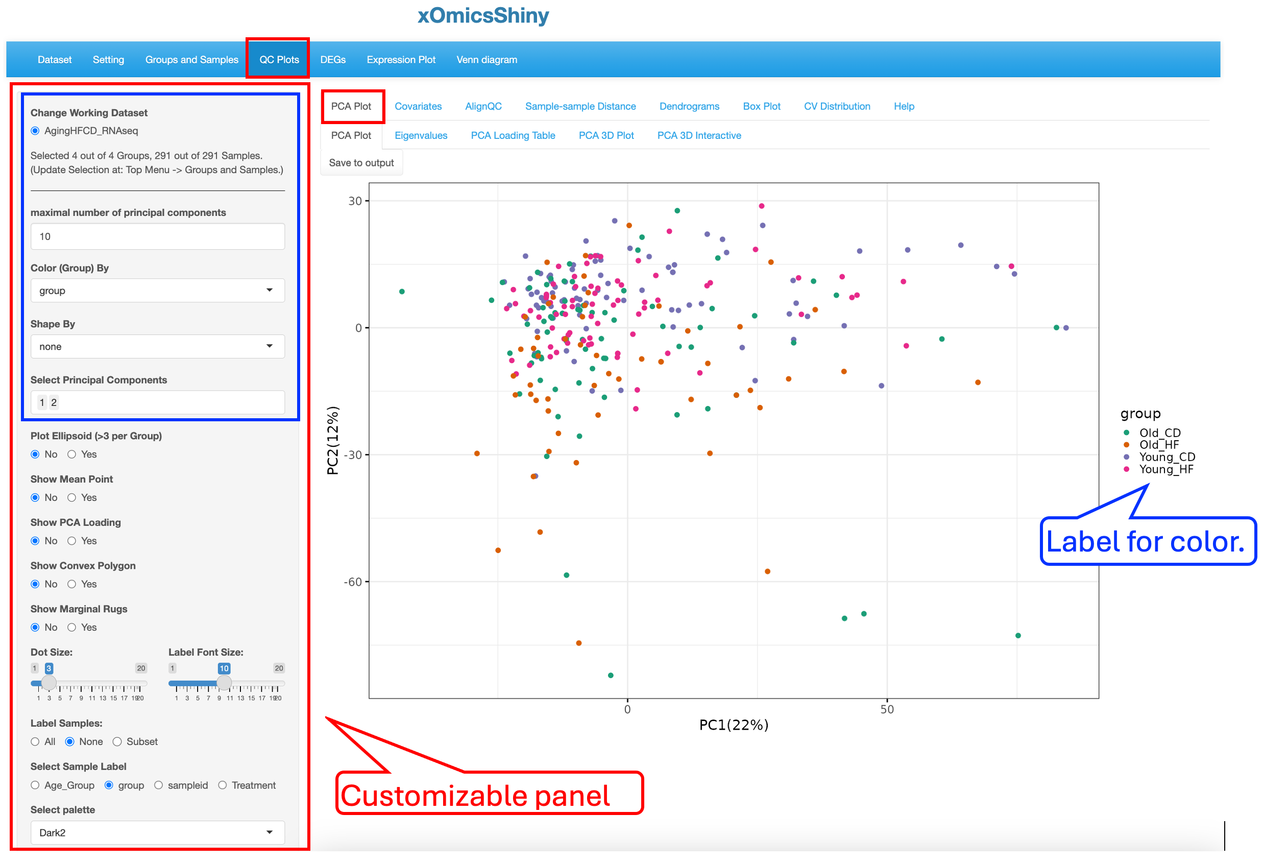
5.1 PCA Plot
5.1.1 PCA Plot
The principle component analysis (PCA) plot displays, by default, the first 2 PC’s in the dataset and colors study groups with “none” selected in shape and size settings. This plot is highly customizable. Users can change the display by annotating the plot with different colors, shapes, size scheme, as well as label selected subsets data points.
To illustrate the strengths of customization, we changed a few display elements, including labeling Treatment by shape (red rectangle boxes), showing ellipsoid (blue rectangle boxes and arrows) and showing marginal rugs (green rectangle boxes) as shown below to visualize the influence of Age and Treatment on sample clustering:
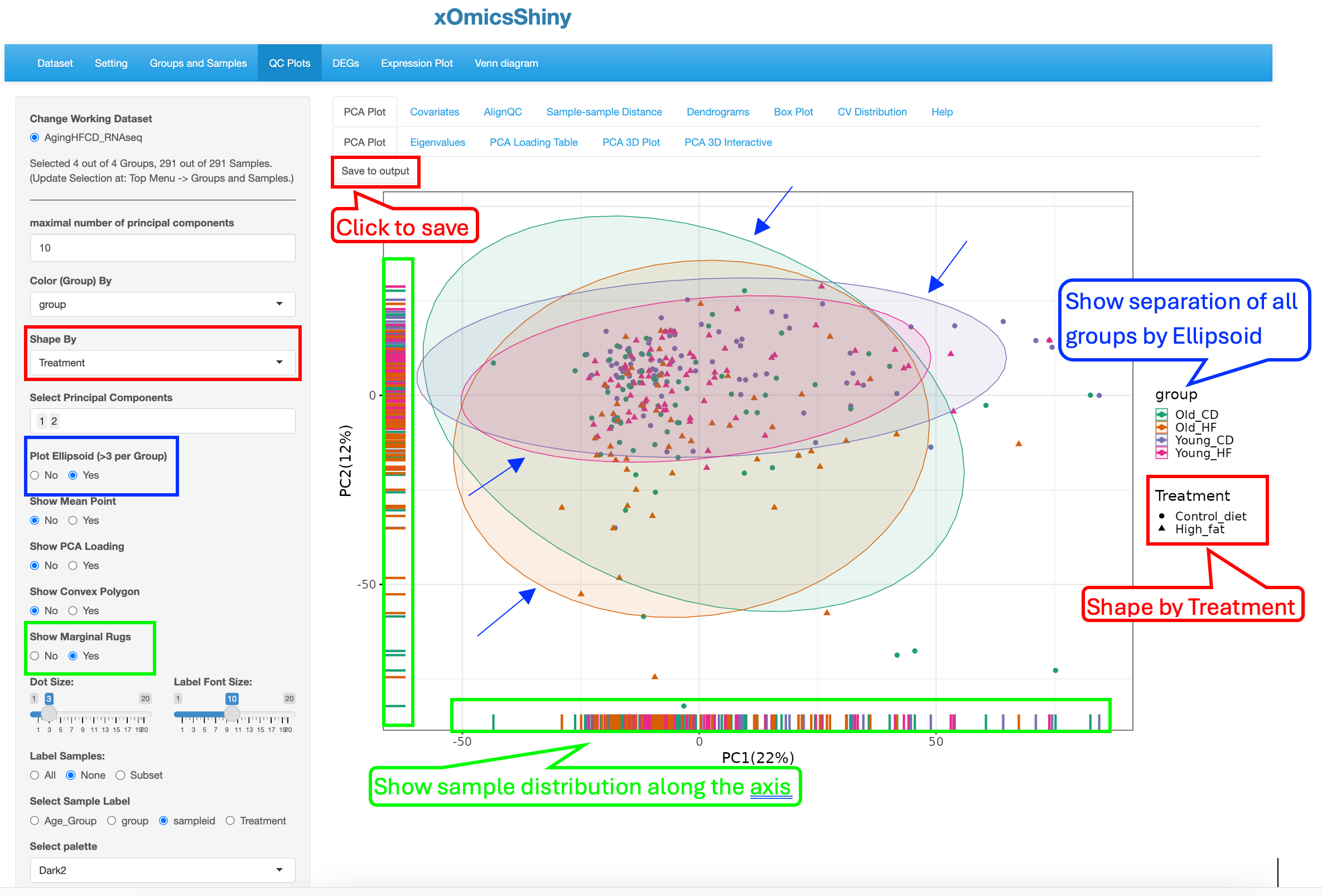
These changes results in a PCA plot that showed that both Age and Treatment played some moderate effect that drives small separation among the groups although most of the samples are in a overlapped region. The Ellipsoid feature helps group samples by the color attribute, while the Marginal Rug feature helps understand the sample distribution along the axis.
Furthermore, the plot can be saved in high resolution by clicking on “Save to Output”. Section 19 of this document describes the next steps of downloading and obtaining the saved plots.
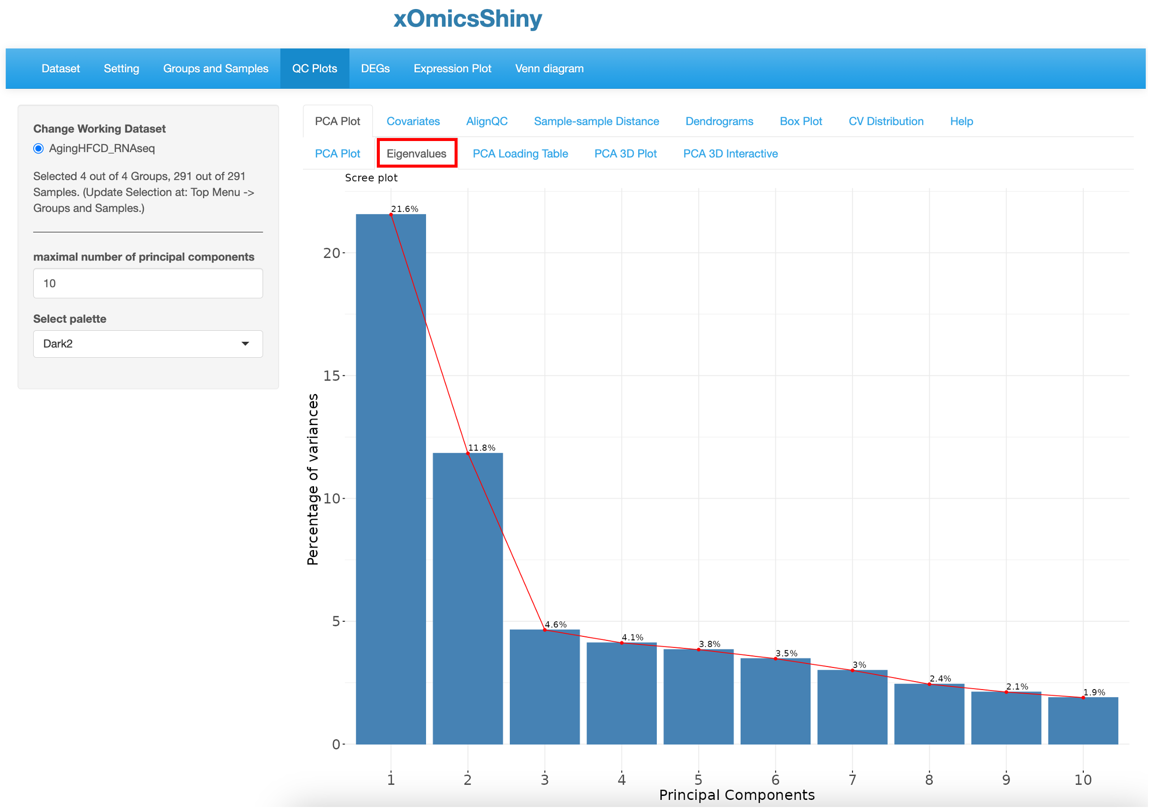
5.1.2 Eigenvalues
By default, the PCA plot displays PC1 and PC2 as described in Section 5.1. However, in many cases other PC’s may be important in explaining additional variance in the dataset. This sub-tab generates a plot of the variances versus the first 10 PCs in the dataset, enabling Users to make educated decisions of which PCs to plot in 2D scatter plot. In this dataset PC1 and PC2 together explain around 33% of the variance.
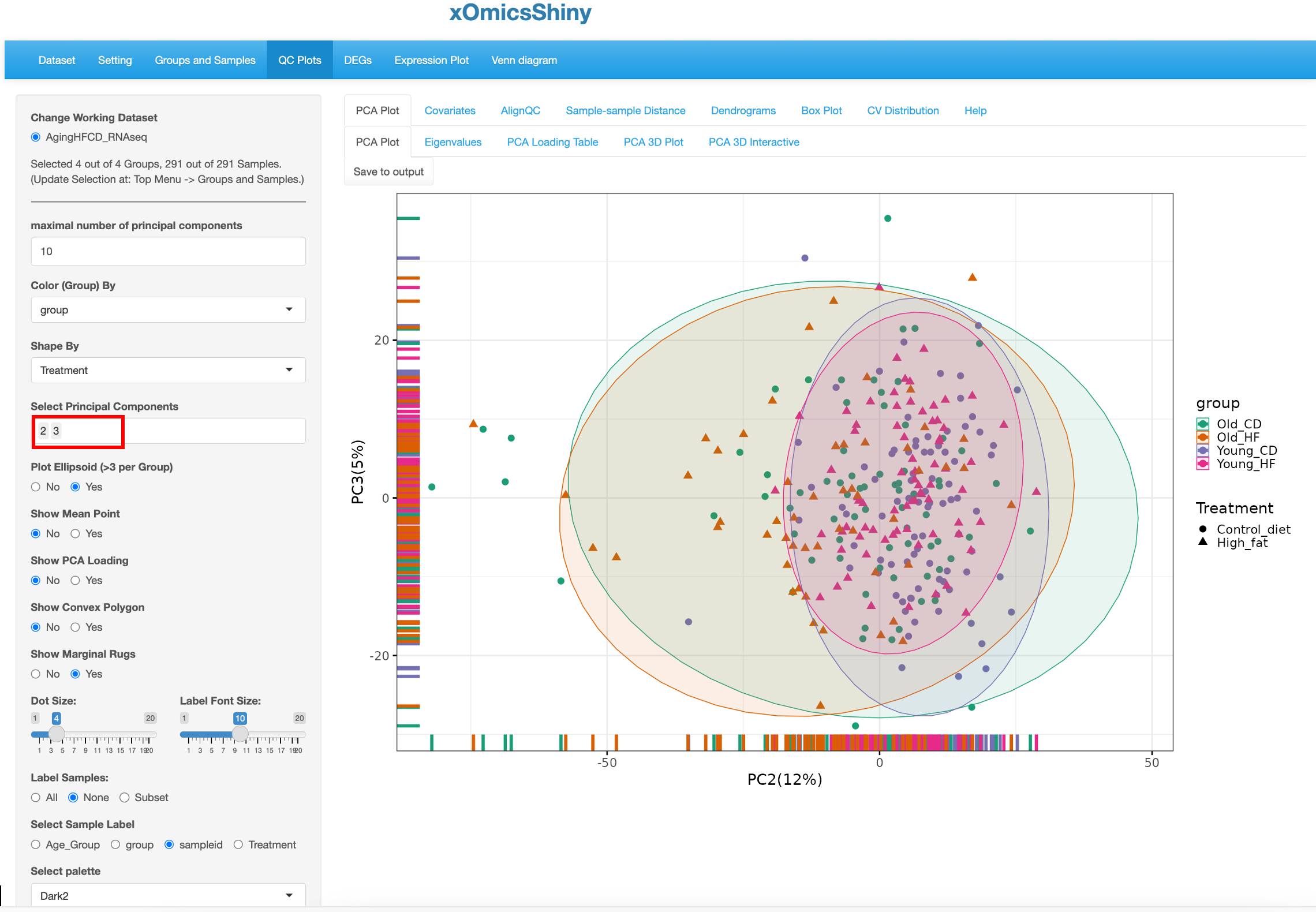
PC2 and PC3 were used to redo the PCA plot, but here the factors driving the separation of the samples is not as clear although we can see that the samples in the Old group are more spreading out.
5.1.3 PCA Loading Table
A PCA loading table for RNA-Seq data displays the loadings of each gene, which are the unit eigenvectors scaled by the square root of the eigenvalues. Genes with large positive or negative loadings have the greatest influence on the direction of the principal component. By comparing loadings across principal components, one can identify the genes that account for the most variation in the data.
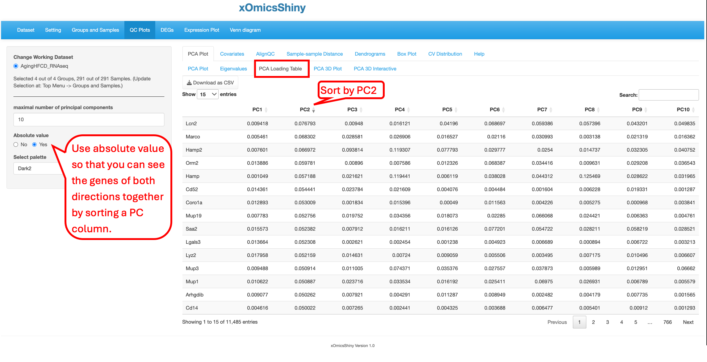
By turn on the function to “Show PCA Loading”, users can see the top contributing genes in the PCA plot.
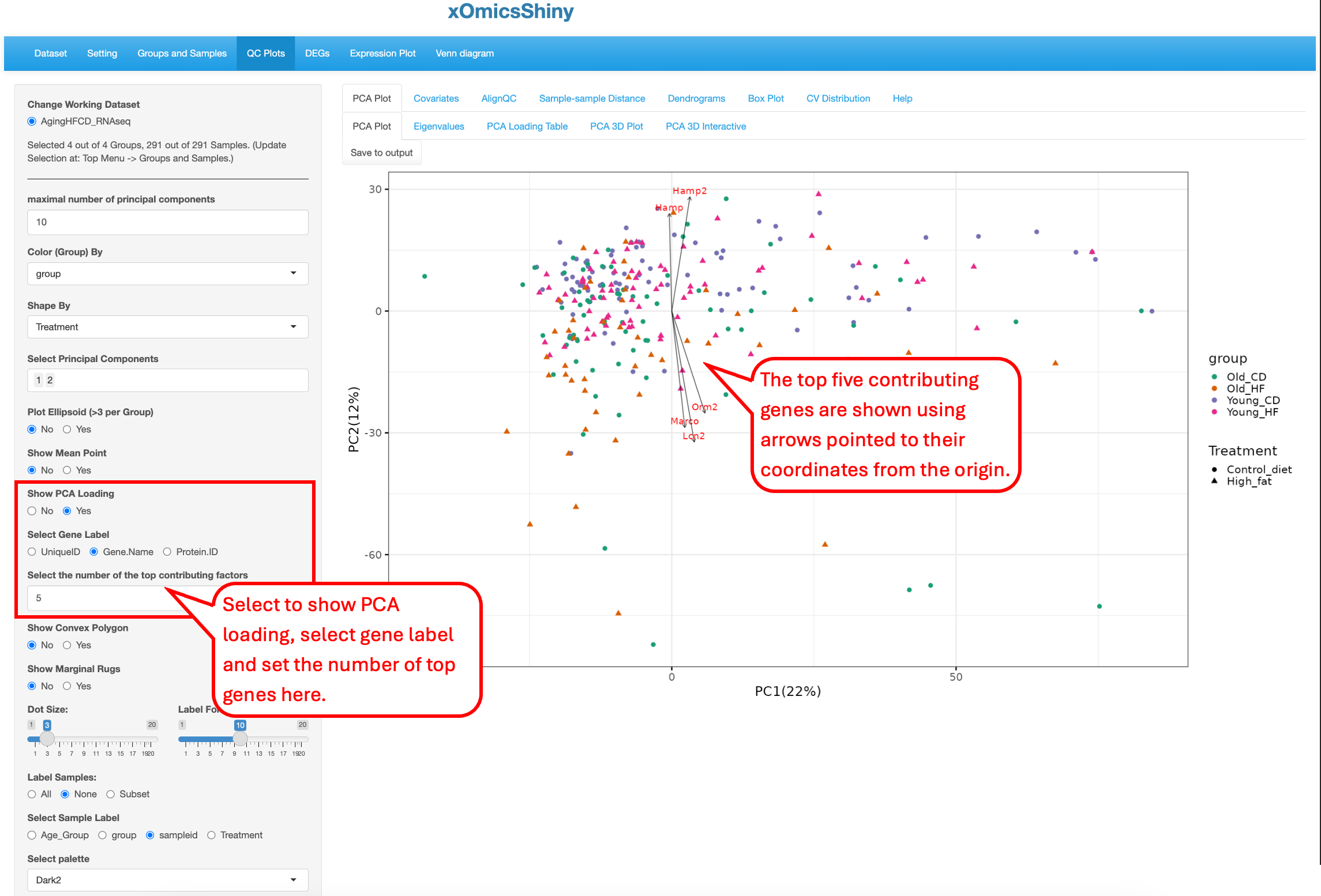
You can see that the top 5 genes in the PCA plot are consistent with the top 5 genes in the sorted PCA Loading table.
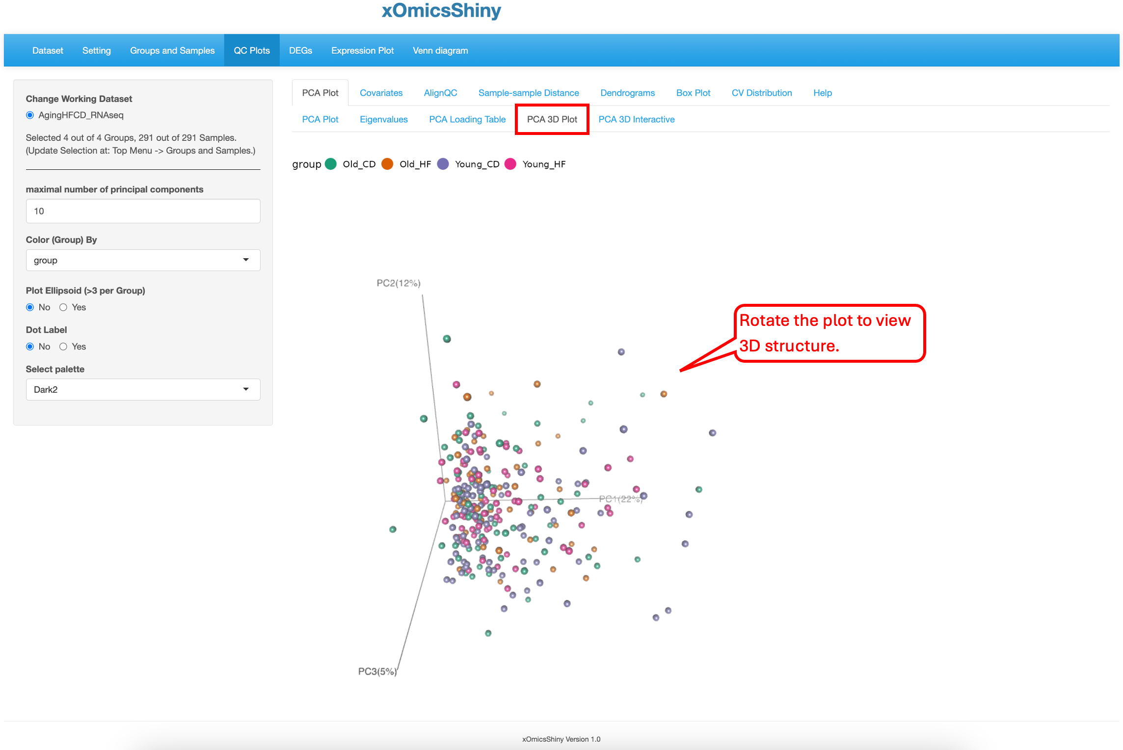
5.1.4 PCA 3D Plot
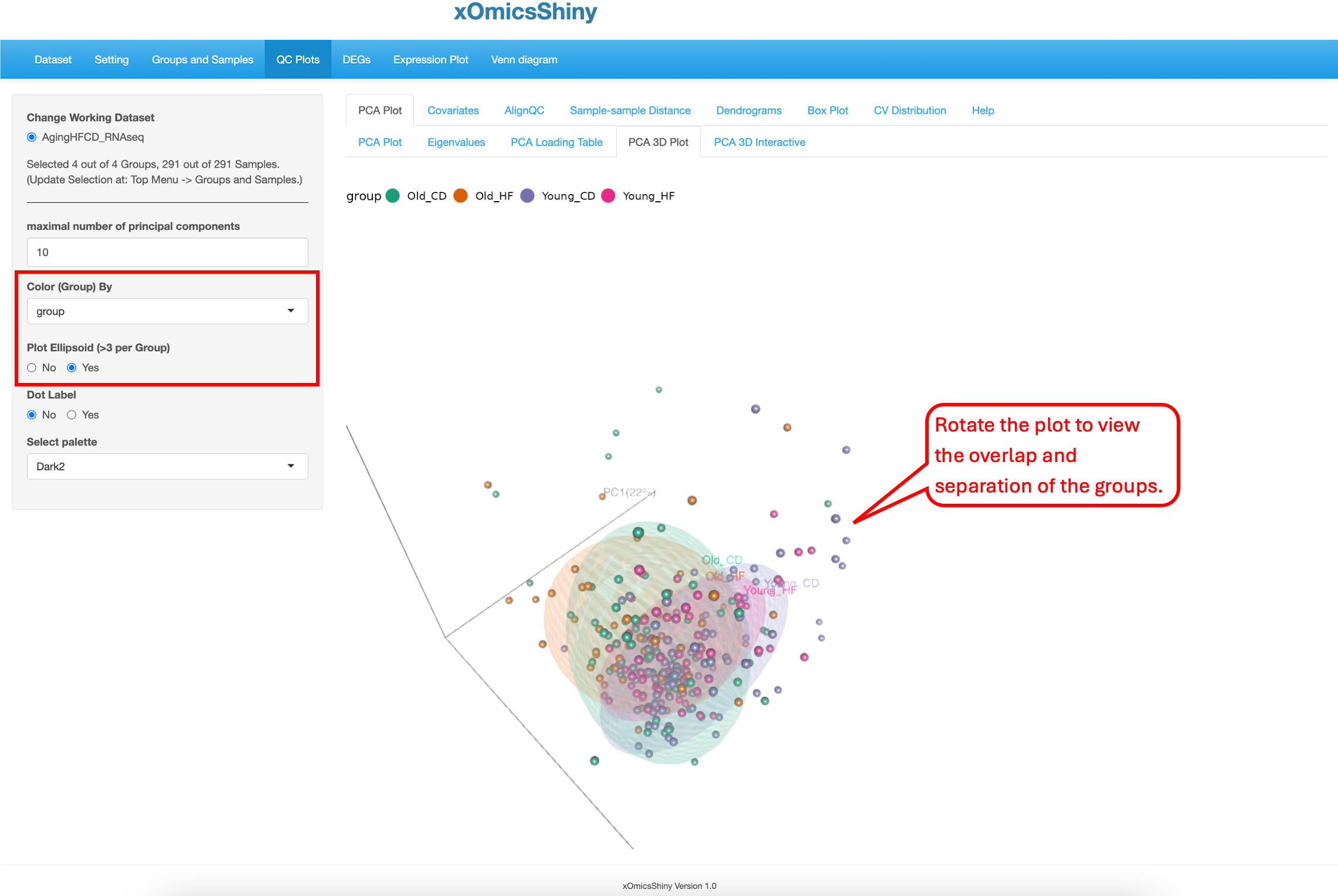
This sub-tab contains a way to perform 3D PCA representation. The functionality is limited to doing so only on PC1, PC2 and PC3. Users can zoom in and out to focus on different areas of the plot or rotate the plot in different axes to find the best separation by age as shown below. There are 5 attributes that can be changed: maximal number of principal components, color by group, ellipsoid inclusion, labels of the samples and color scheme.
The “Plot Ellipsoid” attribute was changed in the following plot. This highlights the boundaries of sample groups.
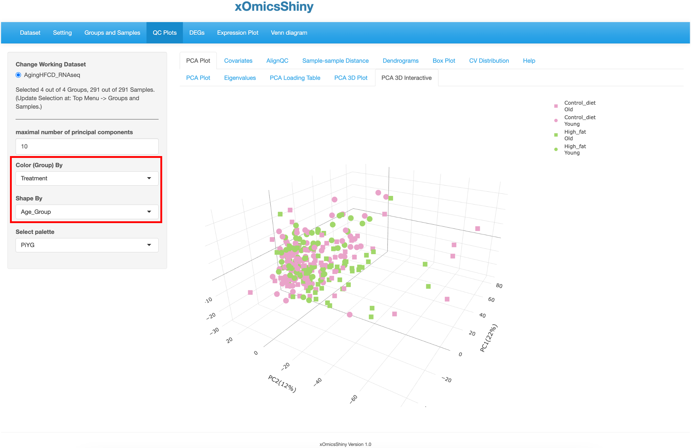
5.1.5 PCA 3D Interactive
This tab is similar to the previous one (5.4 PCA 3D Plot), but here users have the additional capability to hover over the samples on the plot to identify more details, see the pointer below. This was implemented through the plotly package in R. Users can change 4 attributes here: maximal number of principal components, color by group, shape by group, and color scheme.
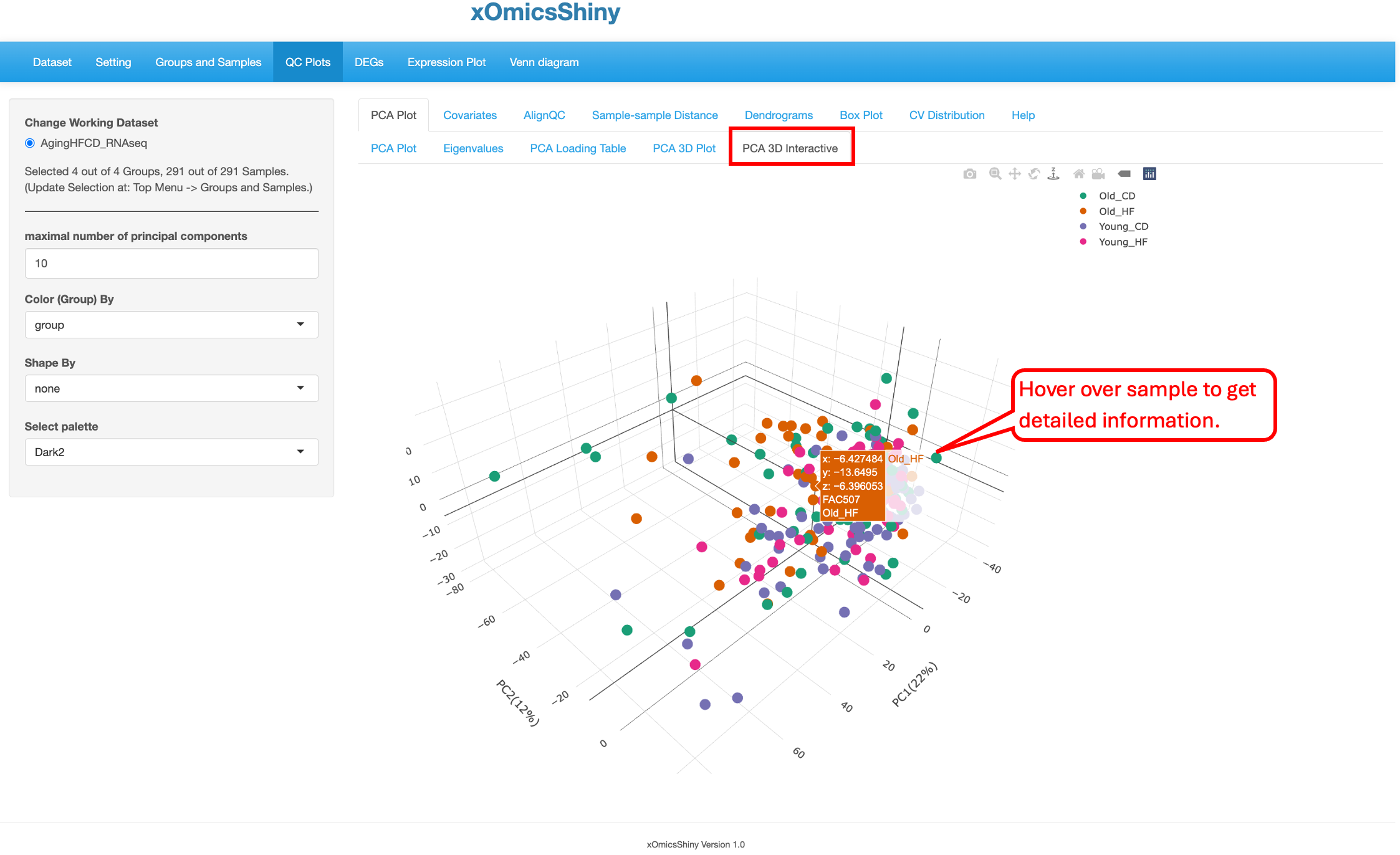
In the plot below, the “Color By” and “Shape By” attributes have been changed to highlight the check the group separation.
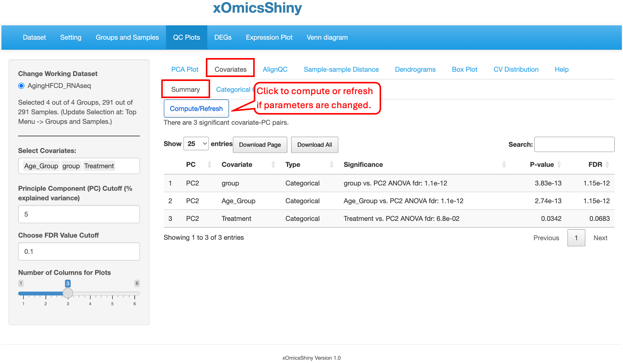
5.2 Covariates
The Covariates tab provides flexibility to visualize the covariates, such as Age_group, group, and Treatment showing here. Users can also adjust the covariates and cutoffs on the left and click “Compute/Refresh” to show the result table. The table contains several columns including the Significance, p-value, and FDR for each covariates listed.
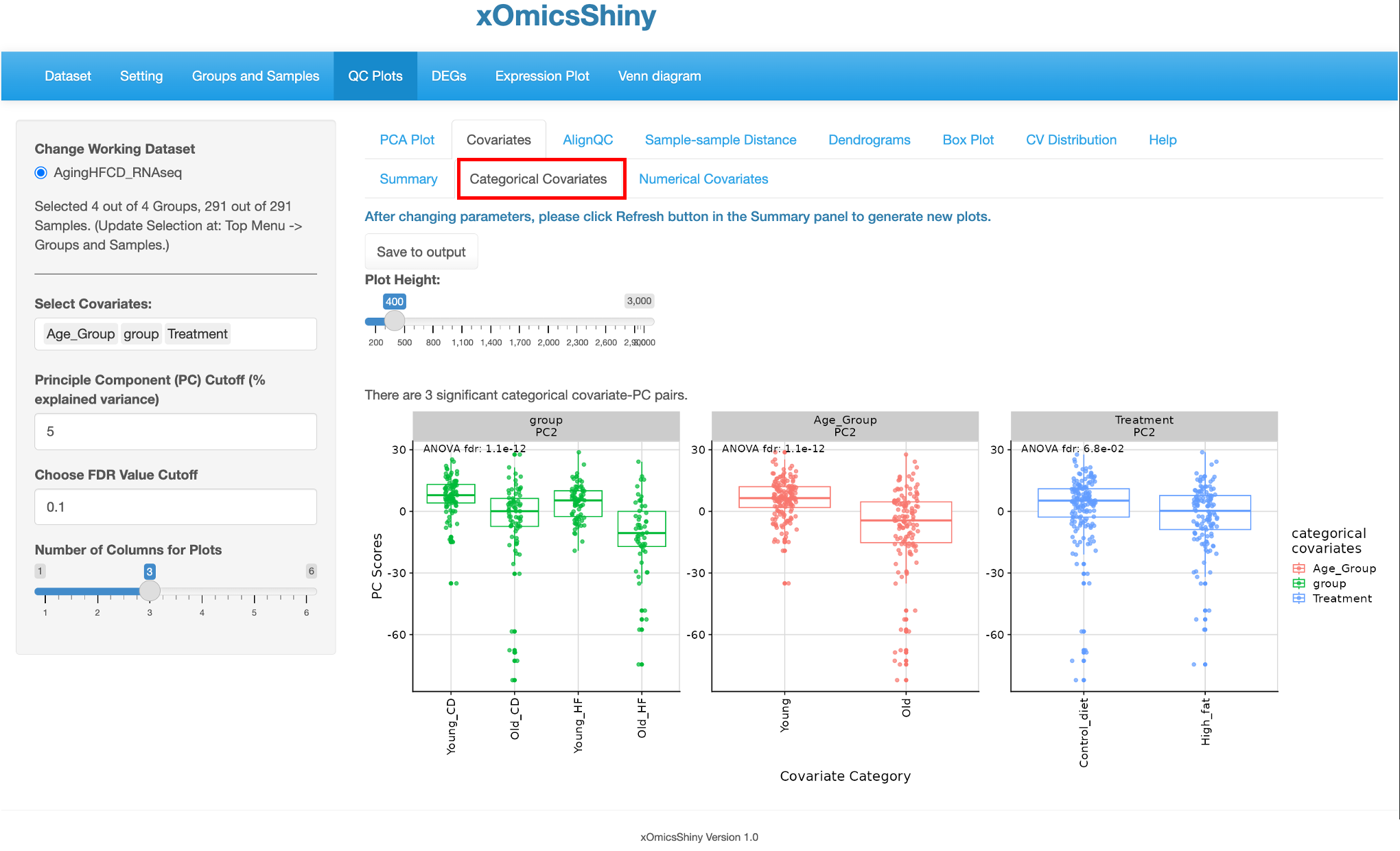
There are two other tabs of Categorical Covariates and Numerical Covariates, which showed the box plots of the significant PC-covariants pairs with the covariate groups as the x-axis and PC scores as the y-axis.
5.3 AlignQC
The AlignQC tab contains several sub-tabs to visualize the QC metrics of the alignment step. Here, we can check the ‘Top Gene Ratio’, ‘Top Gene List’, ‘Mapped Read Allocation’, or ‘Plot Other Variables’ across samples if the selected dataset contains the information. More details can be adjusted on the left panel, such as the height, width, and font size of the plot. The ‘Save to output’ function can add the current plot in the output list.
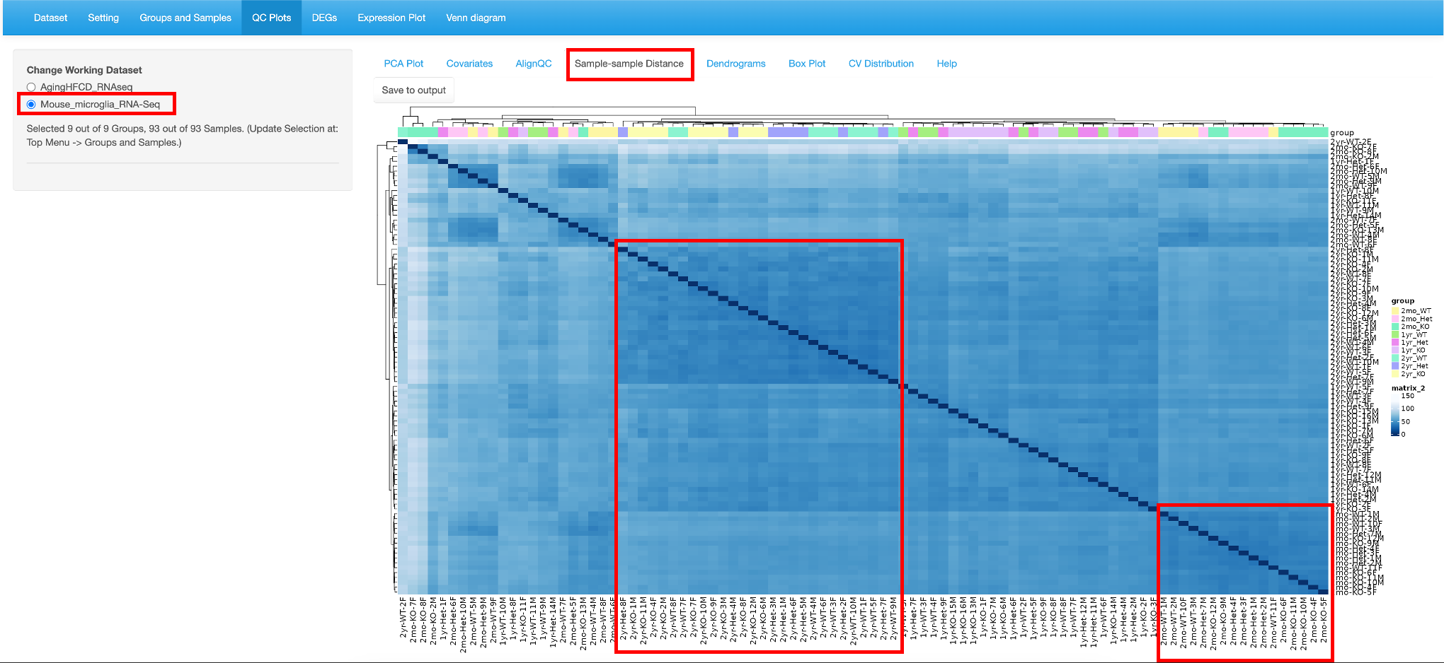
5.4 Sample-sample Distance
This tab helps identify pair-wise similarity between all samples. A distance matrix is generated for every sample pair and is plotted as a heatmap. The rows and columns are clustered based on similarity.
Here we use the Mouse microglia RNA-Seq dataset, which was demoed in the QuickOmics tutorial and showed clearly samples of the same Age have the smaller distances, that is, they have closer gene expression patterns. Here again, users have the option to save to output.
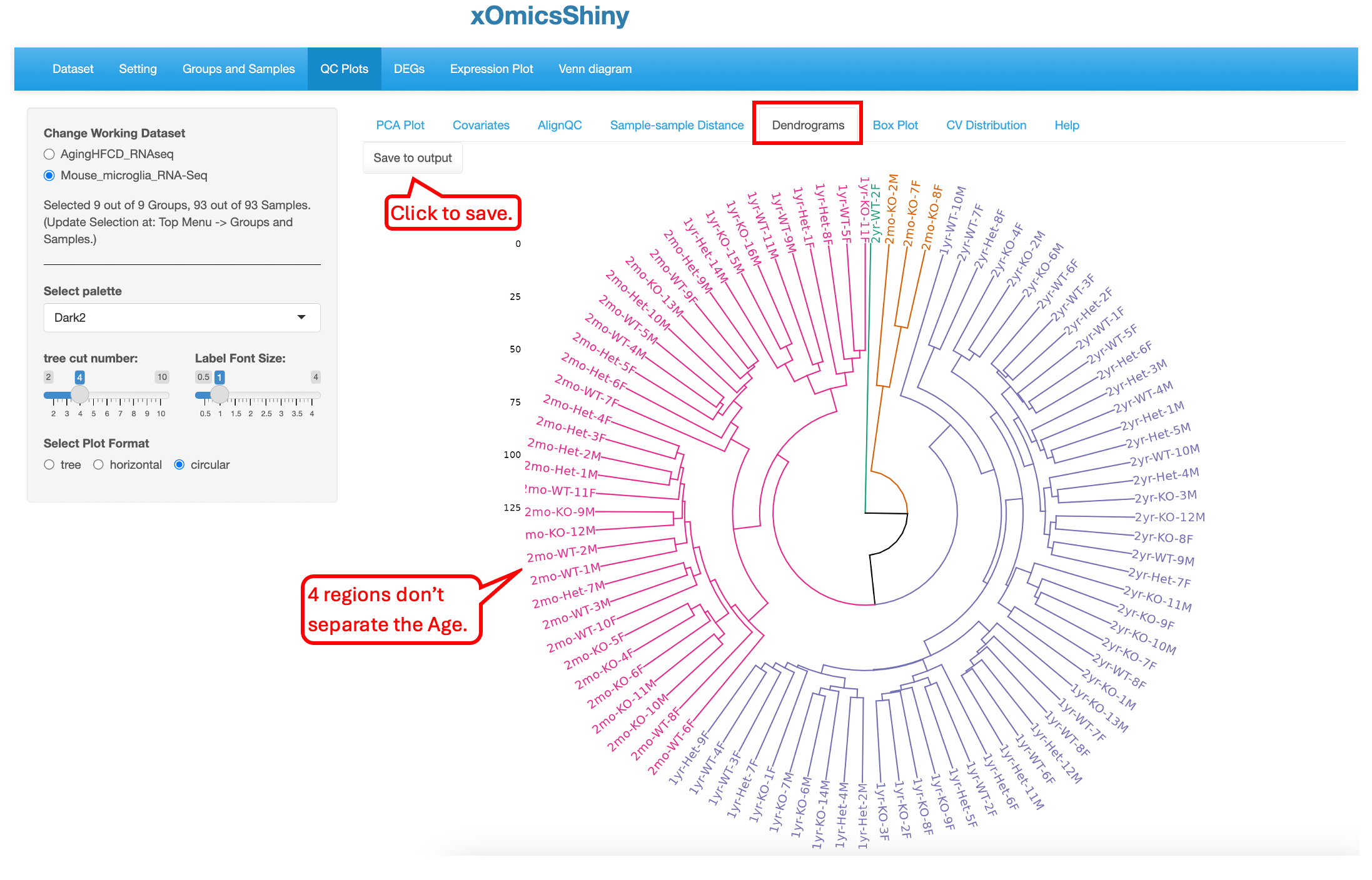
5.5 Dendrograms
Like the previous plot (5.4 Sample-sample Distance), the Dendrogram plot helps visualize hierarchical clustering relationships between samples. The Default plot is Circular and cut into four parts. Users have the option to visualize in two other ways (tree or horizontal) and cut the plot in multiple regions. Here again, users can save the plot to output.
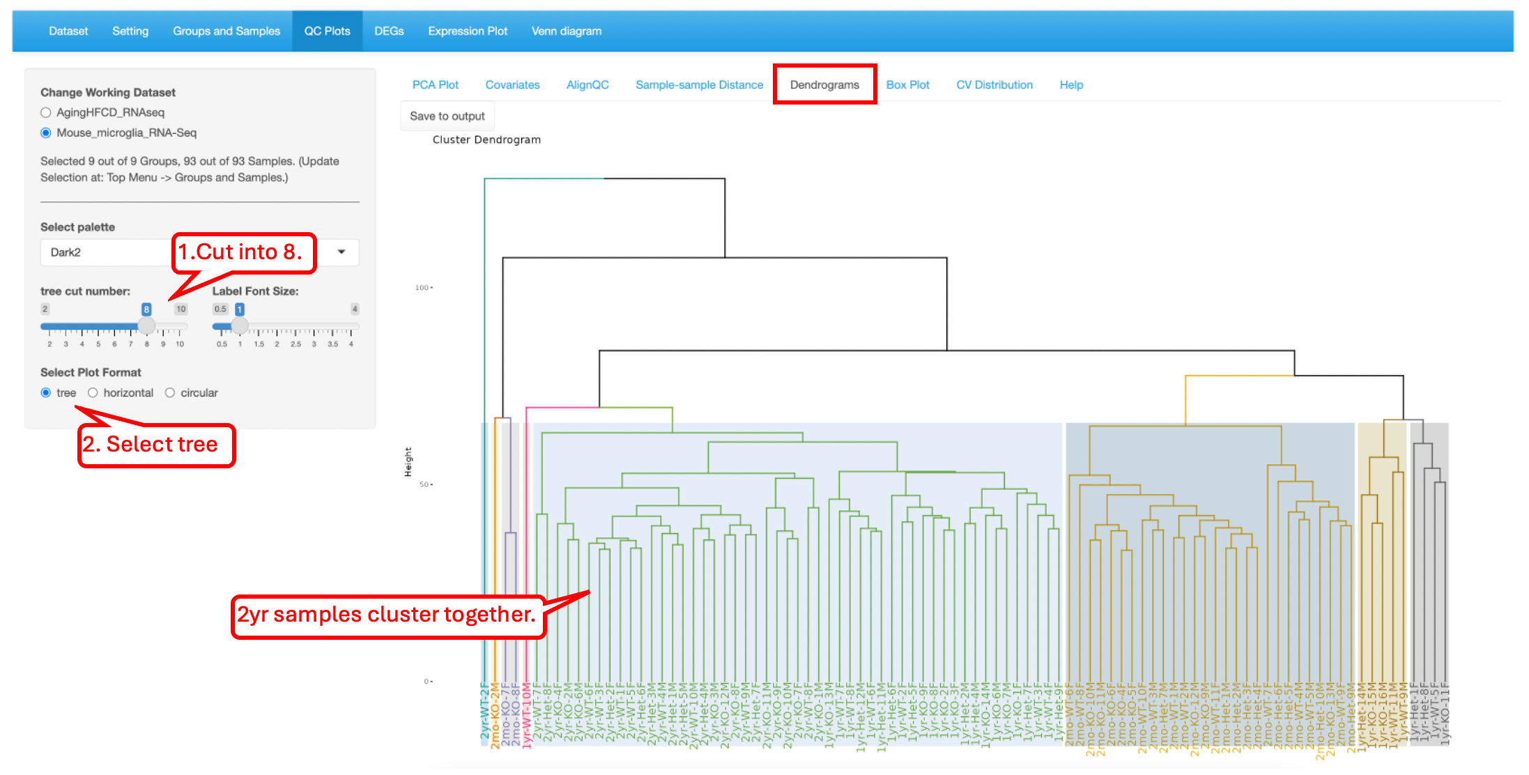
In the plot below, we have selected to visualize as a tree and cut into eight parts. This shows the relationship between the samples to help understand the hierarchal clustering. Overall, the samples are arranged by age, but there are some outliers that appear. It is also interesting how the 2mo samples cluster with the 1yr samples.
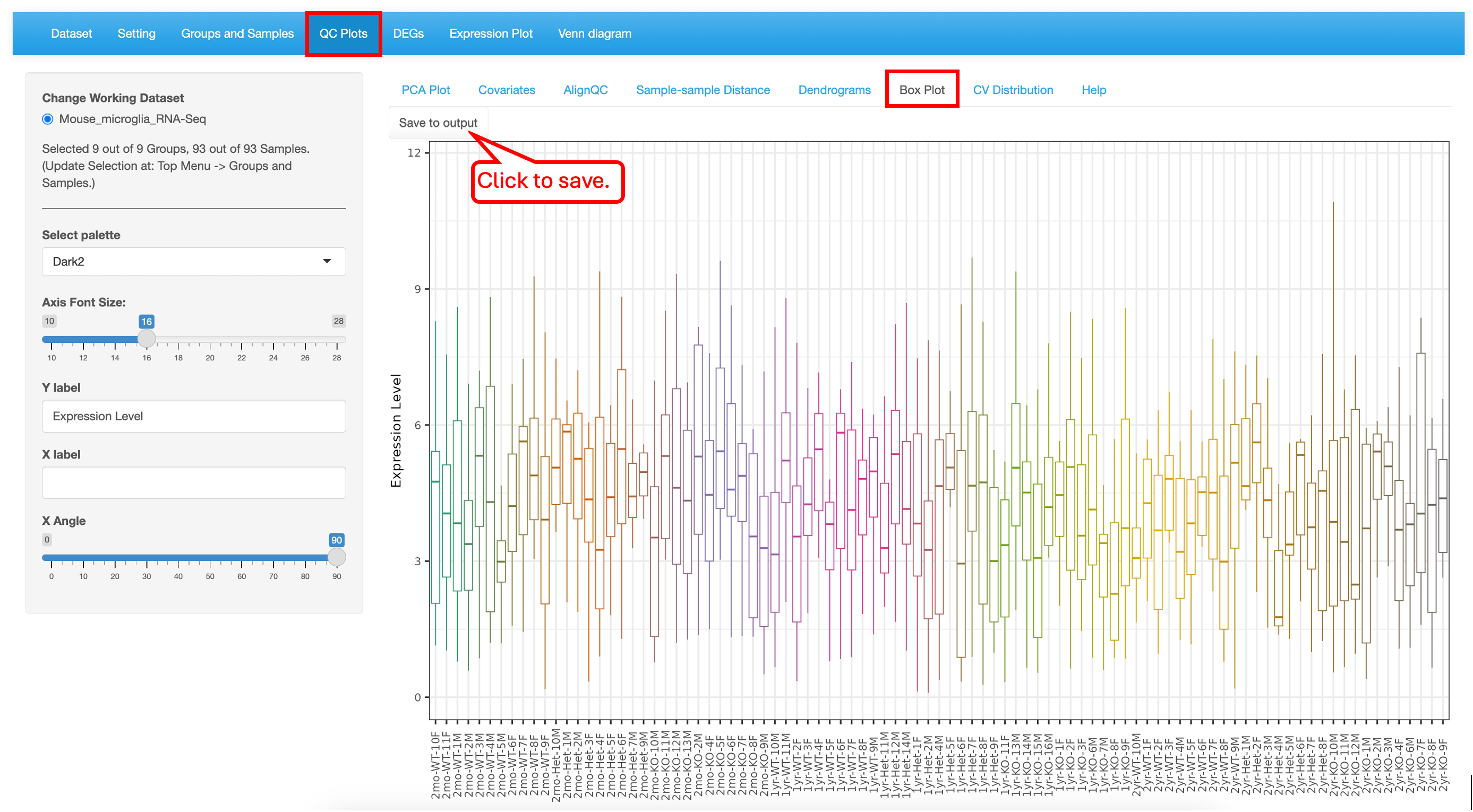
5.6 Box Plot
The Boxplot is a visualization to understand the distribution of the normalized expression levels in all samples. This identifies the minimum, first quartile, median, third quartile, and maximum values in the dataset. In this demo dataset, most of the samples have the same range of expression, indicating that there are no outliers.
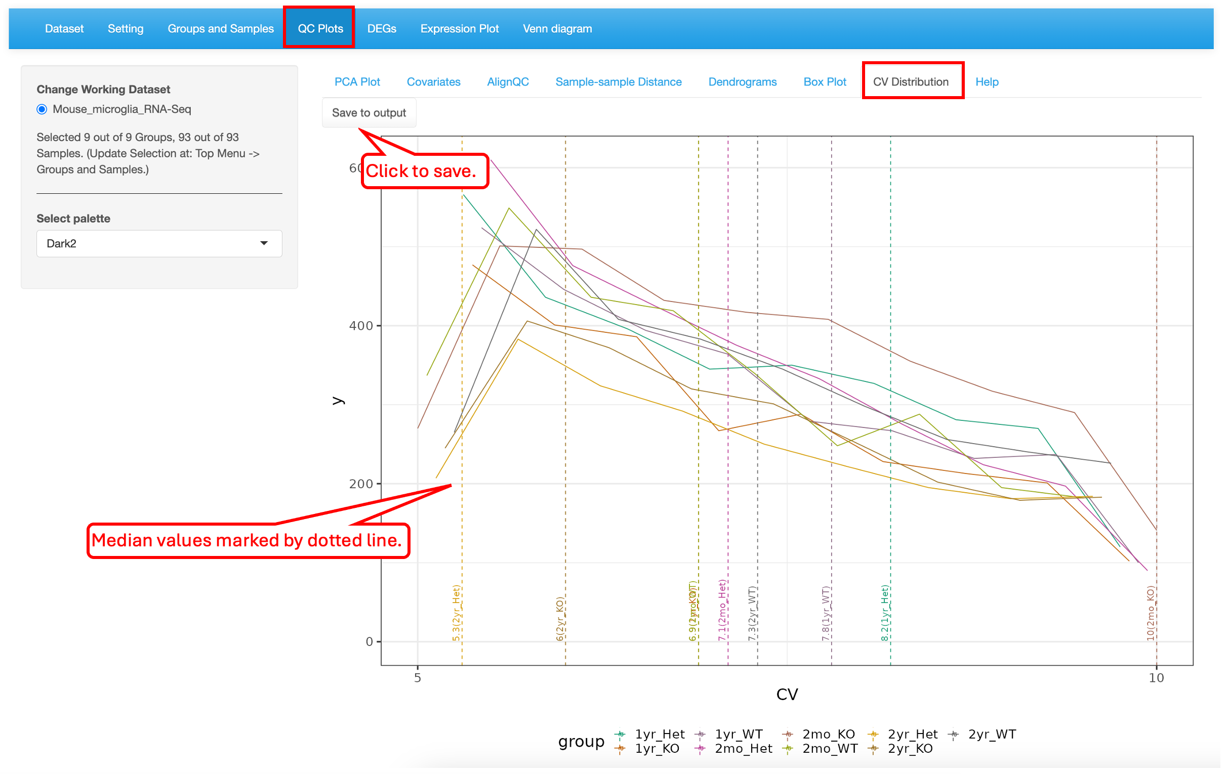
5.7 CV Distribution
This plot shows the histogram of CVs (coefficient of variation) and a dotted line for each group indicates the median CV. In this dataset, the 2mon_KO samples have the highest CV while the 2yr_Het samples have the lowest variability.
5.8 Help
The Help section describes each tab of the QC Plot and what is being visualized. For further help please visit the GitHub containing the source code for this tools (https://github.com/interactivereport/xOmicsShiny).