Chapter 6 DEG Module
This section is designed to explore the differentially expressed genes (DEGs) and differentially expressed proteins (DEPs) in the selected dataset. The comparisons are defined by the User when they input the datasets. Please refer to our GitHub for more details on uploading datasets.
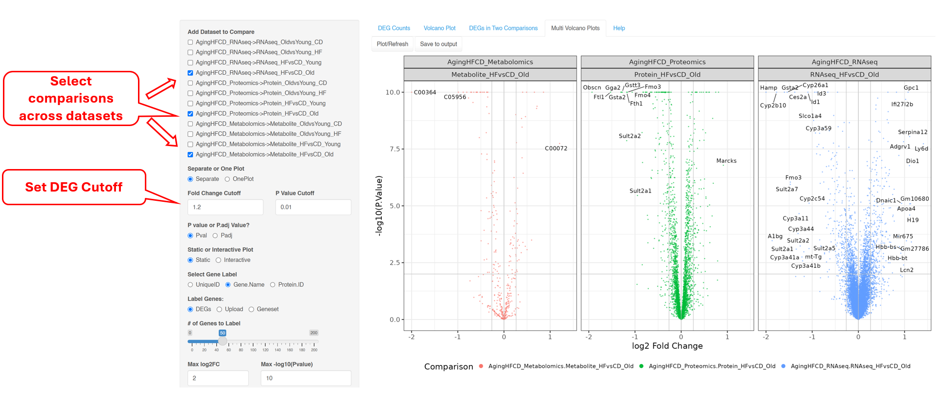
The “Volcano Plot (Static)” described in Section 6.2 and “Volcano Plot (Interactive)” described in Section 6.3 are ways to visualize each pair-wise comparison one by one. “DEGs/DEPs in Two Comparisons” described in Section 6.4 is a novel way to visualize the similarities and differences in two comparisons. Finally, “Multi Volcano Plots” can plot comparisons across experiments for visual inspections.
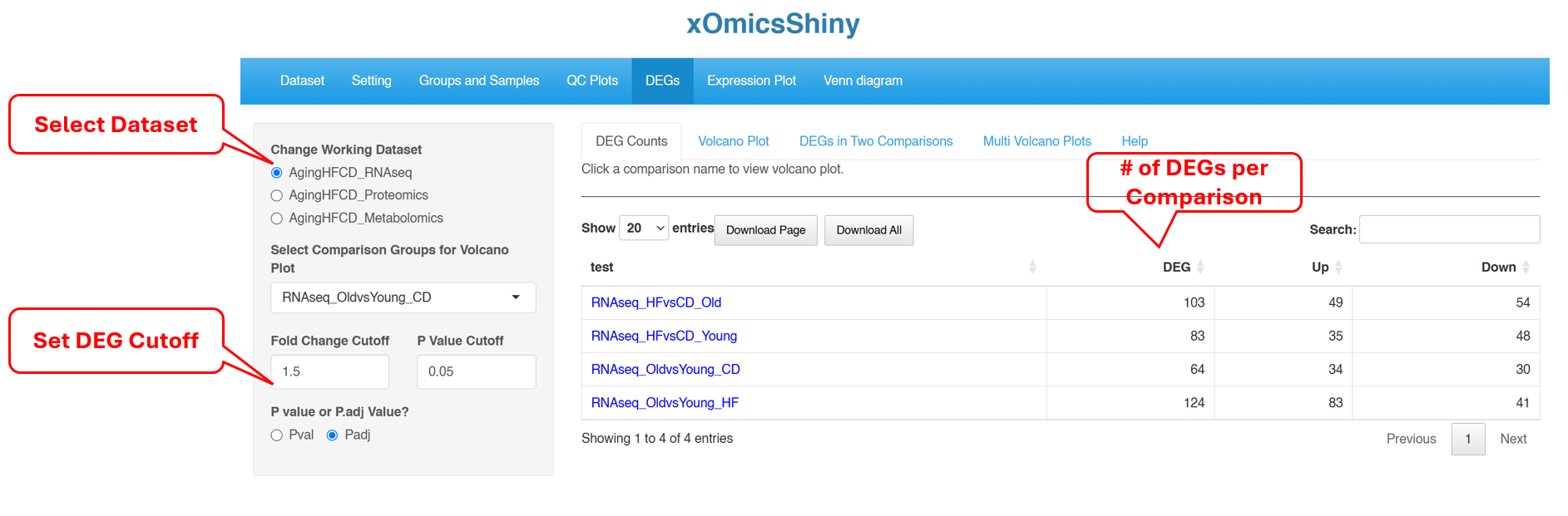
6.1 DEG Counts
DEG Counts tab provides a summary of the number of significantly changed genes for each comparison, separating Up- and Down-regulated genes. Use the left menu to select which dataset to view DEG counts, and the log2FC and p-value/FDR cutoff to call DEGs.
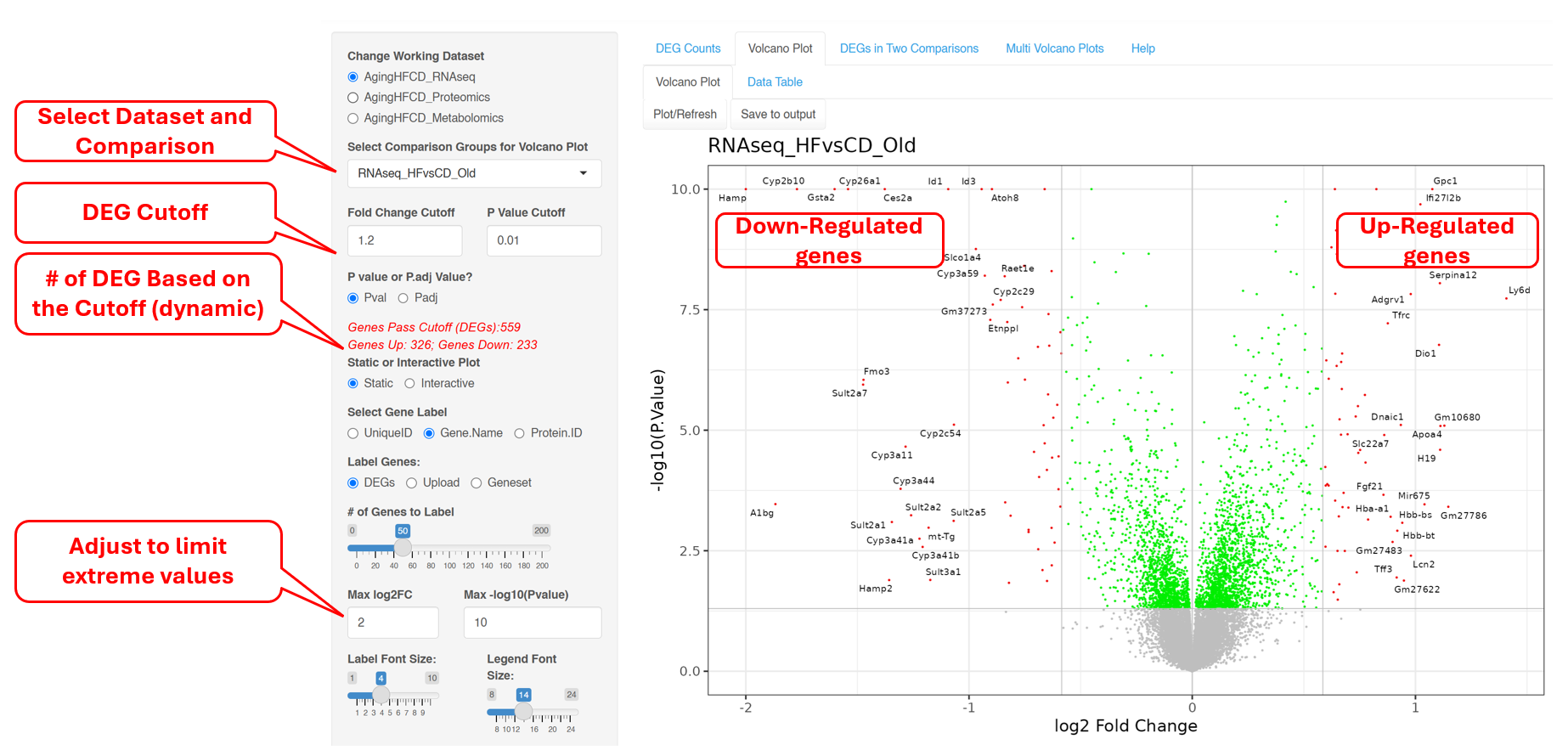
6.2 Volcano Plot (Static)
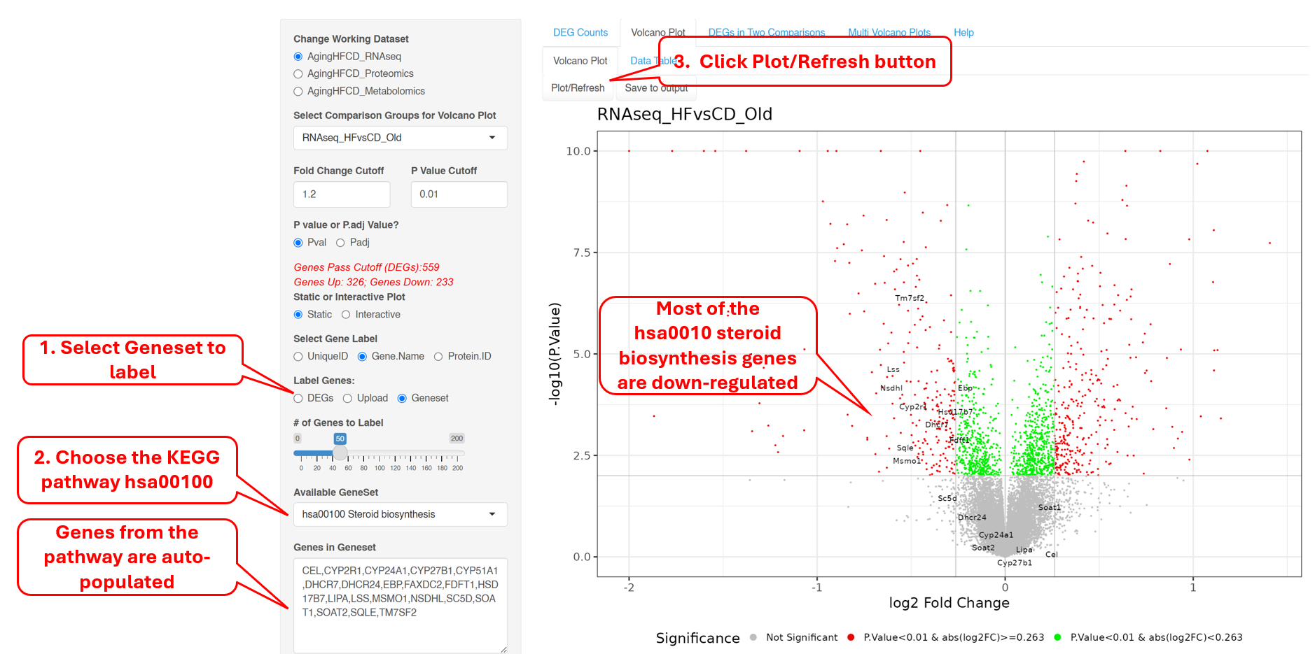
This plot reveals the differentially expressed genes provided in the input data file. By default, the Fold change Cutoff is set to 1.2 and the P value Cutoff is set to 0.01. Users have the option to change any of these parameters. For more advanced display options, they can set the “Show More Options” to “Yes” to customize other settings.
The red dots are indicative of all genes that pass the Fold Change and P value cutoff, while the green dots are indicative of genes that only pass the P value cutoff. Fifty random genes are labelled for both the up-regulated and down-regulated genes by default.
If there are extreme values in the data such as very small p-values or very large fold changes, the volcano plot may not look nice. In such cases, you can adjust the max log2FC and Max -log10(Pvalue) to force the extreme values to fit into max values.
Instead of DEGs, one can highlight selected genes in the volcano plot. For example, we selected KEGG pathtway hsa100 Steroid biosynthesis genes, and the plots shows that most of these genes are down-regulated.
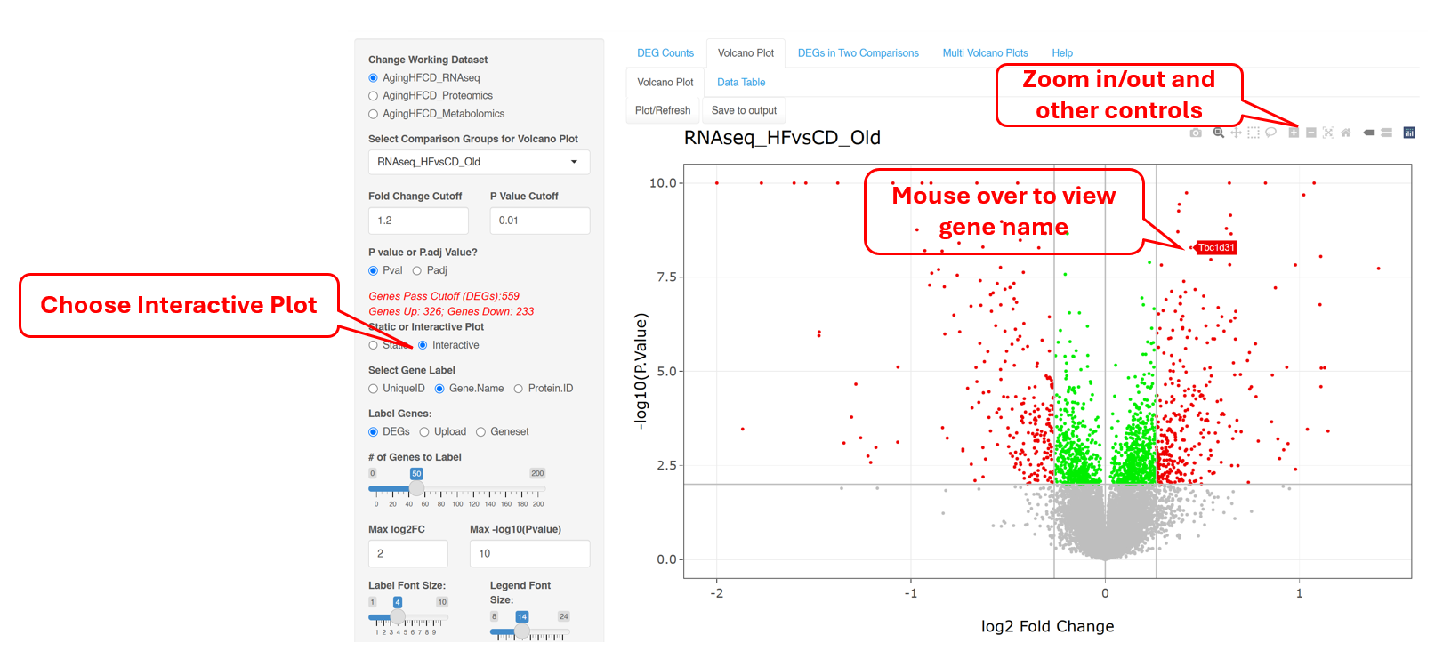
6.3 Volcano Plot (Interactive)
This Volcano plot can also be shown as an interactive plot, which has the additional capability where users can hover over a particular dot/gene on the plot to see more details. Users can also zoom in to a specific region to view more details if needed.
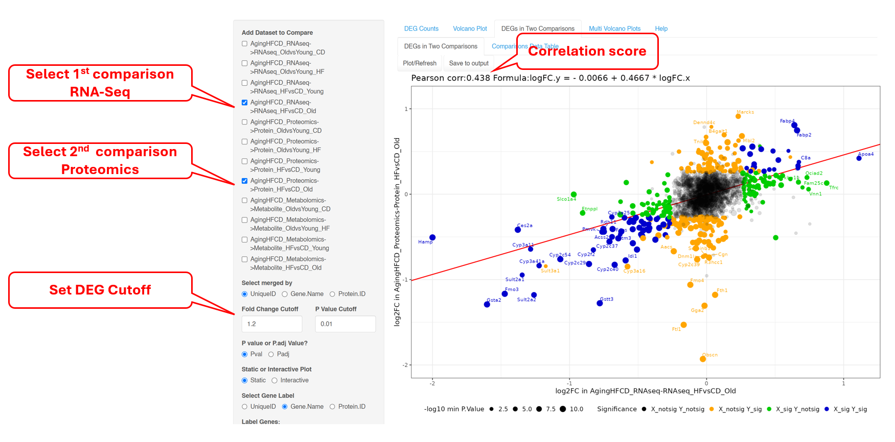
6.4 DEGs and DEPs in Two Comparisons
This next tab helps with identifying DEGs/DEPs that follow a similar trend in two comparisons. xOmicsShiny allows using to perform this comparison across datasets. In the example below, we plotted change genes (from RNA-Seq) and proteins (from proteomics) in high fat vs. control diet in old mice. It can seen that protein and mRNA levels follow the same trend for most geness, and the correlation between the two Omics datasets is 0.438.