Chapter 7 Expression Plot Module
This functional module allows Users to browse through a subset of genes/proteins. It also offers an option to plot expression of individually selected genes. Four different displays: Box Plot, Bar Plot, Violin Plot and Line Plot are made available to fit the Users’ preference. In Quickomics v2.0, we enhanced the Expression Plot module: Genes can be ranked by p-value or logFC, and the number of columns in the graph can be changed.
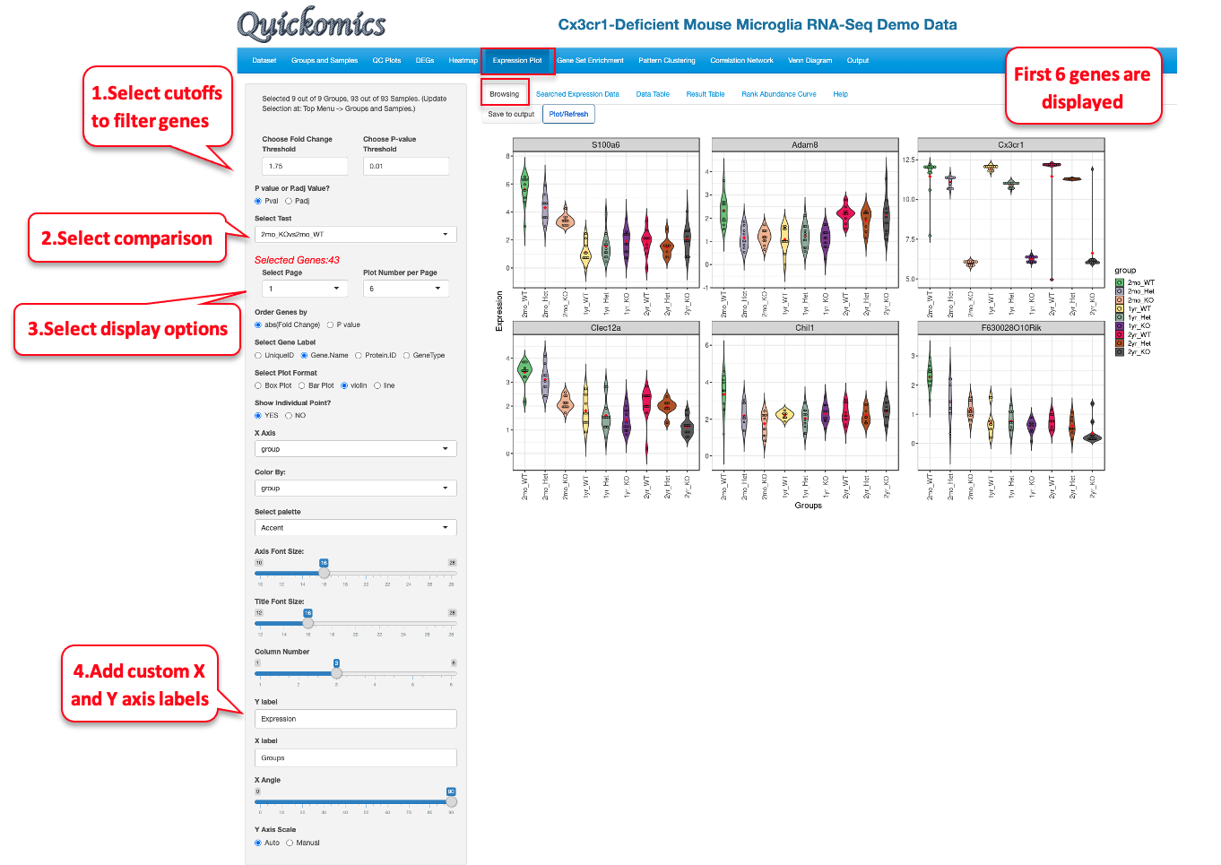
7.1 Browsing
This tab lets the Users plot out the expression of the DEGs/DEPs identified in the different comparisons. In this example below, we demonstrate how to display a few top genes as Violin Plots.
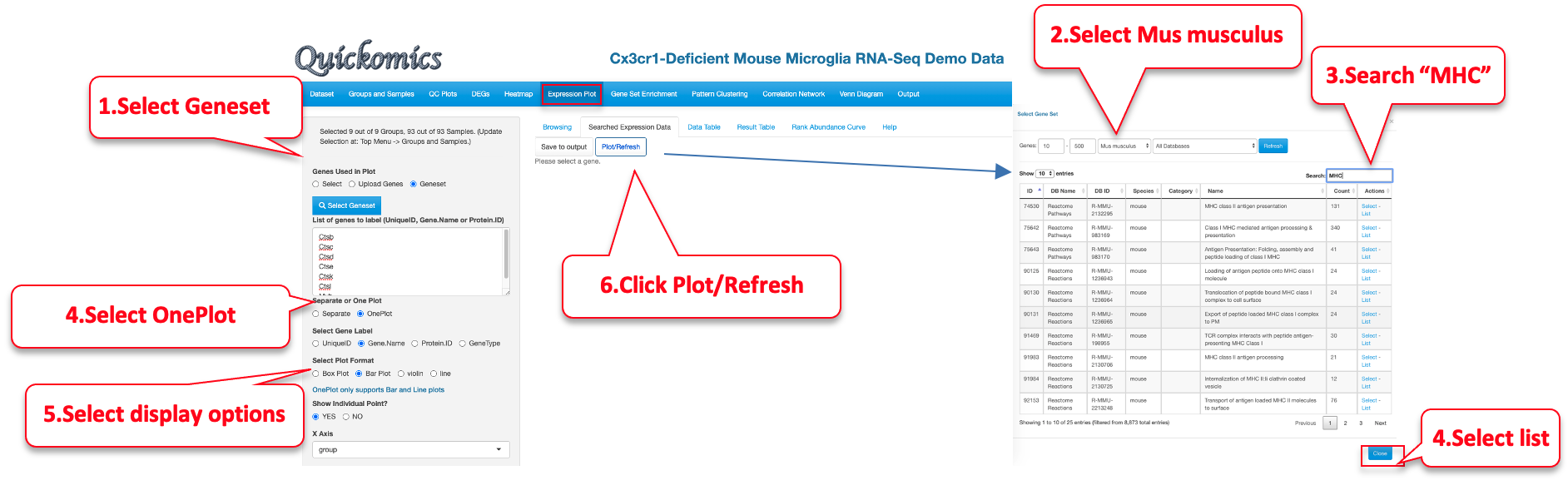
7.2 Searched Expression Data
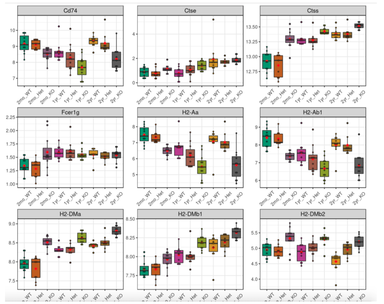
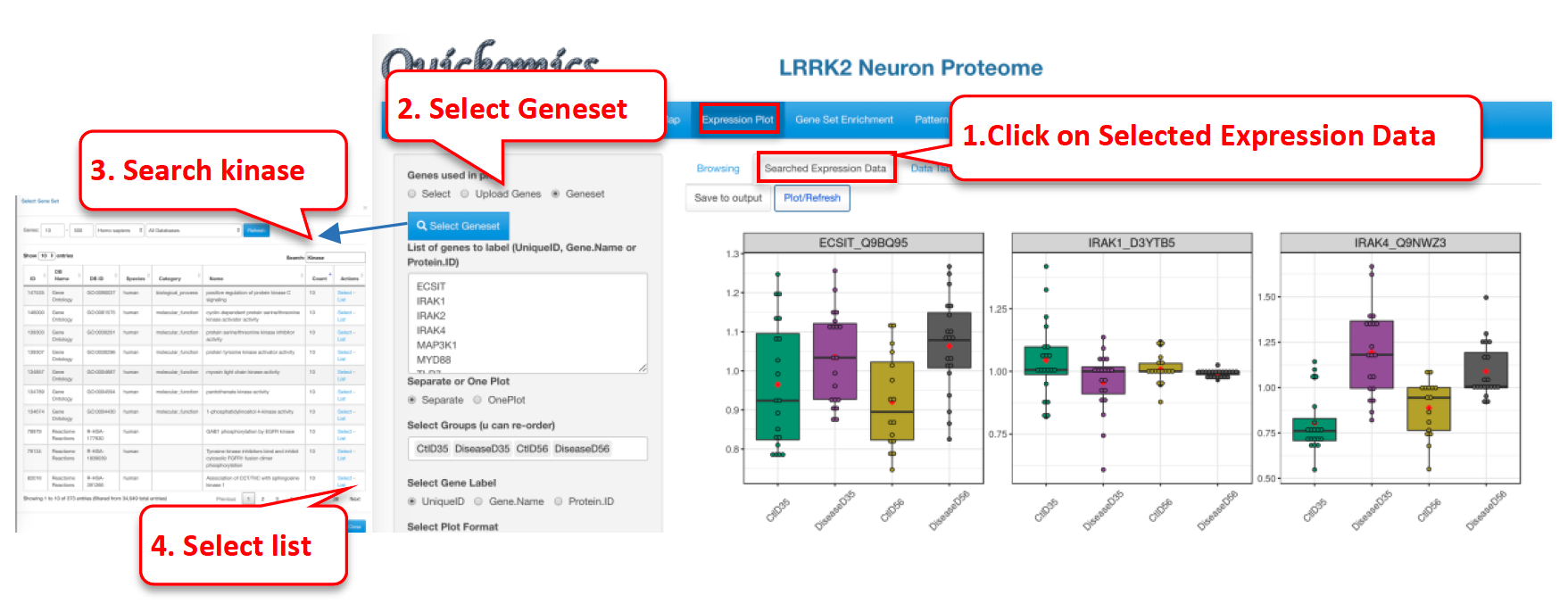
Another way to plot genes/proteins is using this functionality. Users can either enter a custom list of genes/proteins or select a list from online databases like KEGG, MSigDB etc. The selected genes/proteins can be plotted on a single plot or in multiple plots. Here is an example of plotting genes involved in MHCII antigen processing.
The resulting plot shows the expression of a subset of genes from the MHCII antigen presentation family of genes. Many of them appear altered by gene KO in 2mon microglia, but also in all genotypes in 2yr microglia, as indicated in the publication.
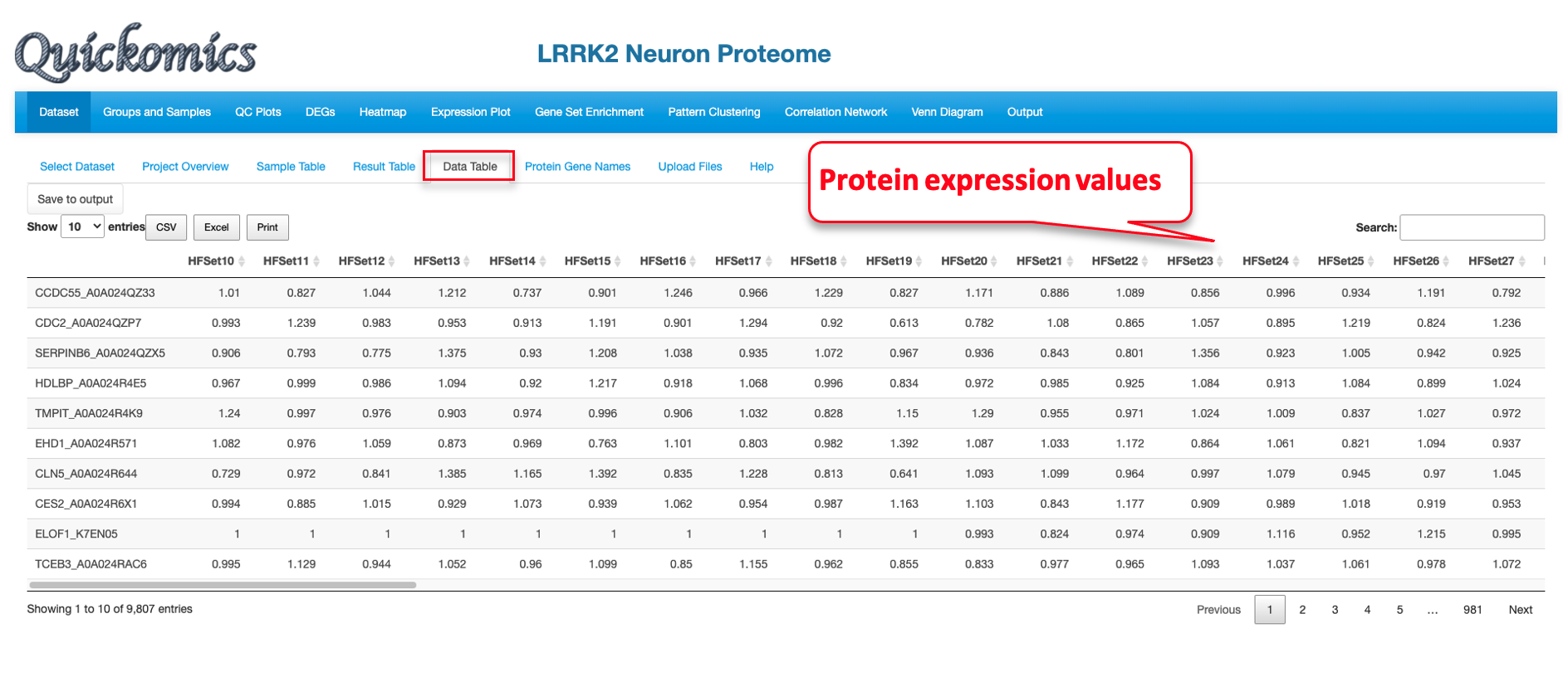
7.3 Data Table
This sub-tab lists the normalized data of the genes/proteins selected in “Searched Expression Data” (Section 7.2) as a searchable table. For a demo of this feature, we select a proteome dataset from published paper (Connor-Robson et al., 2019).
Once the dataset is selected, we go into the “Searched Expression Data” sub-tab to select a gene set.
Finally, we click the “Data Table” tab to look at the expression of the protein selected for a searchable table of values.
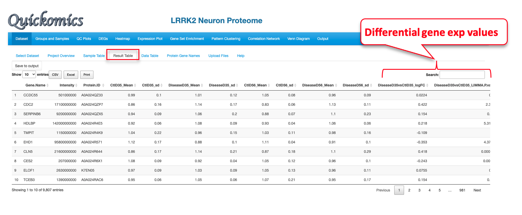
7.4 Result Table
This tab lists the statistics results of the genes/proteins selected in “Searched Expression Data” as a searchable table. Each comparison defined is probed for the genes in the list and the P value and Fold changes are listed. This is specifically designed for the gene values, unlike “Data Table” in the previous section (7.3) that is designed for protein values.
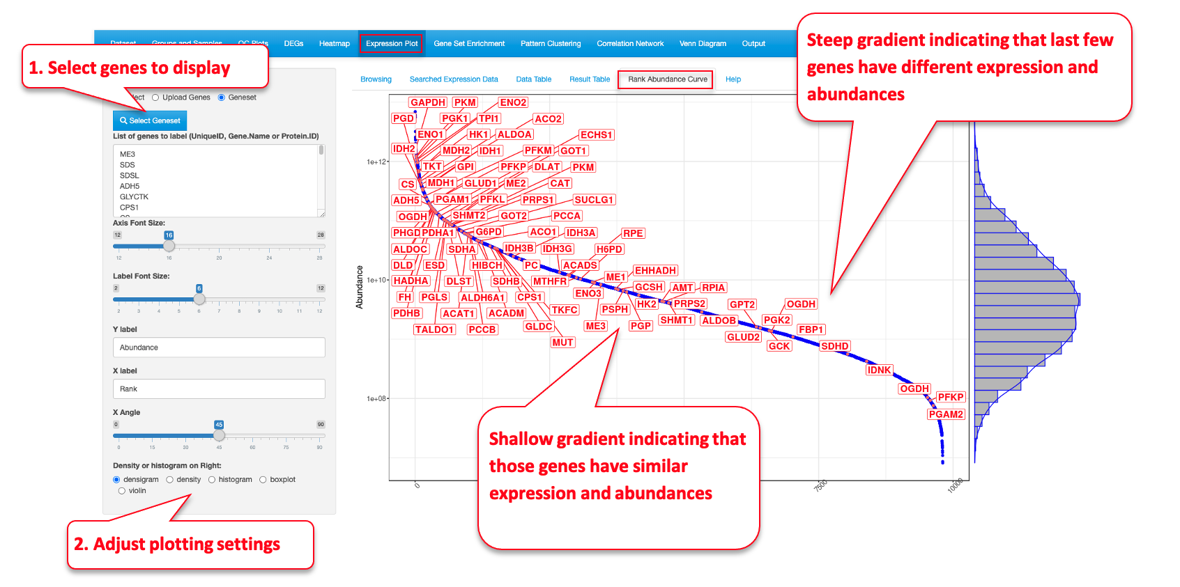
7.5 Rank Abundance Curve
This functionality helps identify the relative abundance of a list of genes within a dataset. This plot helps interpret the distribution of abundance and expression levels of a set of genes. A steep gradient indicates the genes are very different in their expression levels as the high-ranking species have much higher abundances than the low-ranking species. A shallow gradient indicates that the genes have very similar expression levels as the abundances of different species are similar.