Chapter 2 Visualize Gene Expression
For each gene, Users can view its expression levels across multiple samples. Most data in OmicsView are from microarrays, consisting of more than 50K samples, and nearly 3000 samples are from RNA-Seq.
2.1 View Gene Expression from RNA-Seq
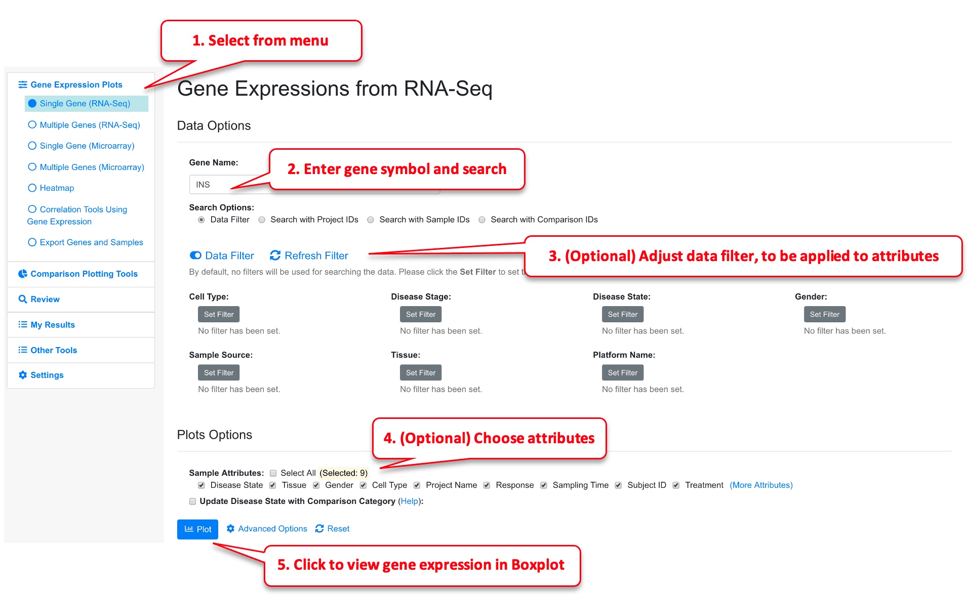
Choose the Gene Expression from RNA-Seq -> Single Gene from left menu, and enter the official symbol of gene. Alternatively, in the gene details page, click View Gene Expression link.
As an optional step, Users can choose what sample attributes to pass to the plot and use data filter to choose only a subset of data points. The Data Filter can be very useful if there are too many data points and you can focus on a few diseases or tissue types.
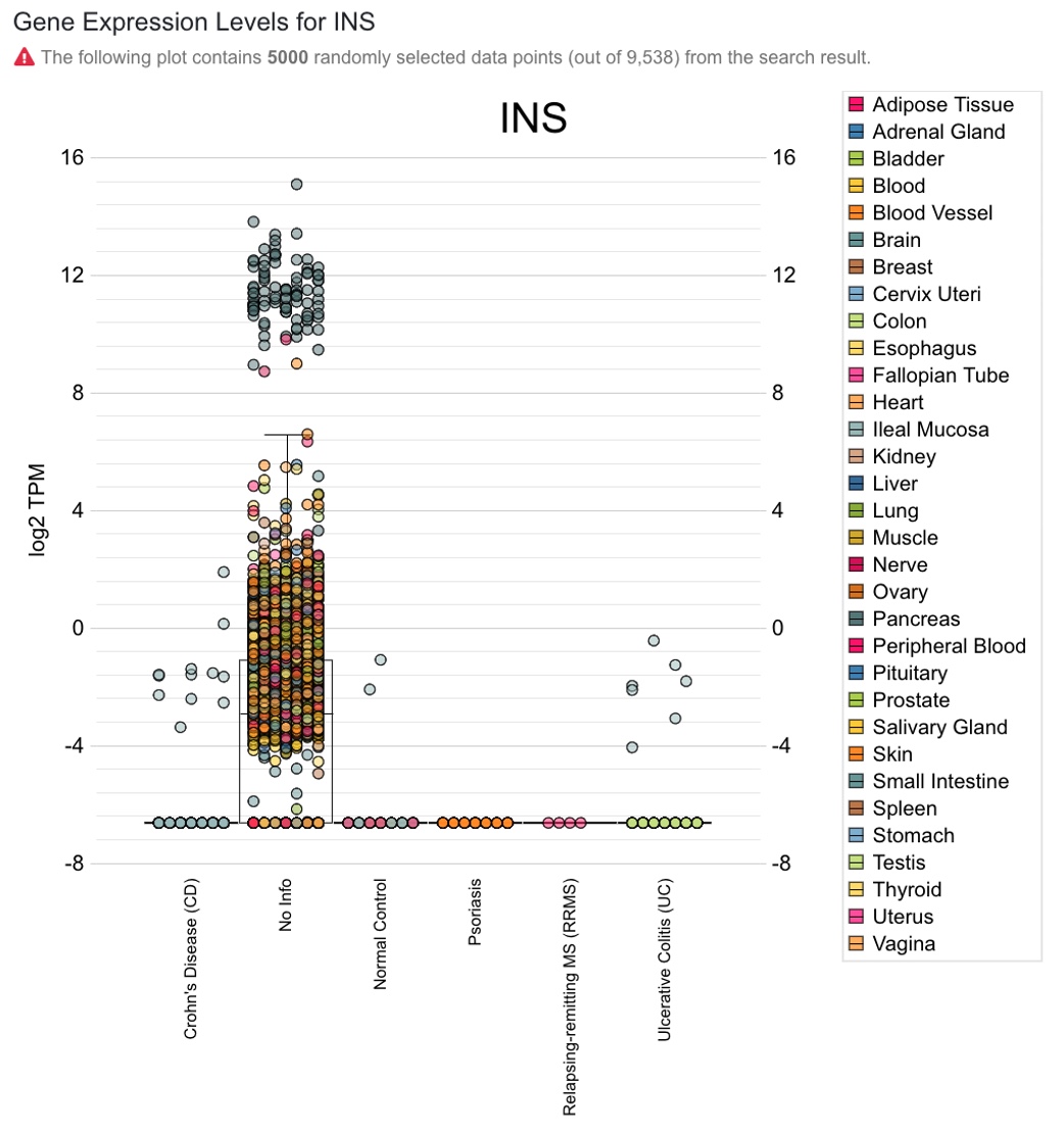
The screenshot below shows default boxplot displaying data points from all diseases, and users can focus on diseases of interest by applying the above “Disease State” filter to narrow down the search. By default, 5000 randomly selected data points are shown.
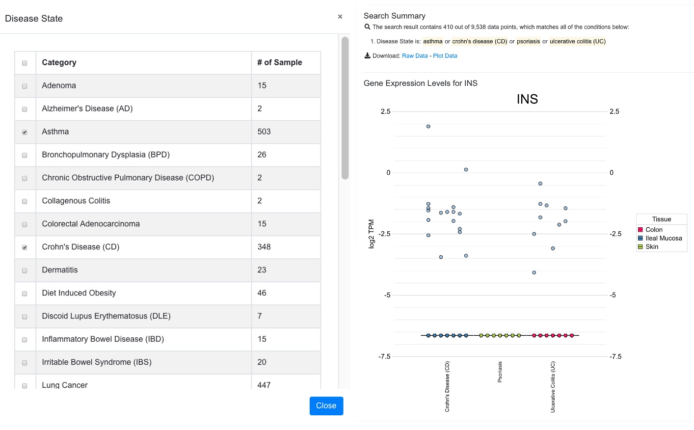
Plot after data filtering was applied to select a few diseases. Now 410 out of 9538 data points are shown. The data filter pop-up window was shown to the left of the box plot in the screen shot below.
2.2 Change Sample Grouping in Gene Expression Plot
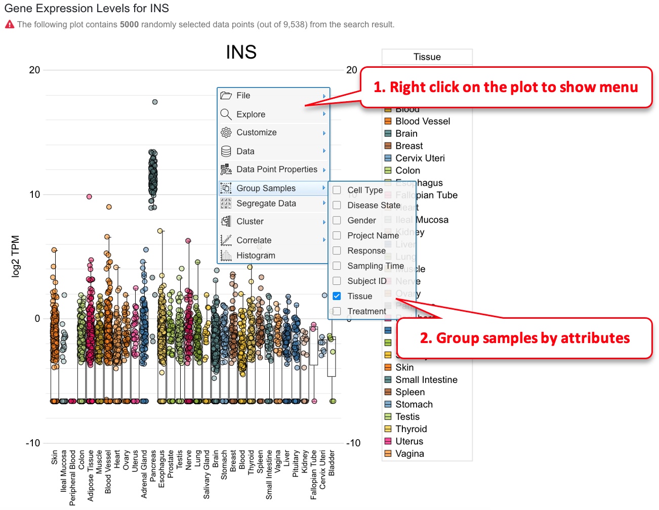
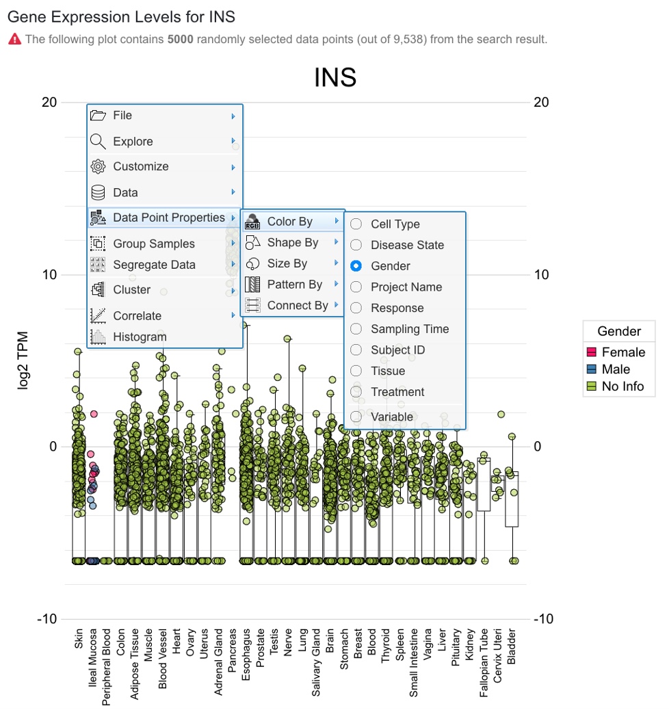
The boxplot is created using CanvasXpress ( https://canvasxpress.org )plug-in, and sample grouping and coloring can be customized by the user. In the example below, we show how sample grouping can be changed.
Once the sample grouping was changed to tissue, the box plot shows that insulin is only expressed in pancreatic islets. Users can also change how the data points are colored (default is by disease).
2.3 View Gene Expression from Microarray Data
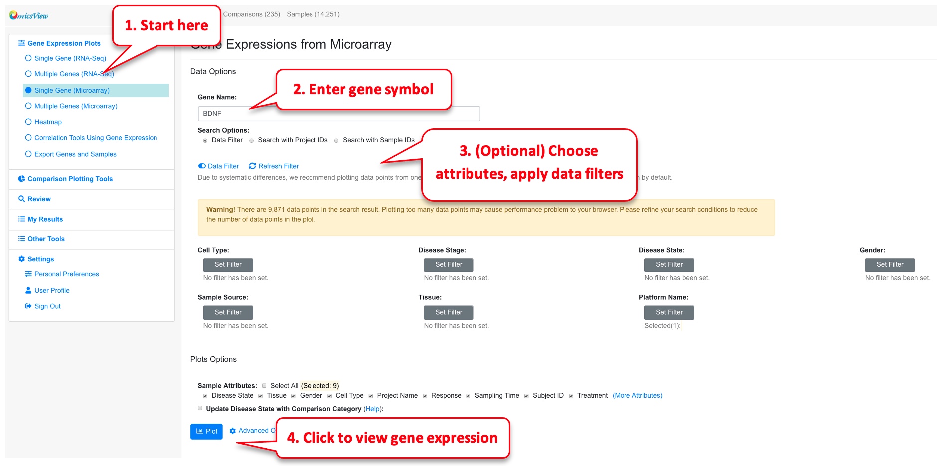
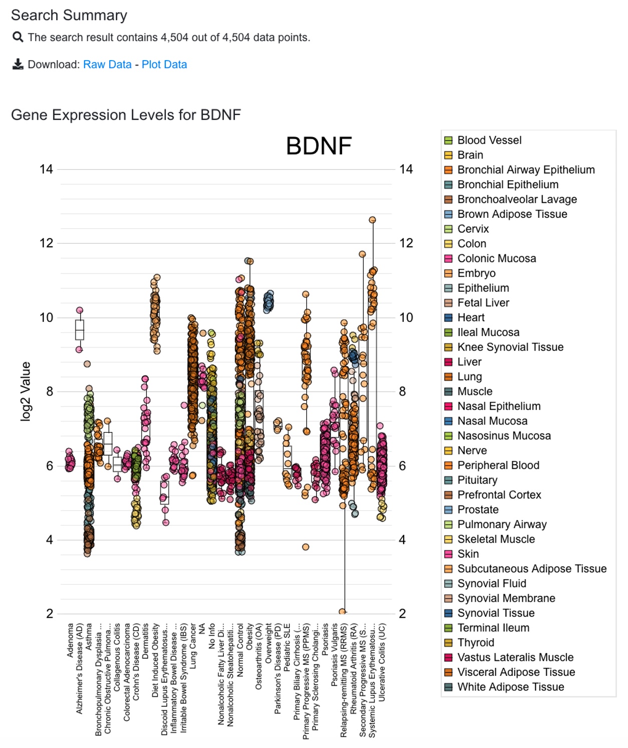
The way to view microarray data is very similar to RNA-Seq data. However, since the expression values from different array platforms are typically not directly comparable, the system by default will choose the platform with the largest number of data points. The user can override this filter if needed. In addition, we recommend the user to add data filter because typically there are too many data points from microarray data. Data filters will help the user to focus on the most important tissues or diseases. If there are still more than 5000 data points after data filer, only the first 5000 are shown in the boxplot.
The sample grouping and coloring can be changed by the user. See the section 2.2 for details.
2.4 View Gene Expression from Multiple Genes
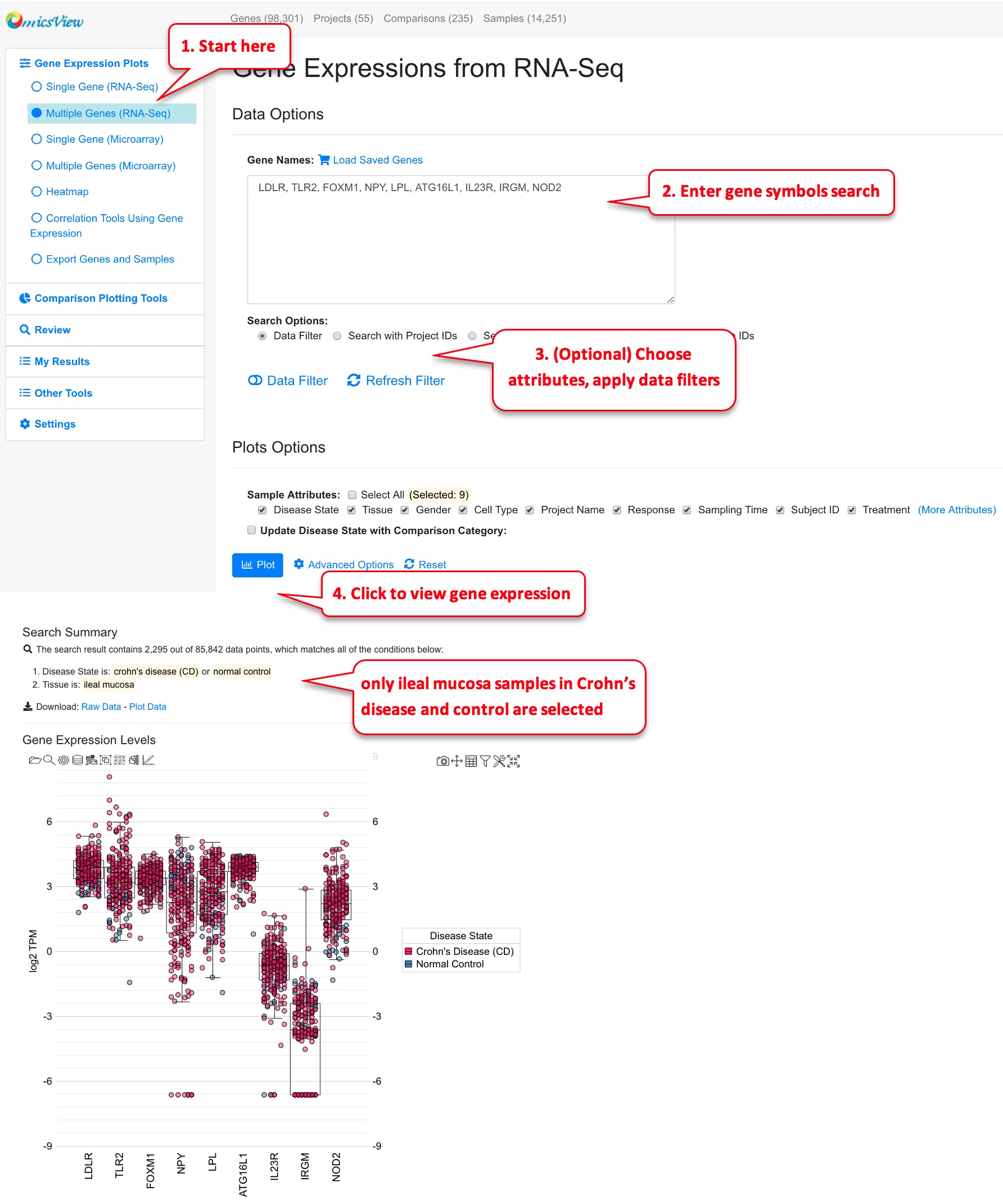
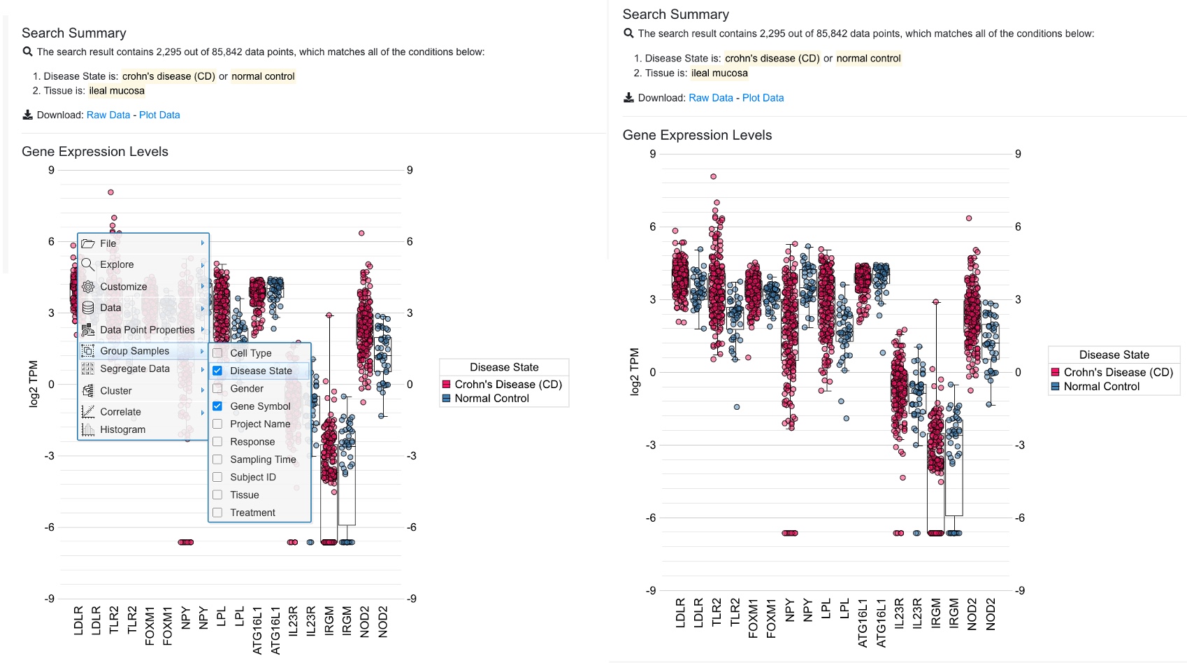
Users can view multiple genes on the same boxplot. The interface is similar to single gene, here you need to enter a list of gene symbols. Users can also load the saved gene lists from your collection. In multiple gene plot, you may want to filter the data to come up with a reasonable number of data points.
From multiple gene plot, you can use the built-in function of CanvasXpress to change grouping and coloring.
In the example plot above, we can change the setting to use group by to distinguish Crohn’s disease samples and control samples.
In the updated plot above, it’s easy to see that many of these genes are expressed slightly higher in disease (red) vs. control (blue).
2.5 View Gene Expression in Heatmap
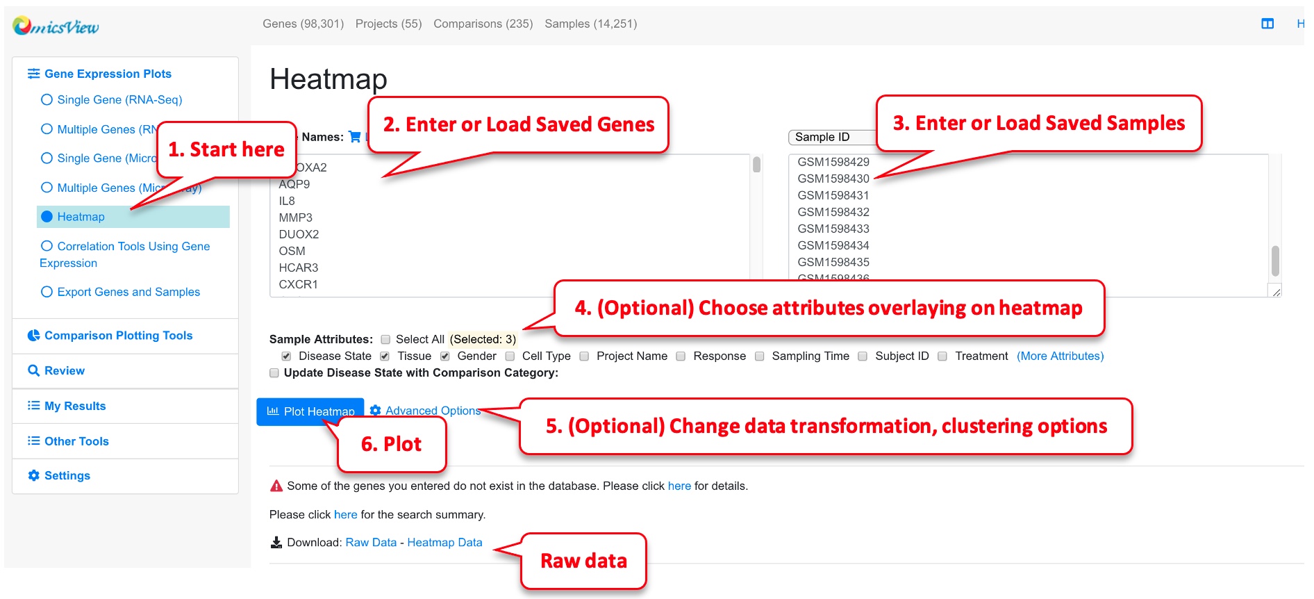
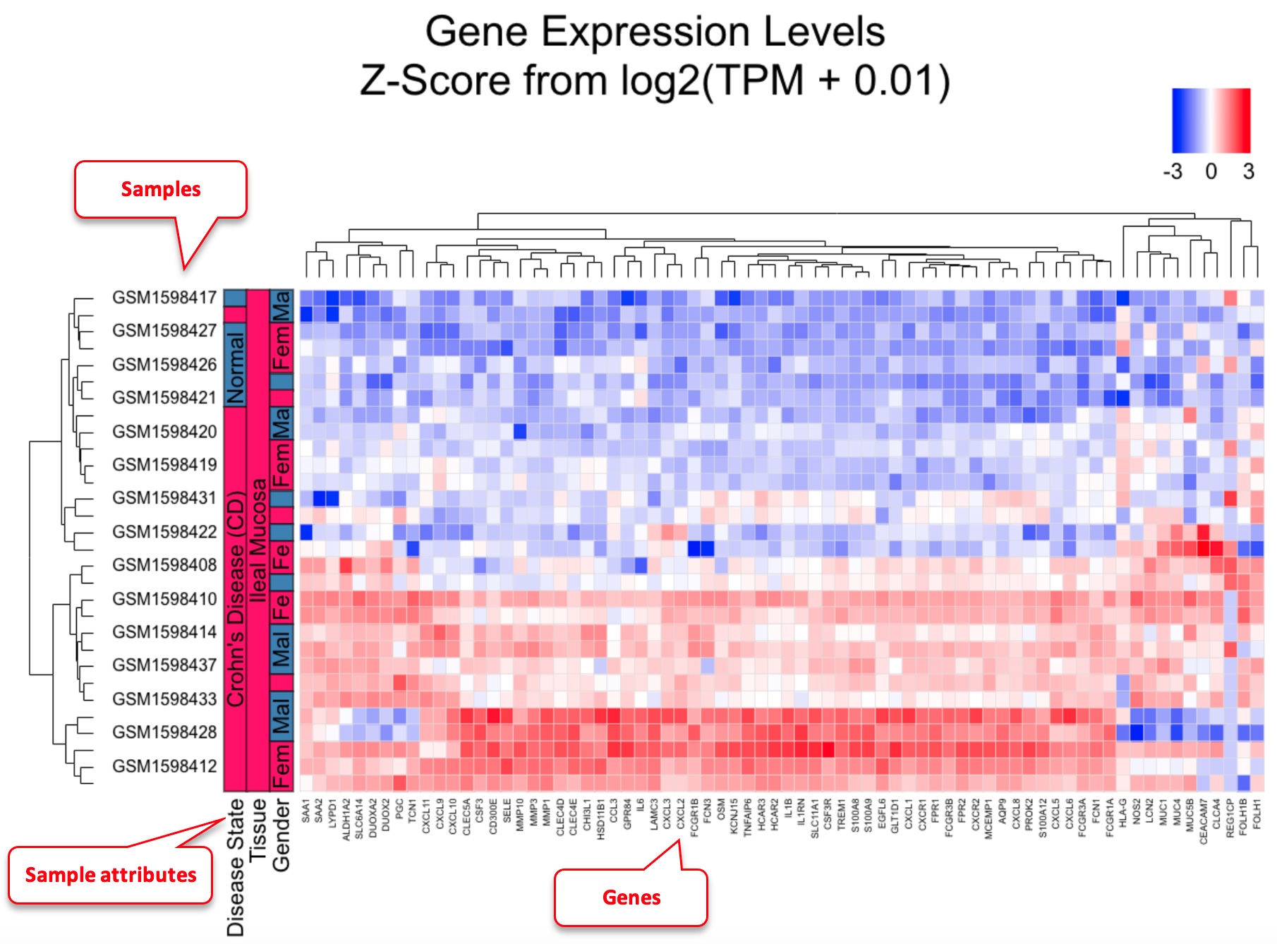
Heatmap can be useful to visualize gene profiles from multiple samples. It can also provide information about how genes and samples cluster. This data is from PMID: 25003194
Users can enter genes and samples in the box or load pre-saved genes and samples quickly from your collection. Be default, we will log2 transform the gene expression data, perform scaling of the data across samples for each gene, and limit the scaled value to -3 to 3 before displaying the data in heatmap. This works well in most situations. However, advanced users can change the options. For example, if you want to keep the order of samples as you entered, just uncheck “Enable Clustering Samples.” The heatmap is rendered by CanvasXpress. Users can change the plot size if needed.
In the example heatmap, we entered a few significantly changed genes in Crohn’s disease, and choose a few disease and control samples. As shown in the heatmap, most of these genes show distinct patterns between disease and control. One of the samples GSM1598422 is labeled as disease, but its gene expression signature match those with normal control very well. Therefore from heatmap clustering, we can decide that this sample is likely an outlier, the sample may be mislabeled, or this patient had very different gene expression patterns form all other patients.
2.6 Export Genes and Samples
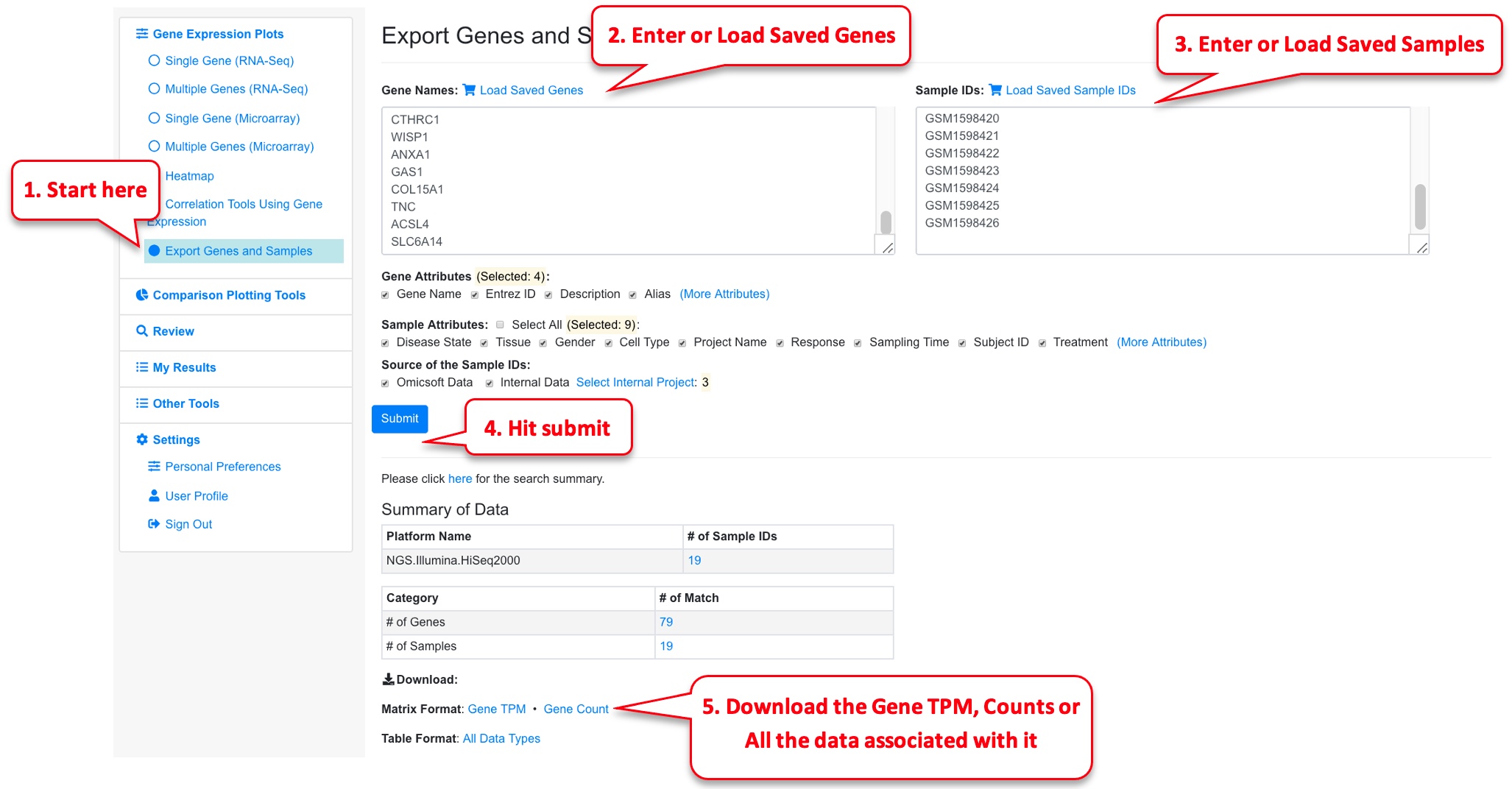
This is a useful feature to download raw (counts) and processed (TPM values) expression matrices from the datasets. This gives the user the opportunity to do any downstream analysis on the raw reads independently.
For this functionality, the samples need to belong to the same platform type and the requested limit is to 100 genes and 20 samples. The files are exported as csv and can be loaded and used by the user to perform their own downstream analysis.
2.7 Similar comparisons
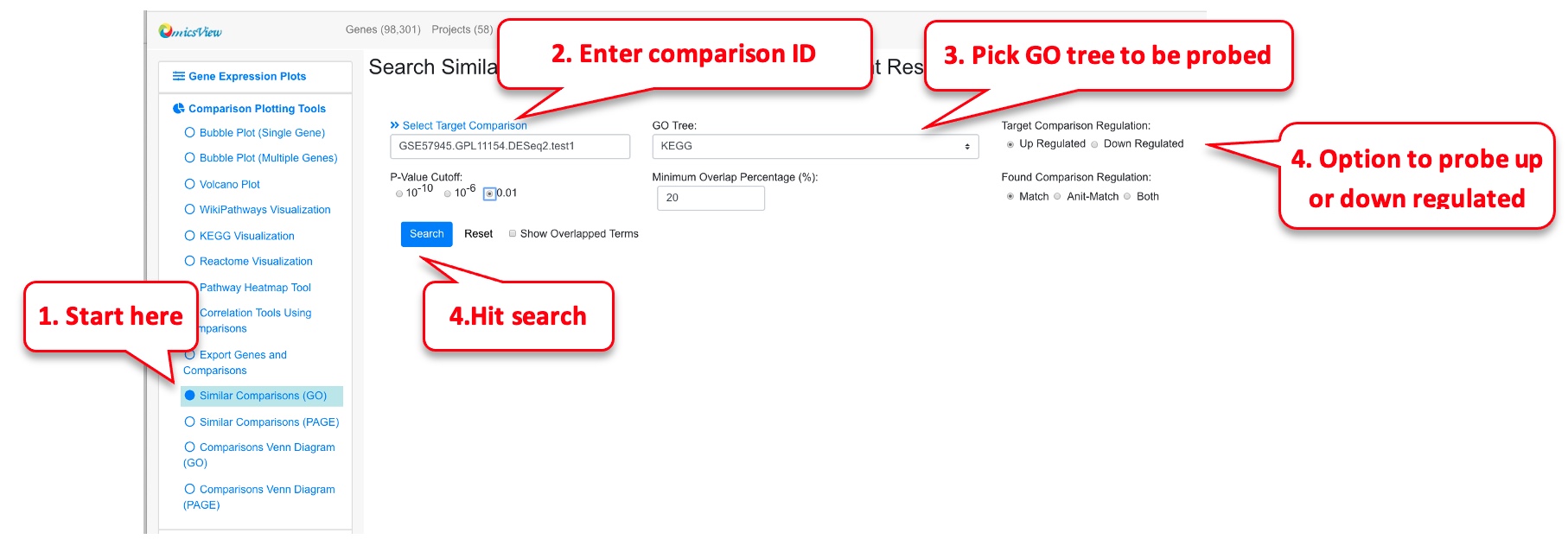
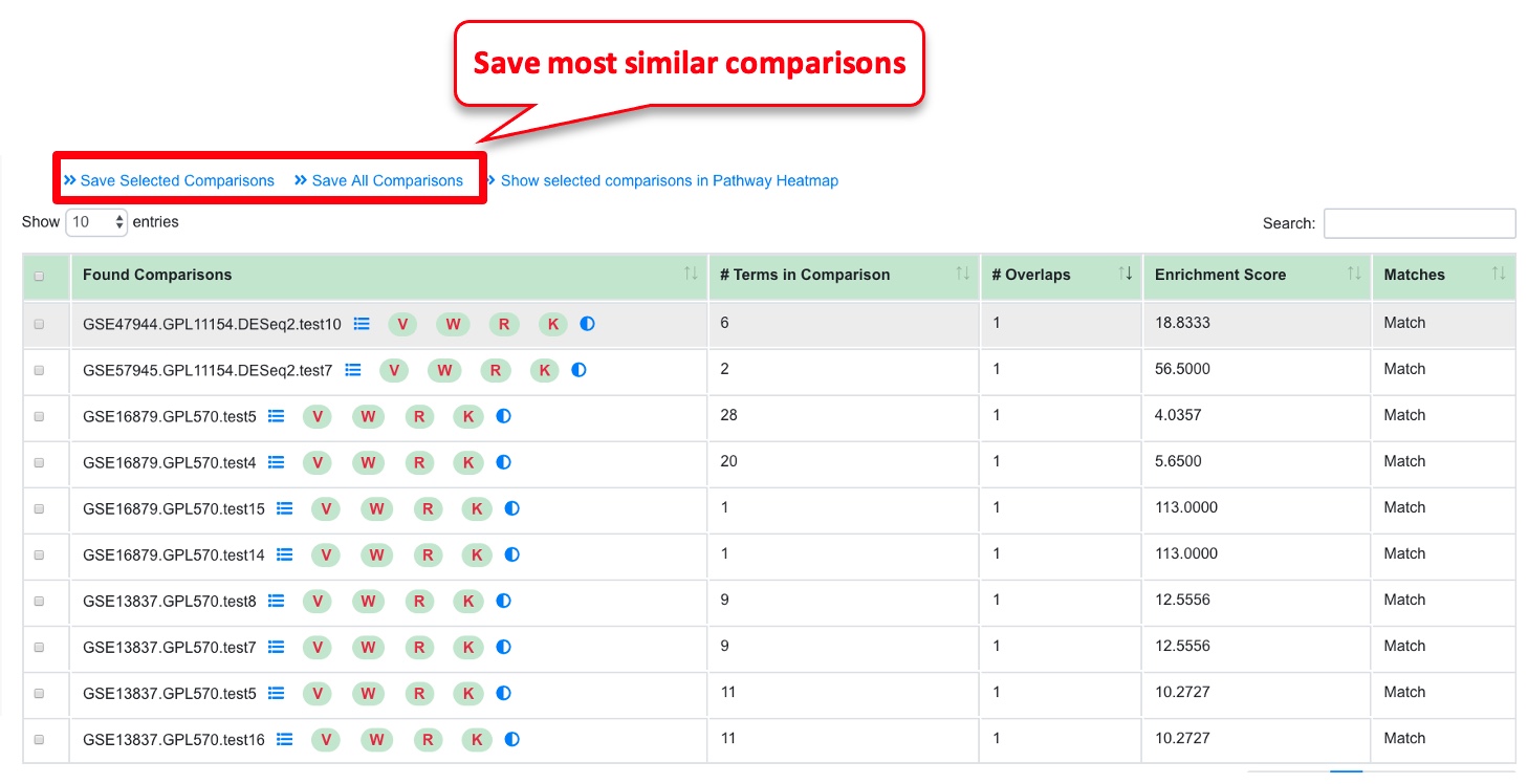
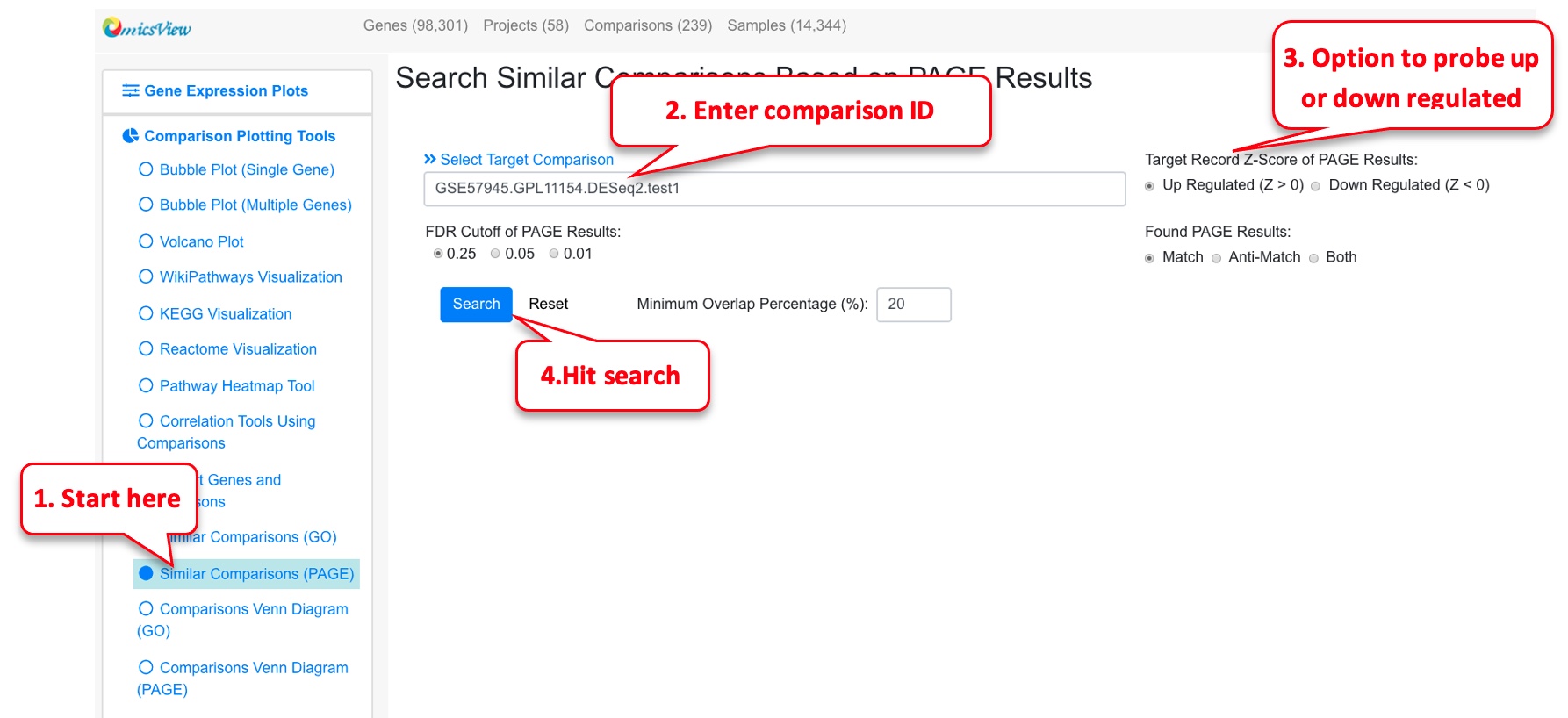
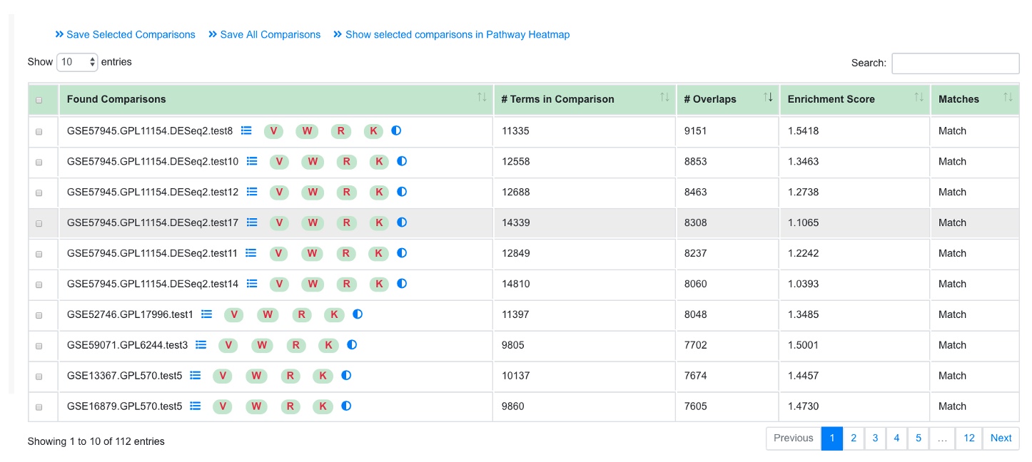
For a given comparison, this functionality helps identify other similar comparisons.
2.7.1 Similar comparisons (GO)
To identify similar comparisons based on GO terms in up or downregulated genes.
2.8 Comparisons Venn Diagrams
A good way to identify similarities and difference between different comparisons is by using the Comparisons Venn Diagram functionality. There are two ways to use this tool: By GO terms and PAGE results.
2.8.1 Comparisons Venn Diagram (GO)
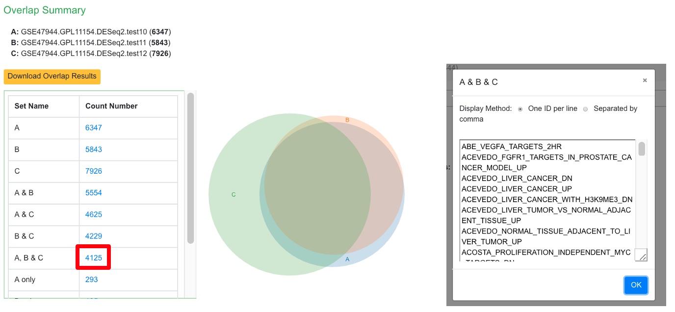
For identifying similar GO terms between comparisons either in the Up and Down regulated categories, this functionality can be used. In this example, 3 comparisons from Psoriasis are probed, the user also has the option of probing 2 comparisons by leaving the third field empty.
Upon finishing, an overlap summary is generated. This contains a Venn Diagram of the intersection of all the GO terms between the 3 comparisons. The count number can be clicked, as shown below, to view which terms are included.
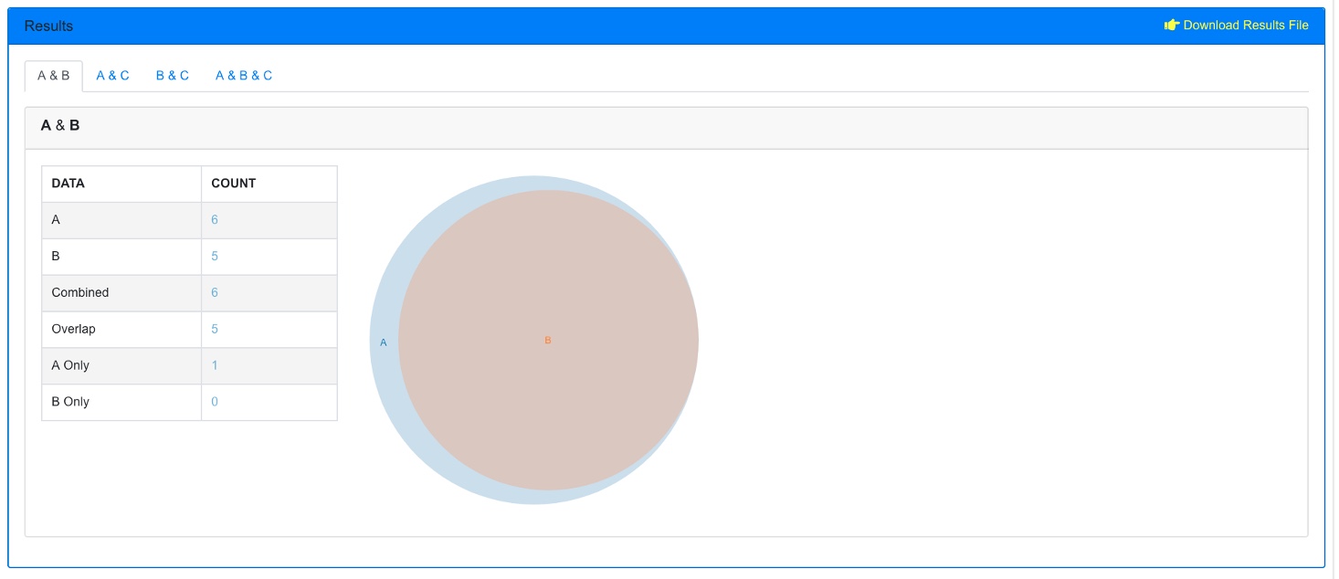
Furthermore, there is another section below this where pairs of the comparisons can be probed. Here, just A & B are displayed.
2.8.2 Comparisons Venn Diagram (PAGE)
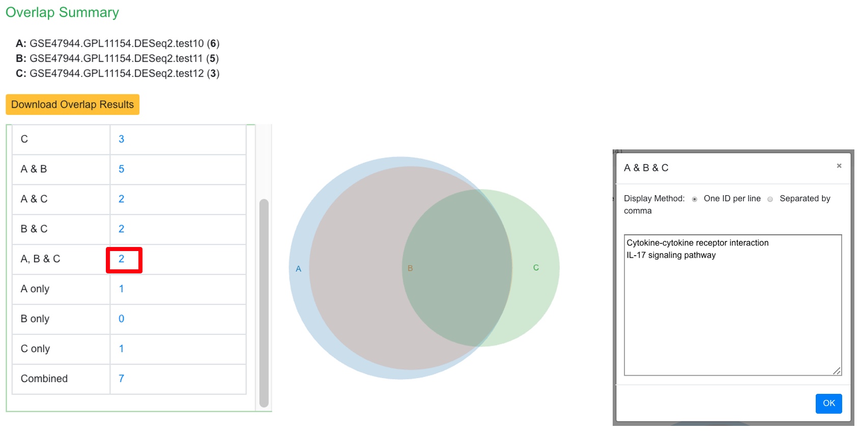
Similarly, the user can probe the similarities between PAGE results or 2 or 3 comparisons. In this example we probe comparisons from Psoriasis again.
Upon finishing an overlap summary is generated which shows the intersection of the PAGE results between the comparisons.
