Chapter 4 Functional Enrichment from Comparisons
4.1 Enrichment from Up and Down Regulated Genes
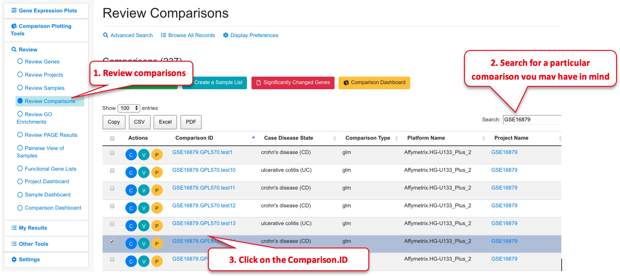
Let’s first select a comparison to view.
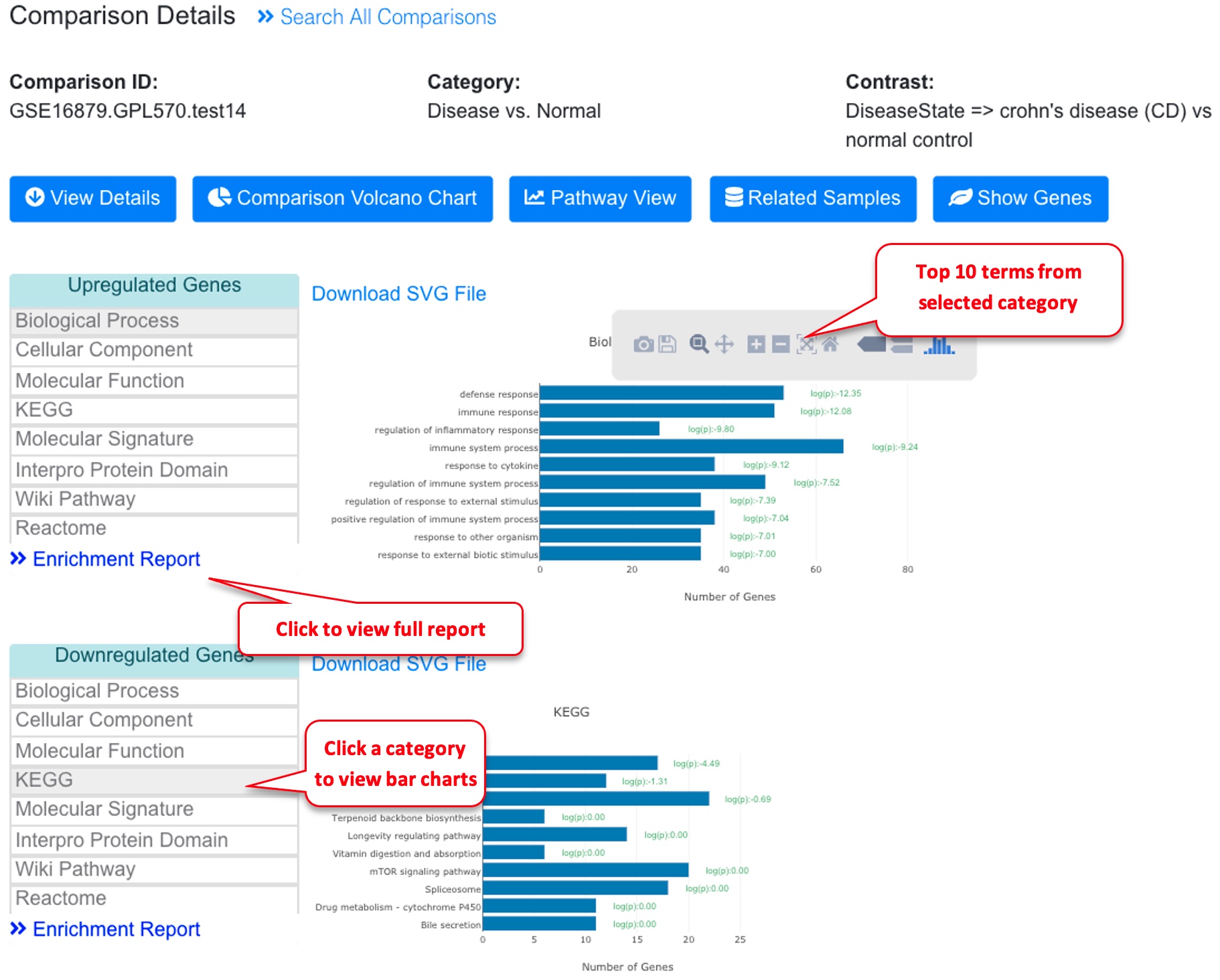
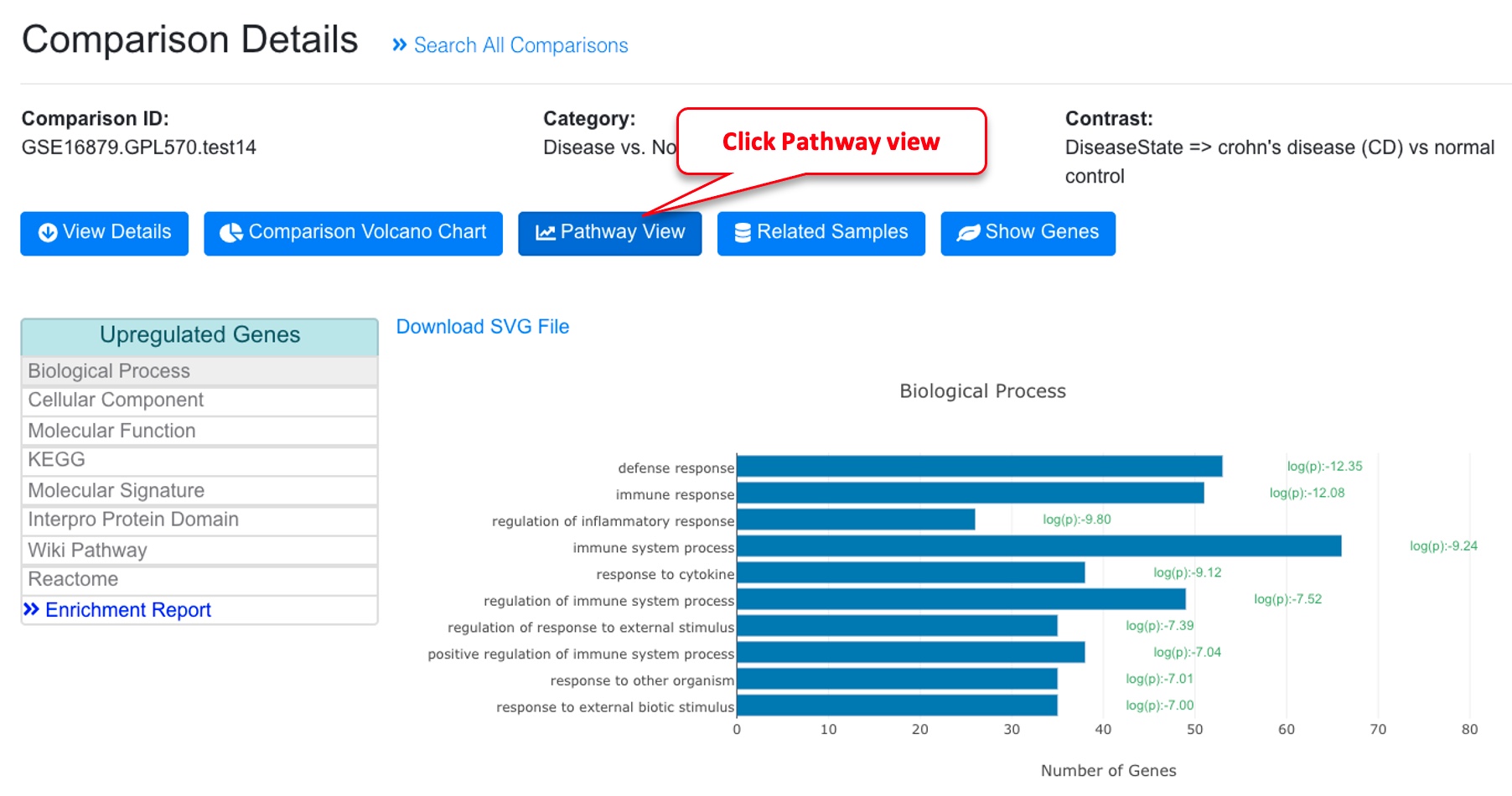
When Users view details of a comparison, the functional enrichment results are shown. Briefly, for each comparison, we generated the up and down regulated gene lists and use these lists to compare with all genes in the genome to identify functions that are significantly enriched.
In the example above, this comparison is between Crohn’s disease (CD) vs normal control, and the top up-regulated biological processes are defense and immune response.
Clicking on the left menu will switch the bar charts for different categories (Gene Ontology, KEGG, Molecular signature, Protein domain etc.).
The bar charts here show the top 10 categories. To view complete results, click the Enrichment Report.
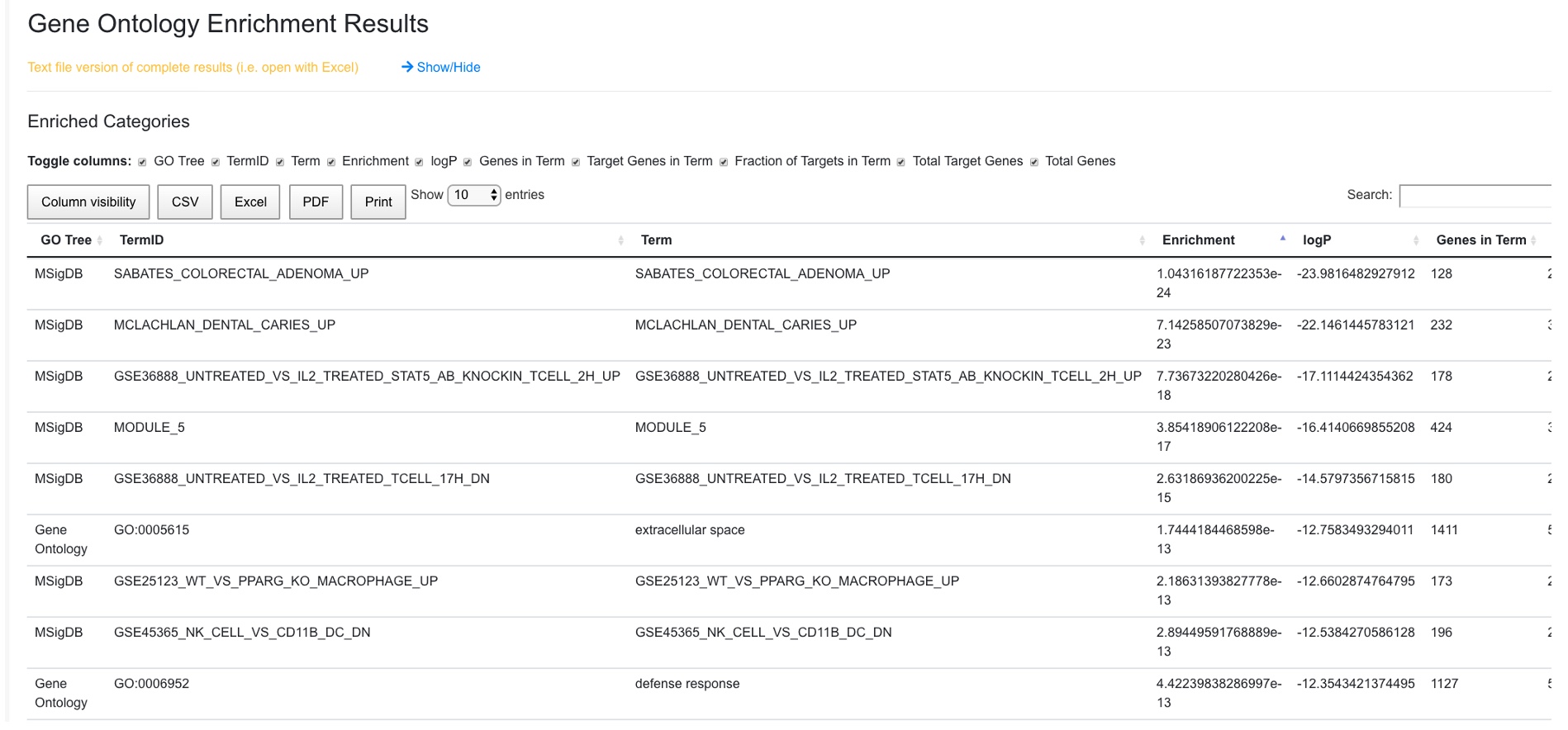
In the enrichment report, the full list of functional terms are shown by order of Enrichment.
4.2 View Changed Genes from a Functional Term in Volcano Plot
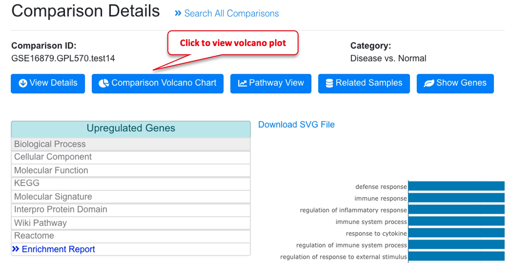
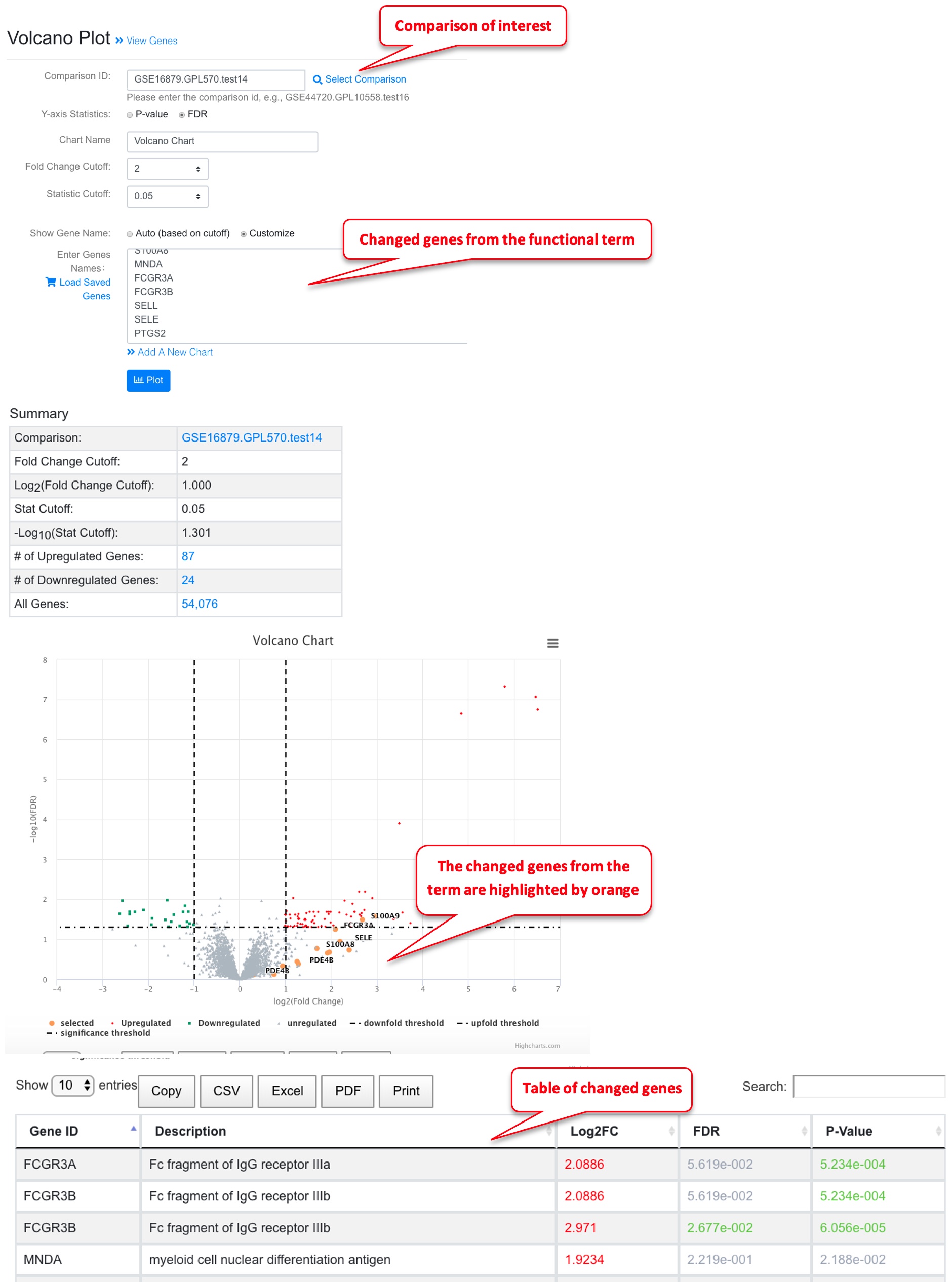
From the bar chat, click a functional term, and you have the option to view these genes in a volcano plot.
Once you click the link, volcano plot will be generated for the comparison with the changed genes from the selected term highlighted.
4.3 View Enriched Pathways Directly from Comparison Details
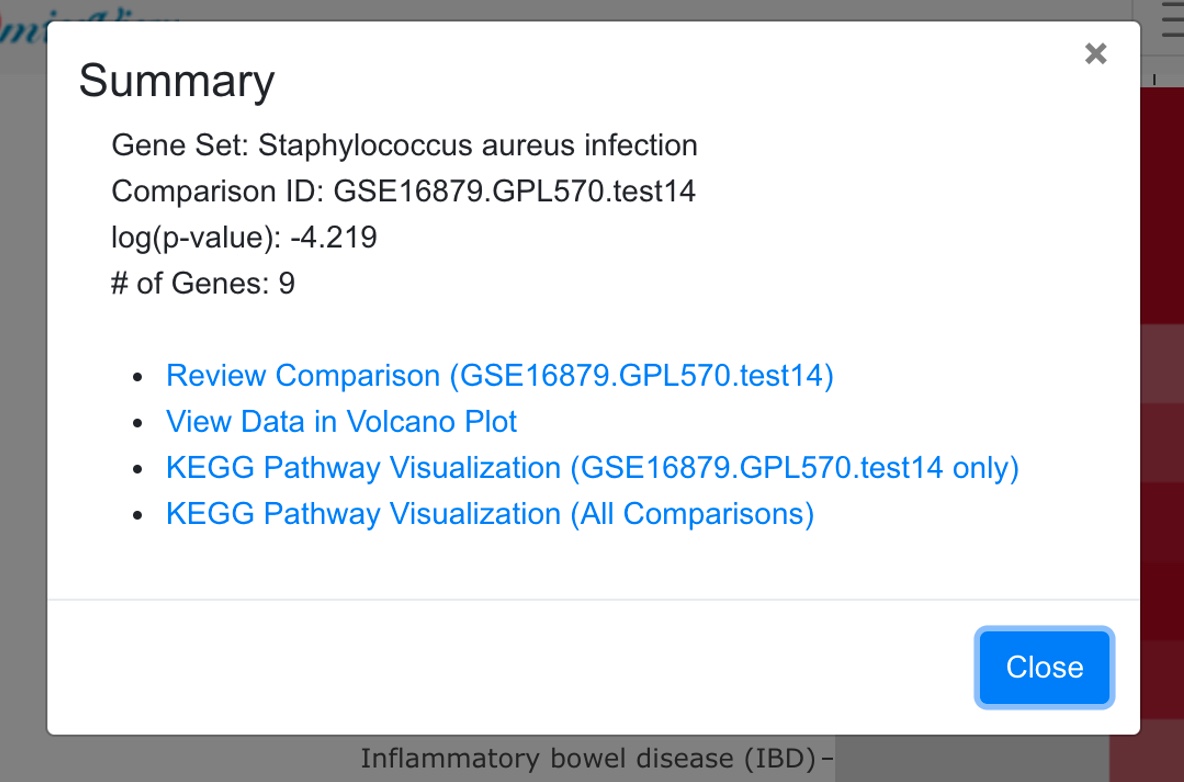
This will automatically open the pathway visualization page, and preload the pathway and comparison.
4.4 Gene Set Enrichment from Ranked Genes
For each comparison, we produce a rank file for all genes using logFC. We use PAGE (Parametric Analysis of Gene Set Enrichment) to identify significant biological changes. PAGE can be more sensitive for comparisons where the logFC is relatively small, but most genes in a functional set show the same direction of change.
The predefined gene sets were from MSigDB.
For each comparison, the top up-regulated and down-regulated gene sets are plotted.
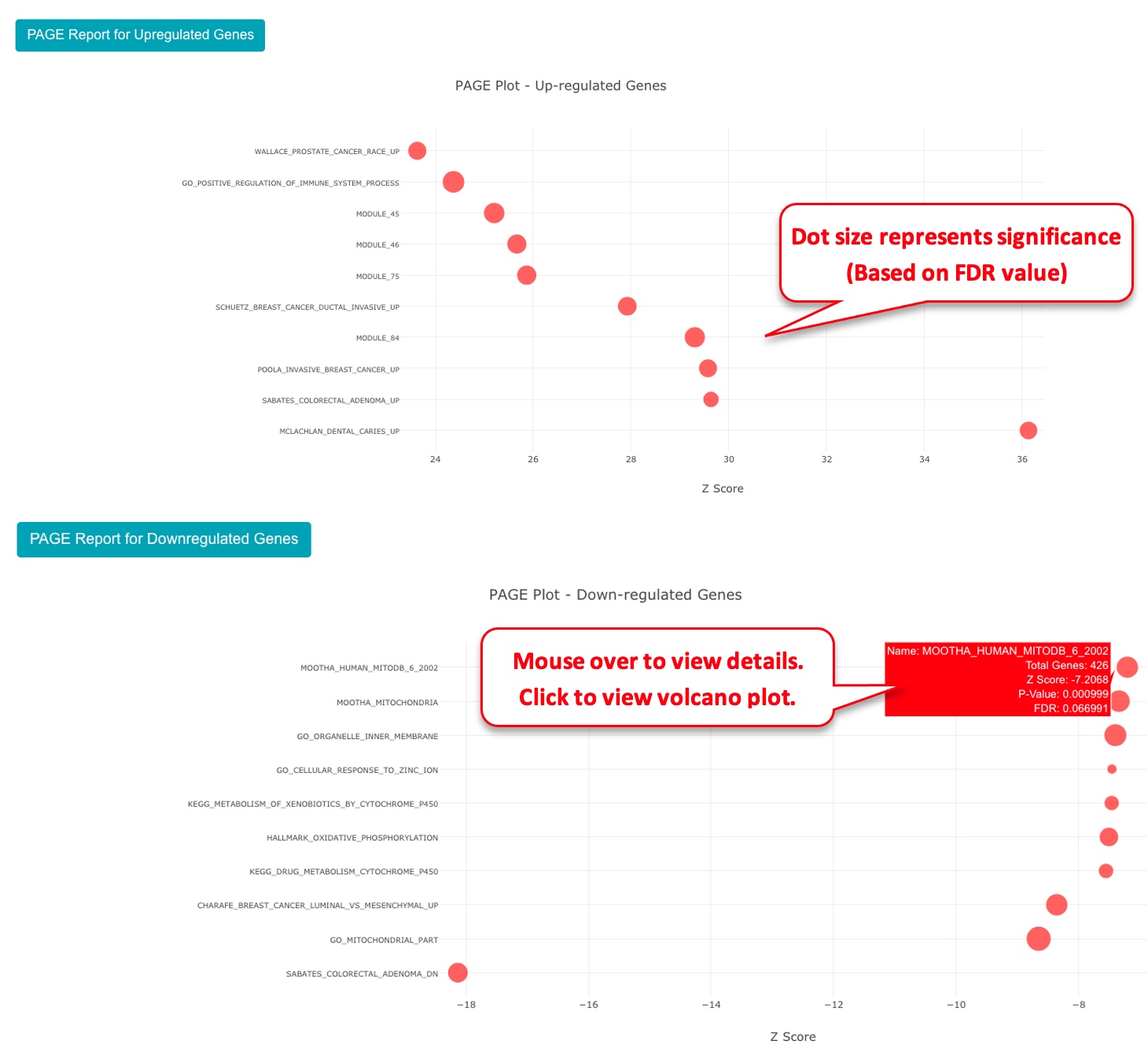
To view the genes within a gene set using volcano plot, you can click the dot, and use the link from the pop-up.

4.5 Pathway Heatmap From Comparisons
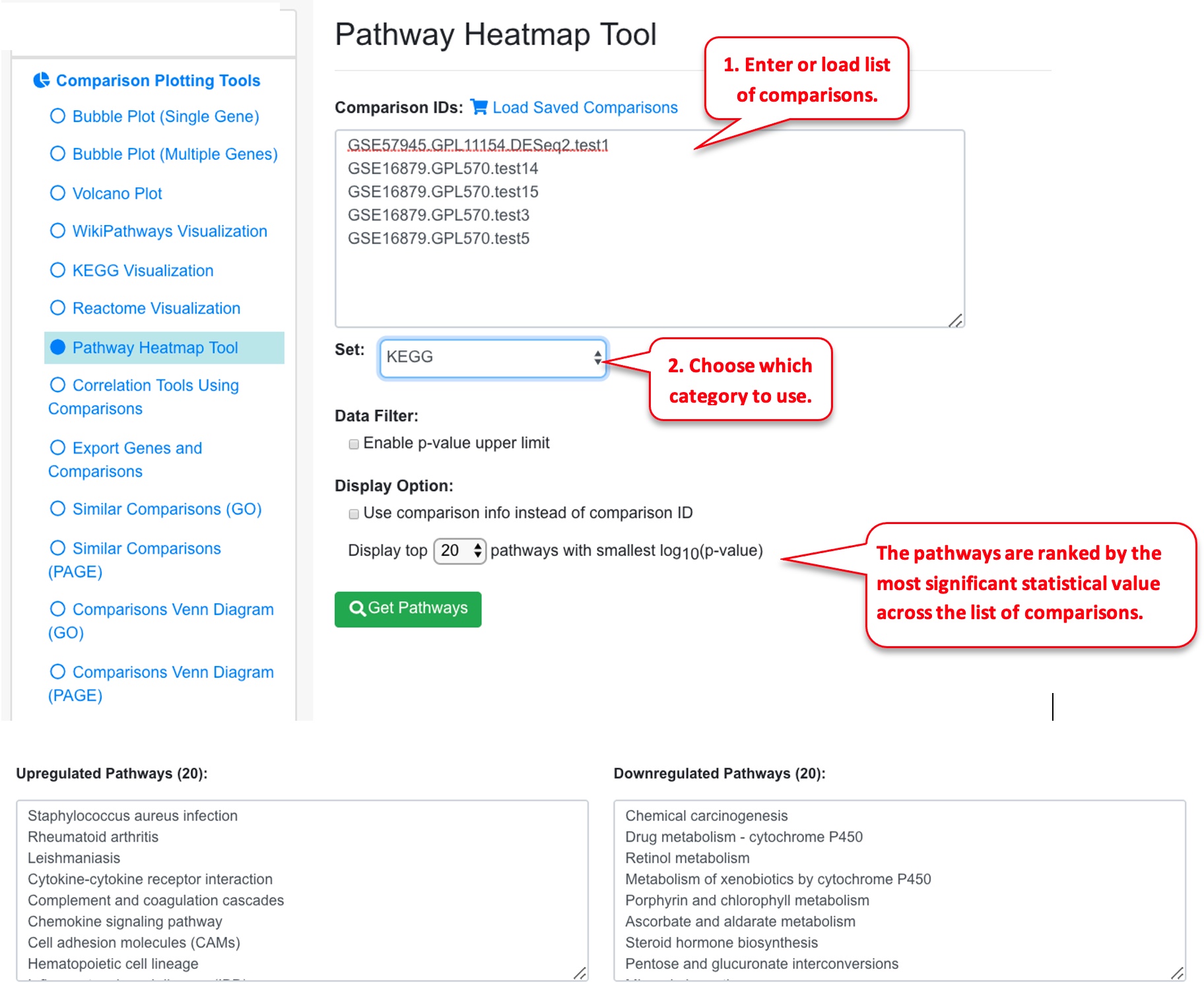
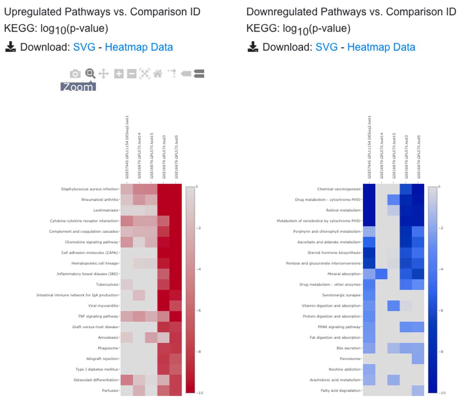
Users can display the enriched pathways from several related comparisons, and visualize the top enriched pathways across comparisons. Users can mix public data and inhouse comparisons.
The heatmap shows pathways in rows, comparisons in columns. The statistical significance is color-coded (log P-value, or Z-score). Pathways are sorted by the negative logP values from the highest to the lowest.
From the pathway heatmap, users can click any data point to view details.
