Chapter 3 Visualize Comparison Data
There are 235 comparisons in the demo system, covering different categories including Disease vs. Normal, Treatment vs. Control, Tissue 1 vs. Tissue 2 etc. The system offers many ways to visualize the data and help users find the most interesting data related to their study.
3.1 Dashboard View of Comparison
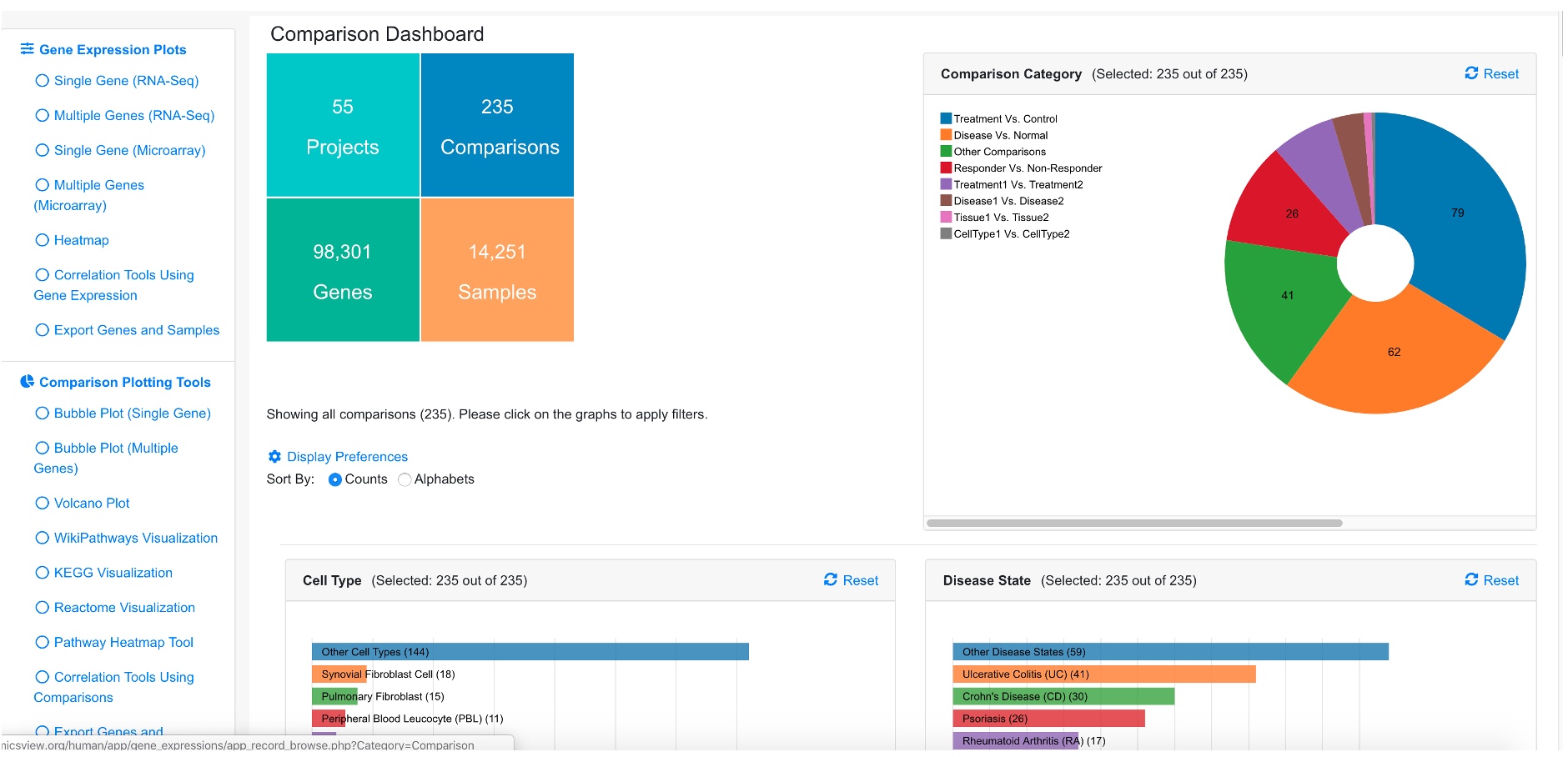
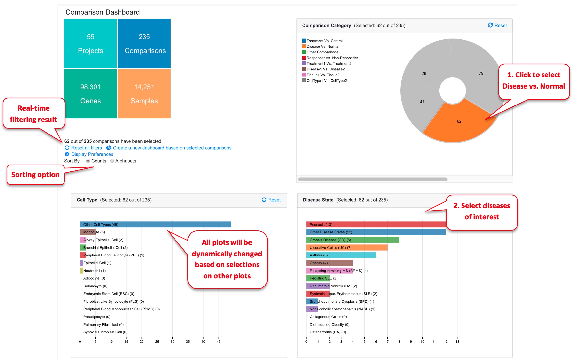
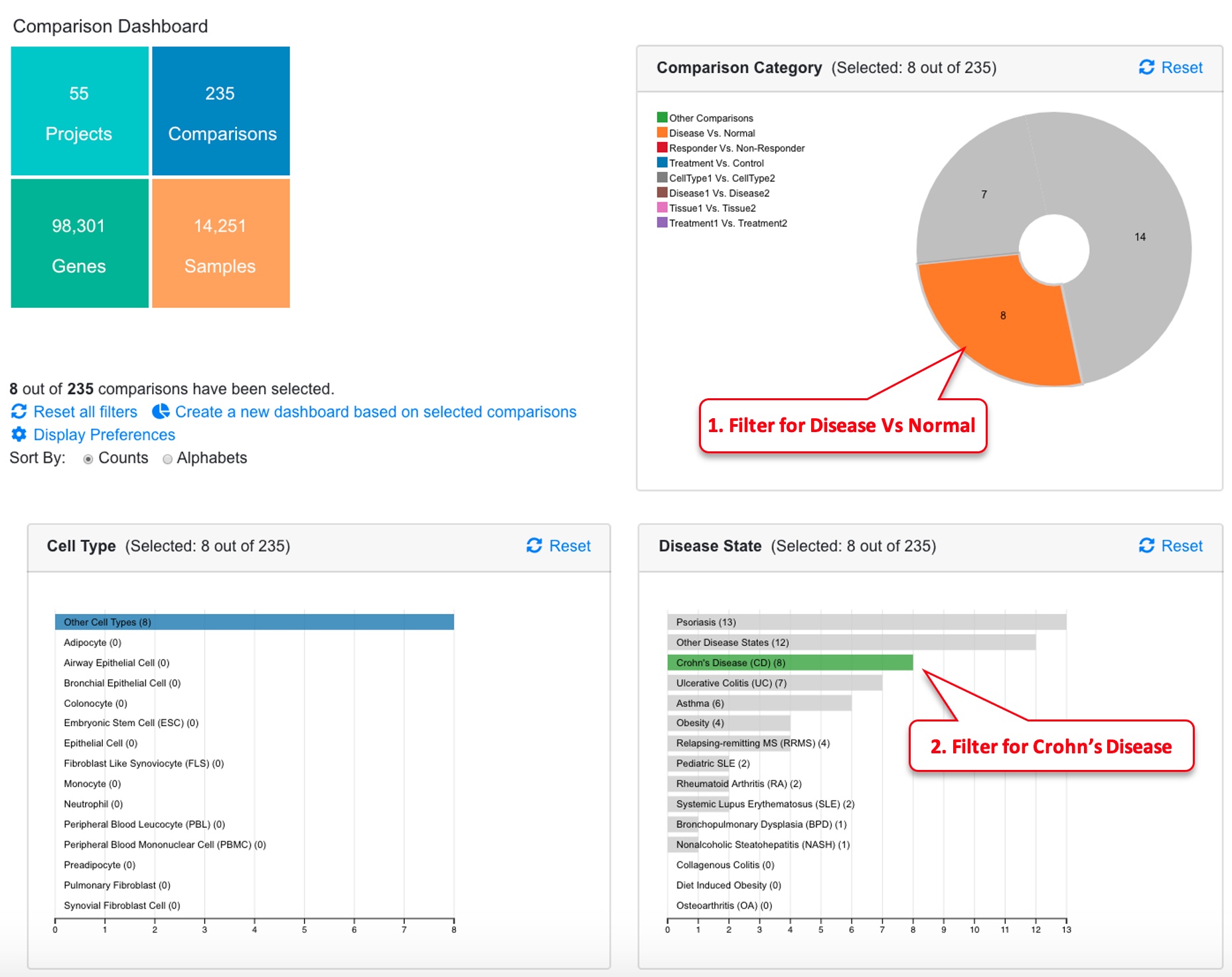
The dashboard shows a summary of all the comparisons.
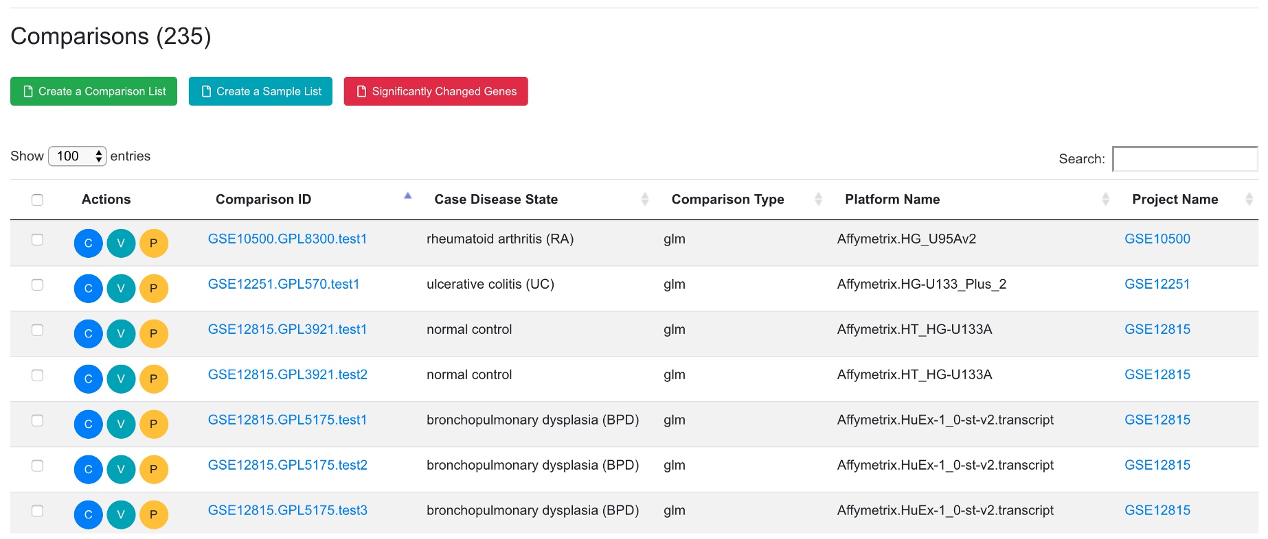
The dashboard shows Comparison Categories, Cell Type, Disease State, Treatment, Platform summaries. A table is also available below the dashboard that lists all the comparisons.
3.2 Set Dashboard Preference
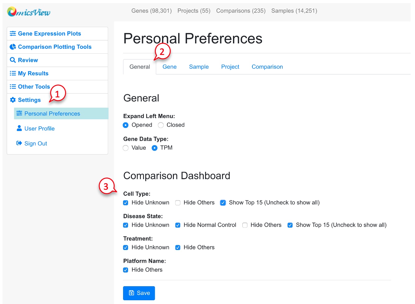
Users can change how the comparison summary is displayed by following the red numbers.
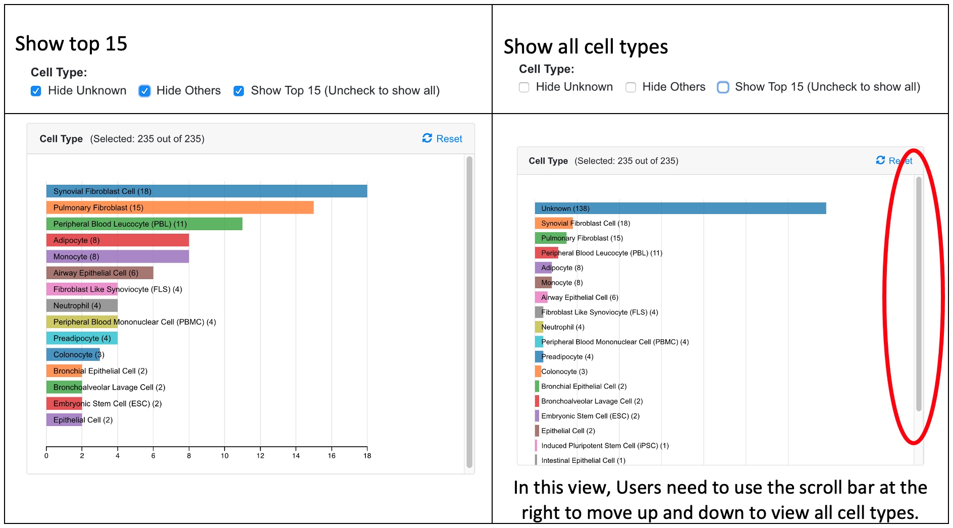
Since there are many Cell Types and Disease States, the user can choose to display only the top 15 categories, or all categories. See example screenshots below.
When the user chooses only the top 15 categories, all other categories are shown as Other Cell Type. There are other data points where the Cell Type is unknown from the study. Two categories denoted as “Other” and “Unknown” can be hidden by the user in the preference.
3.3 Dynamic Filtering of Comparisons on Dashboard
The user can click any chart in the dashboard to focus on one or more categories that are of interest to the study. In the example below, we are only interested in Disease vs. Normal comparisons, and we further narrow down the data to three disease areas: ulcerative colitis, Crohn’s disease, and rheumatoid arthritis. Now we are looking at 36 out of 199 comparisons. The table at the bottom of the page shows details of these 36 comparisons. The “Reset All Charts” link above the statistics panel is used to show all comparisons again.
3.4 Bubble Plot of Comparisons Associated with a Single Gene
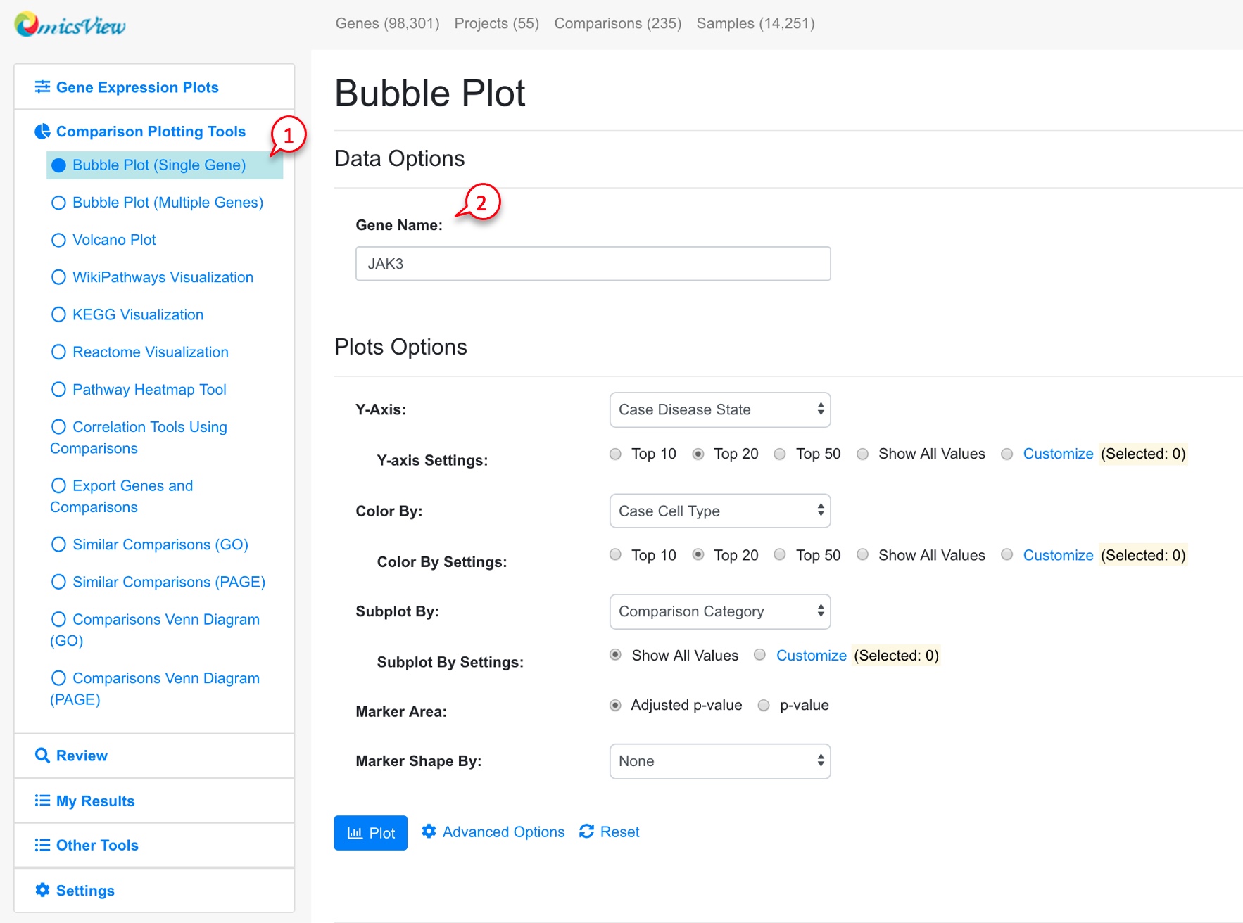
For each gene, users can view all the available comparisons in a bubble chart.
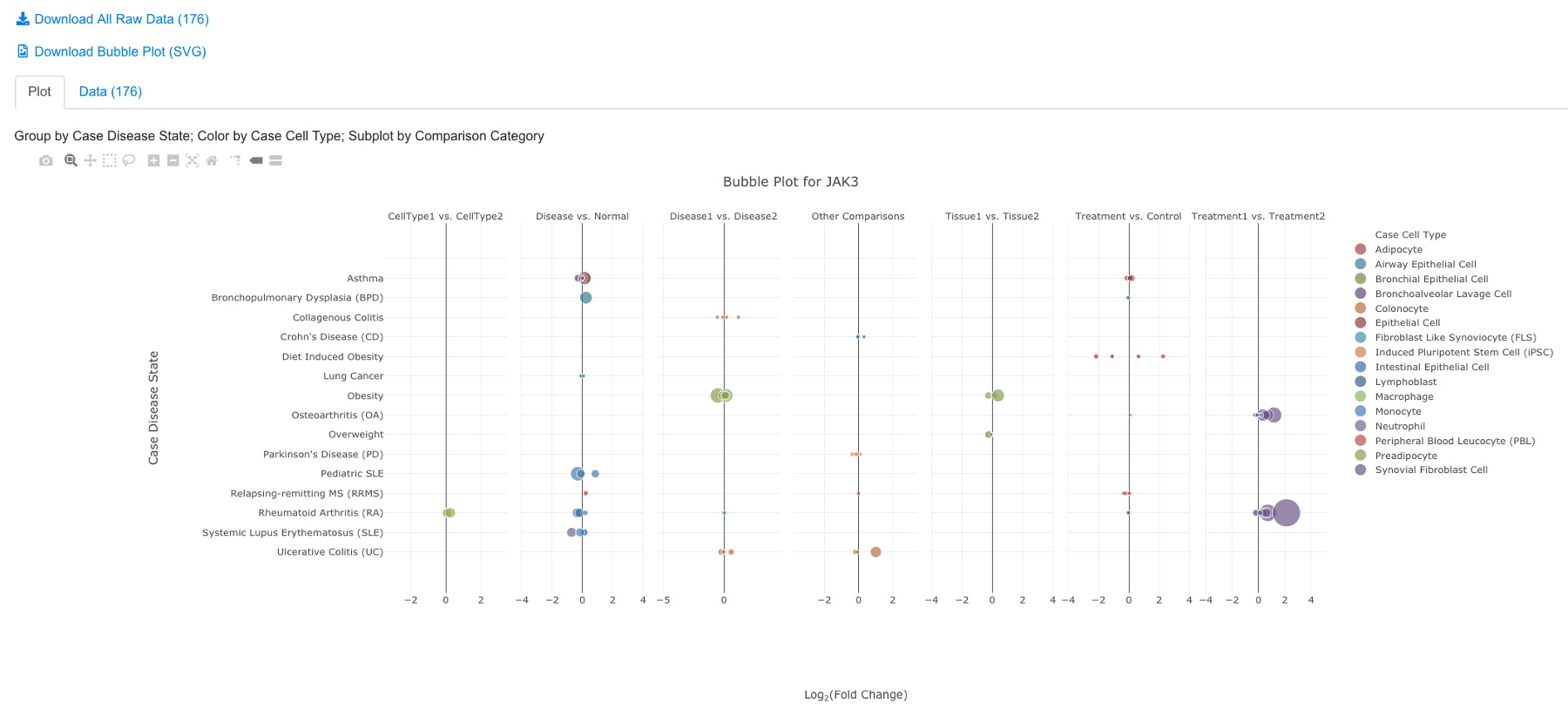
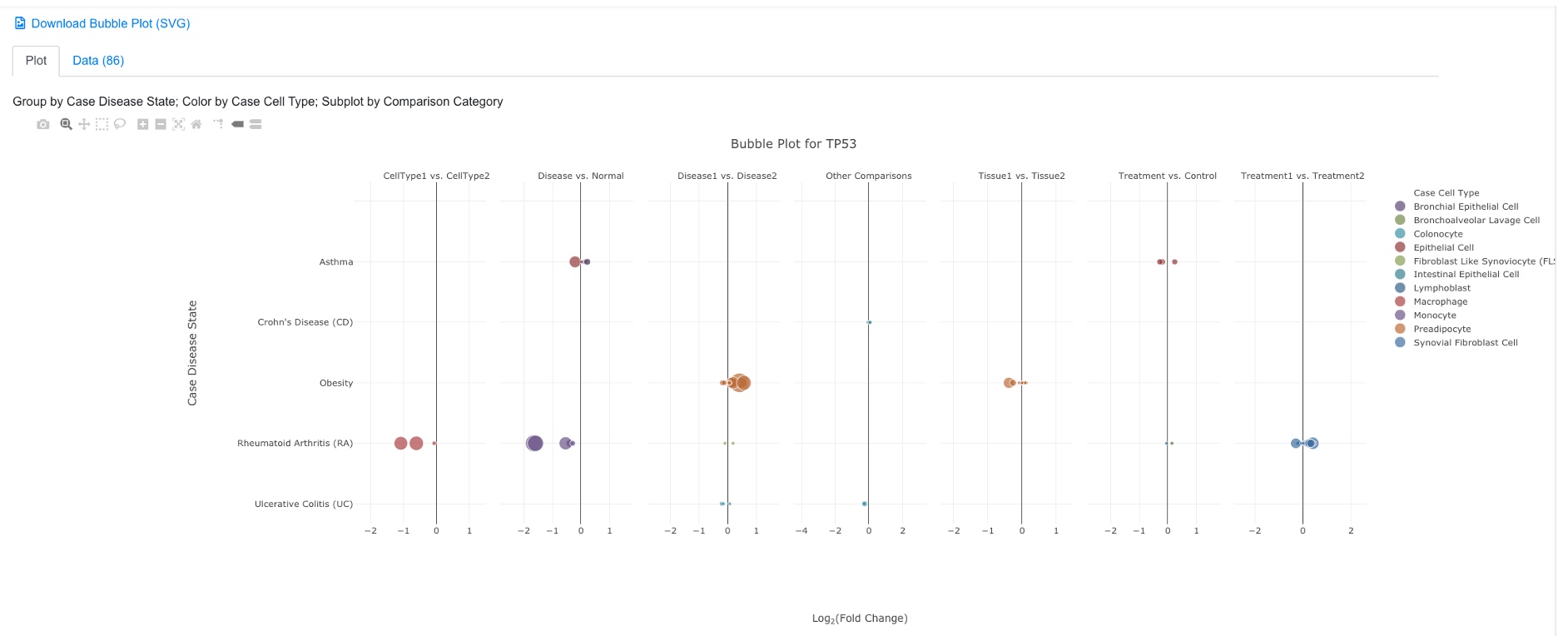
The default settings work for most users. After clicking the Plot button, you will see a plot like below:
In the bubble plot, the X-axis shows log2 Fold Change of the comparison, the Y-axis shows disease state. Each dot represents the comparison result of this gene from one comparison. The color of the dot represents cell type, and the size of the dot represents significance (-log10(FDR), larger is more significant). The user can click and unclick the color legend at right to select or deselect cell types. When mouse over a dot, more details are shown. And the user can also click the dot to link to other graphs. The tool bar at top right corner allows the user to zoom and pan the graph.
3.5 Data Filter and Advanced Settings in Bubble Plot
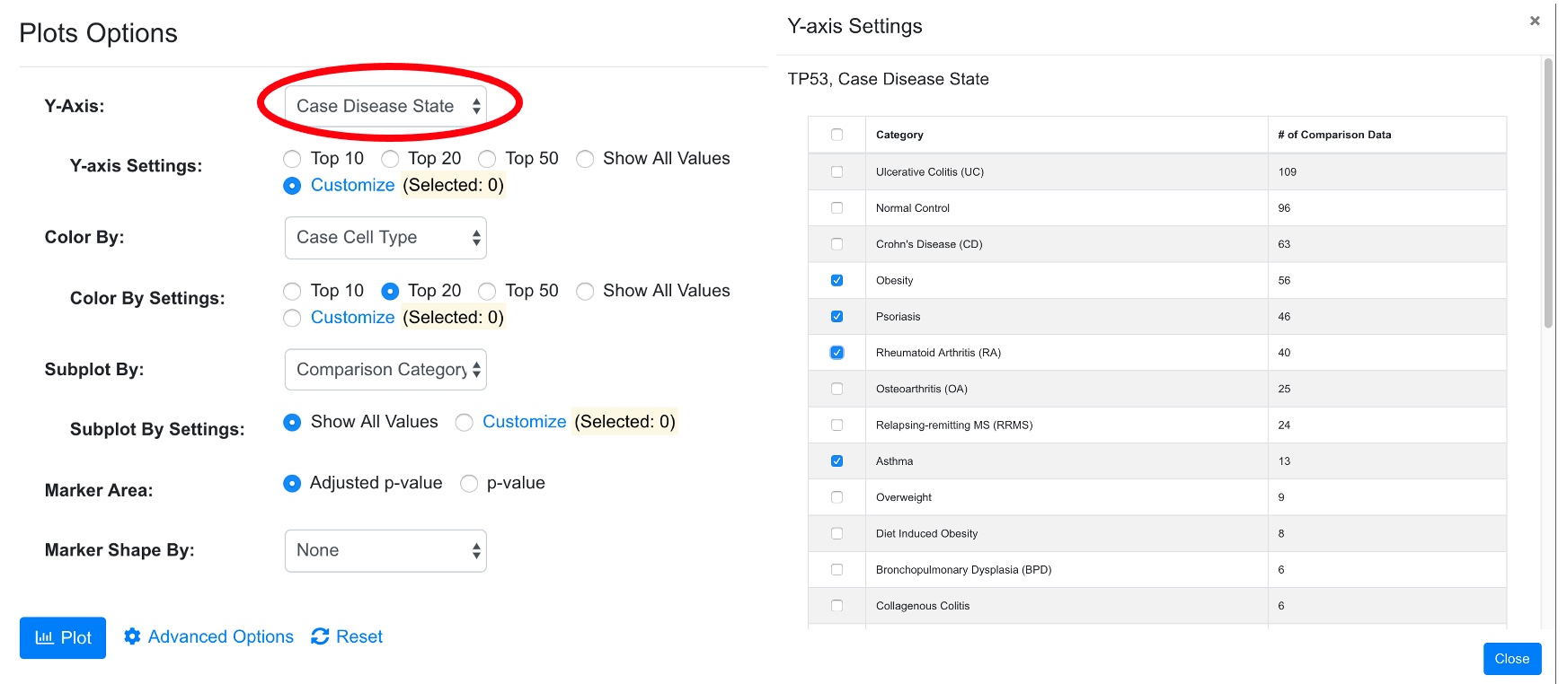
In addition, advanced users can change settings by click “Modify Settings Button.” For example, the user may want to show a selected list of diseases. After clicking Customize in Case_DiseaseState, user can select which diseases to display in the pop-up window.
After modifying the setting, the user can click plot button to view the new chart. The system will display how many data points are chosen based on the filter.
3.6 Bubble Plot of Sets of Genes and Comparisons
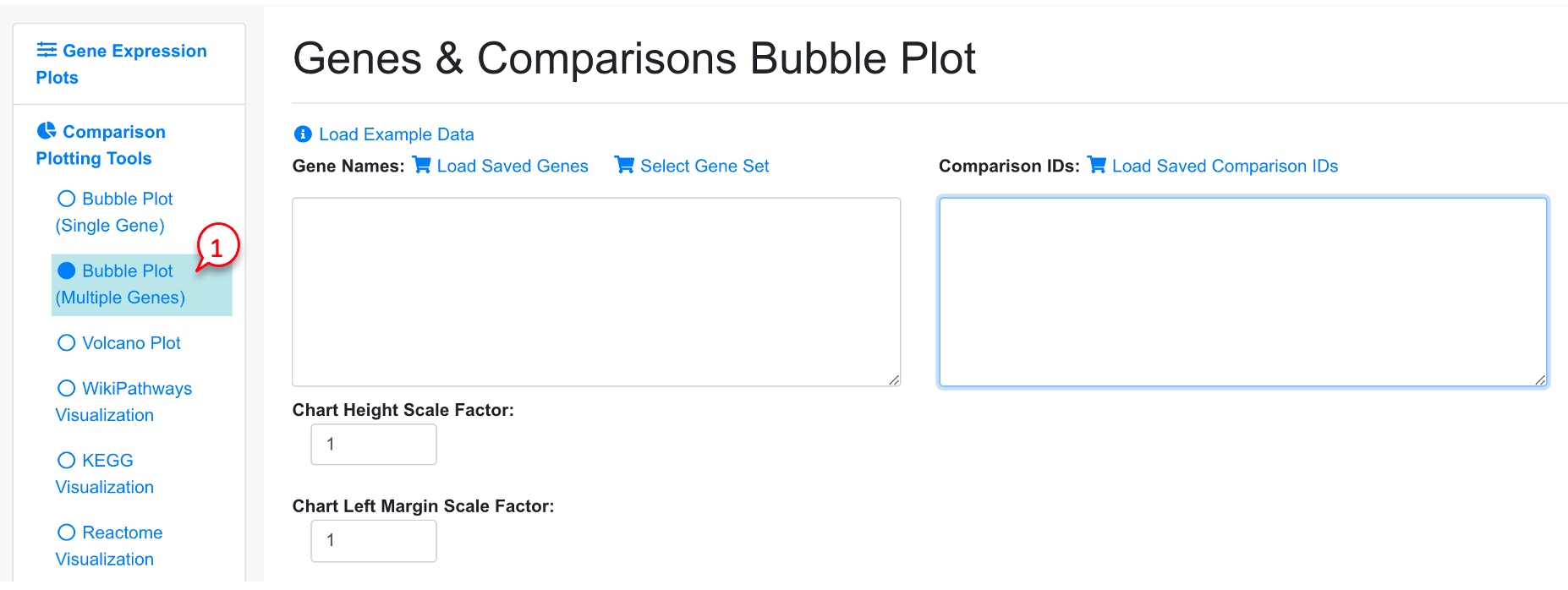
It can be useful to look at a set of genes (e.g., all differentially expressed genes, or genes from a certain pathways) in a set of related comparisons (e.g., all from the same disease). To view this type of bubble plot, select Bubble Plot (Multiple Genes).
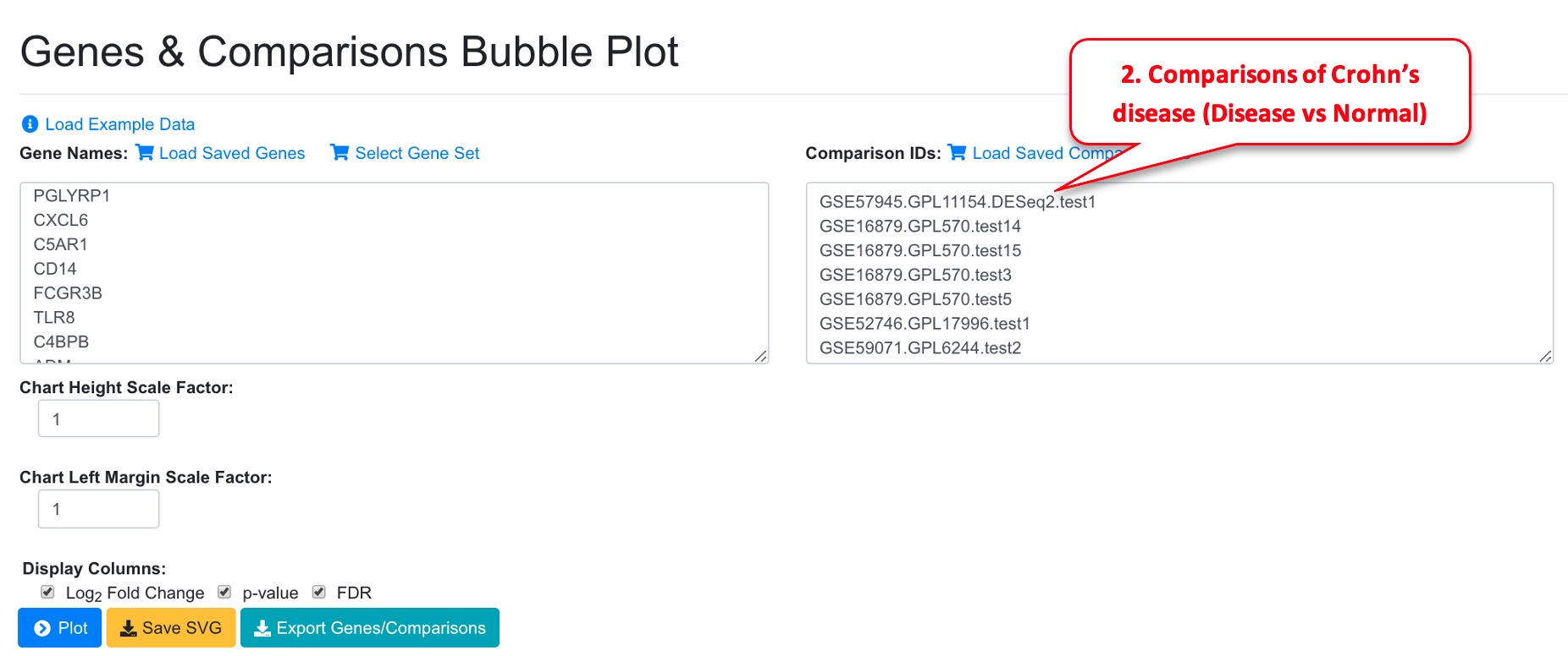
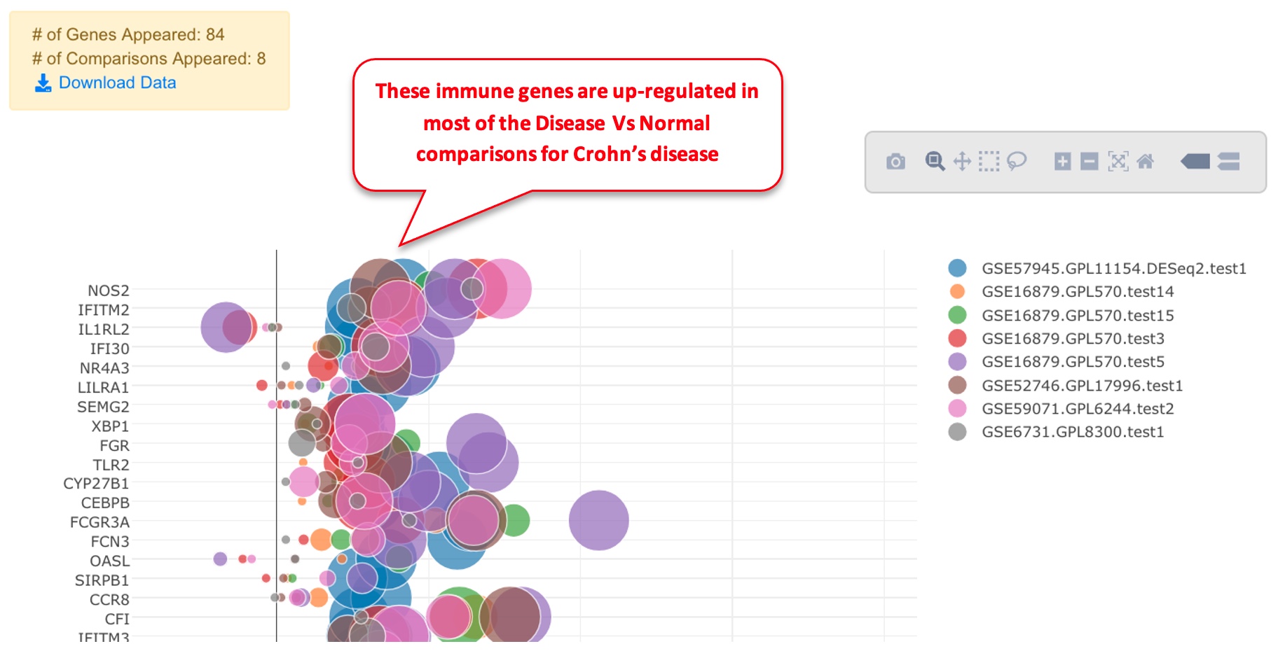
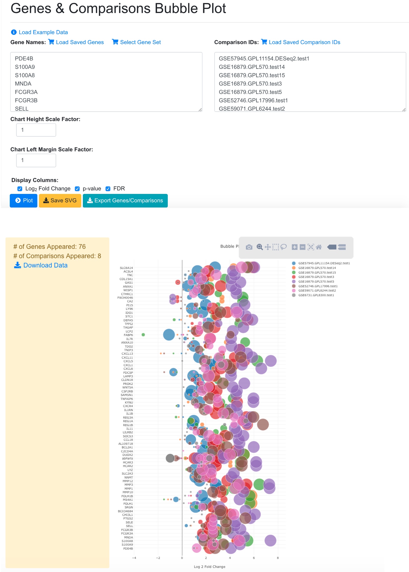
In the Genes and Comparisons Bubble plot window, users can now enter the symbols of the genes, and the comparison names. However, it is much easier to use the saved genes and saved comparisons features, or other tools from the system to quickly get a gene set. In the example below, we use dashboard to select 8 comparisons that are for Disease vs. Normal in Crohn’s disease (CD). We save the comparisons and load in the bubble plot tool. For gene list, we get the up-regulated immune response genes from comparison GSE57945.GPL11154.DESeq2.test1 and paste into the gene names fields.
In the bubble plot, the gene symbols are listed in Y-axis. The X-axis represents logFC, color of the bubble represents comparison, and the size of the bubble represents the significance.
In the legend, the color keys for comparisons are shown. Users can click the color key in the legend to hide/show comparisons. The size of the color dot in the legend correlates to the largest bubble for that comparison, which is the most significant gene with the smallest FDR.
3.7 Get significant genes from comparisons
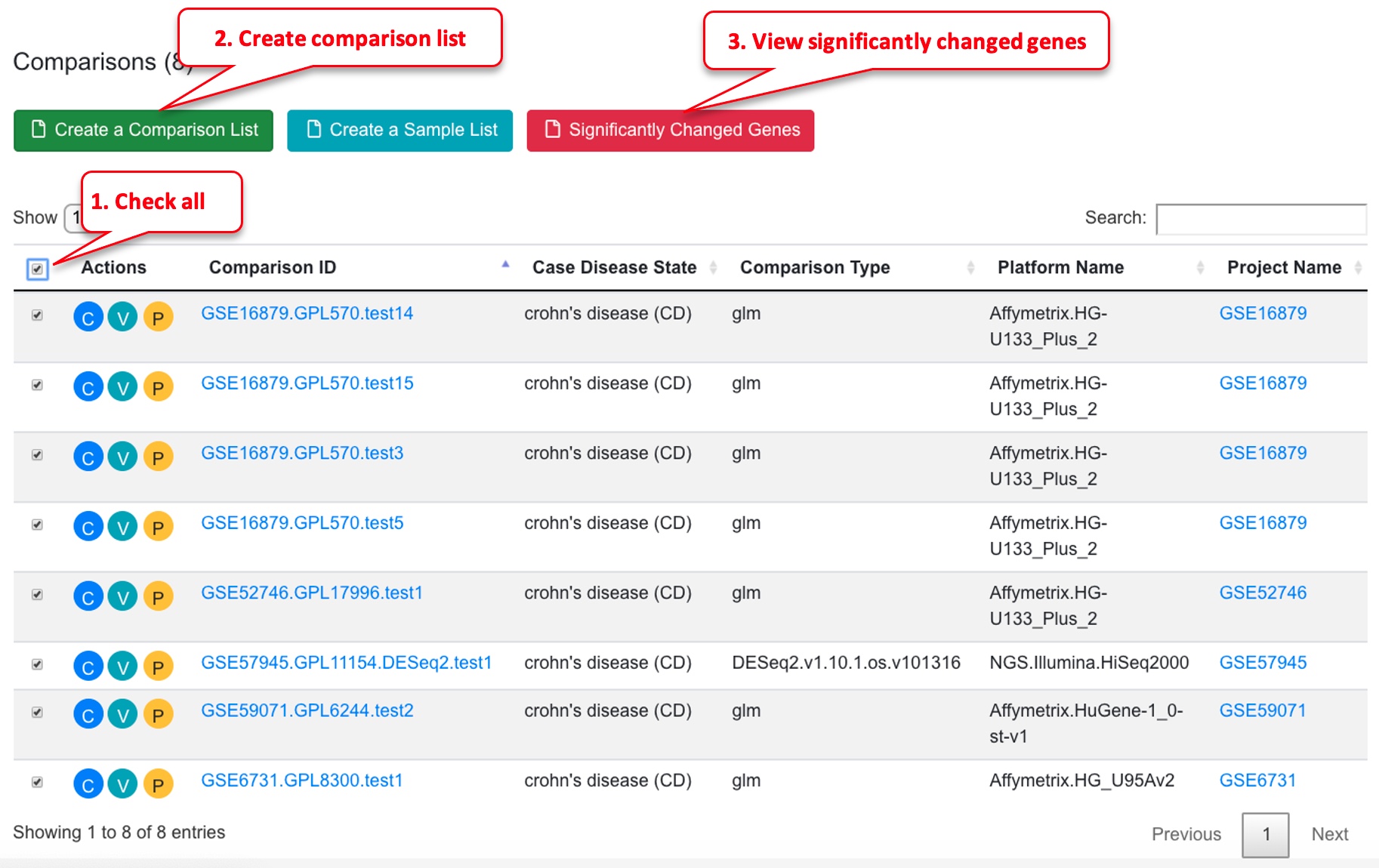
Another way to get a gene set to visualize in the genes/comparisons bubble plot is to filter for significantly changed genes. To do this, first select a few comparisons from the dash board, and click the “View Significantly Changed Genes” button. Dashboard filter:
In table, select comparisons and view significantly changed genes.
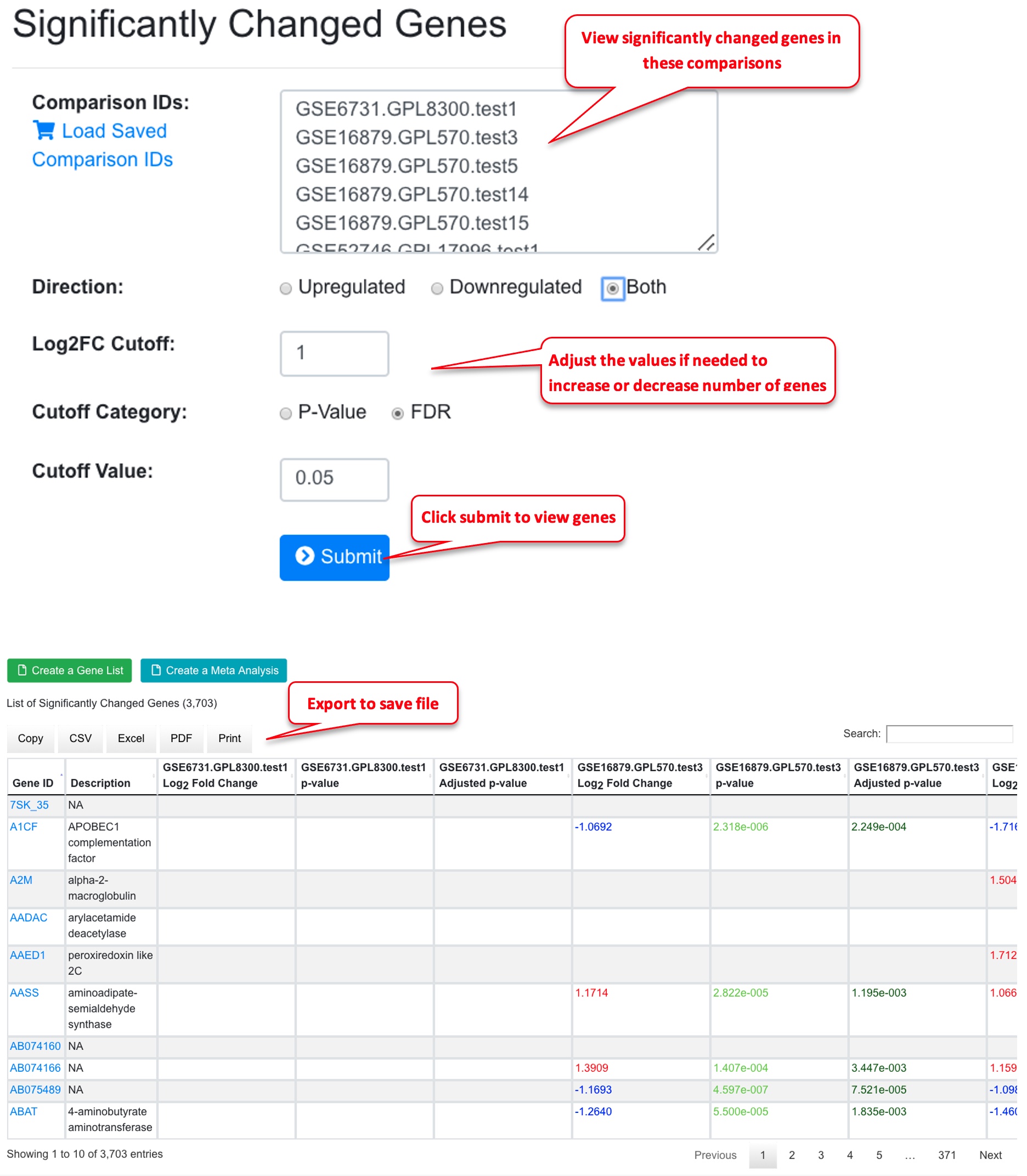
In the significantly Changed Genes window, the comparisons from the previous page are already loaded. You can add or remove comparisons if needed. Now select direction (up-, down-, or both), and use the logFC cutoff and FDR value to get a list of genes. Depending on the comparisons, sometimes you may need to adjust the logFC and FDR values to get a good list of genes. In general, for bubble plot, using <100 genes will make the graph easier to read. Once you are happy with the gene list, you can save it. You can also export the list for later use.
3.8 View Significantly Changed Genes in Bubble Plot
Back to the bubble plot, users can load the saved comparisons and saved genes and view the plot. In the example below, it can be seen that most significant genes come from up-regulated direction.
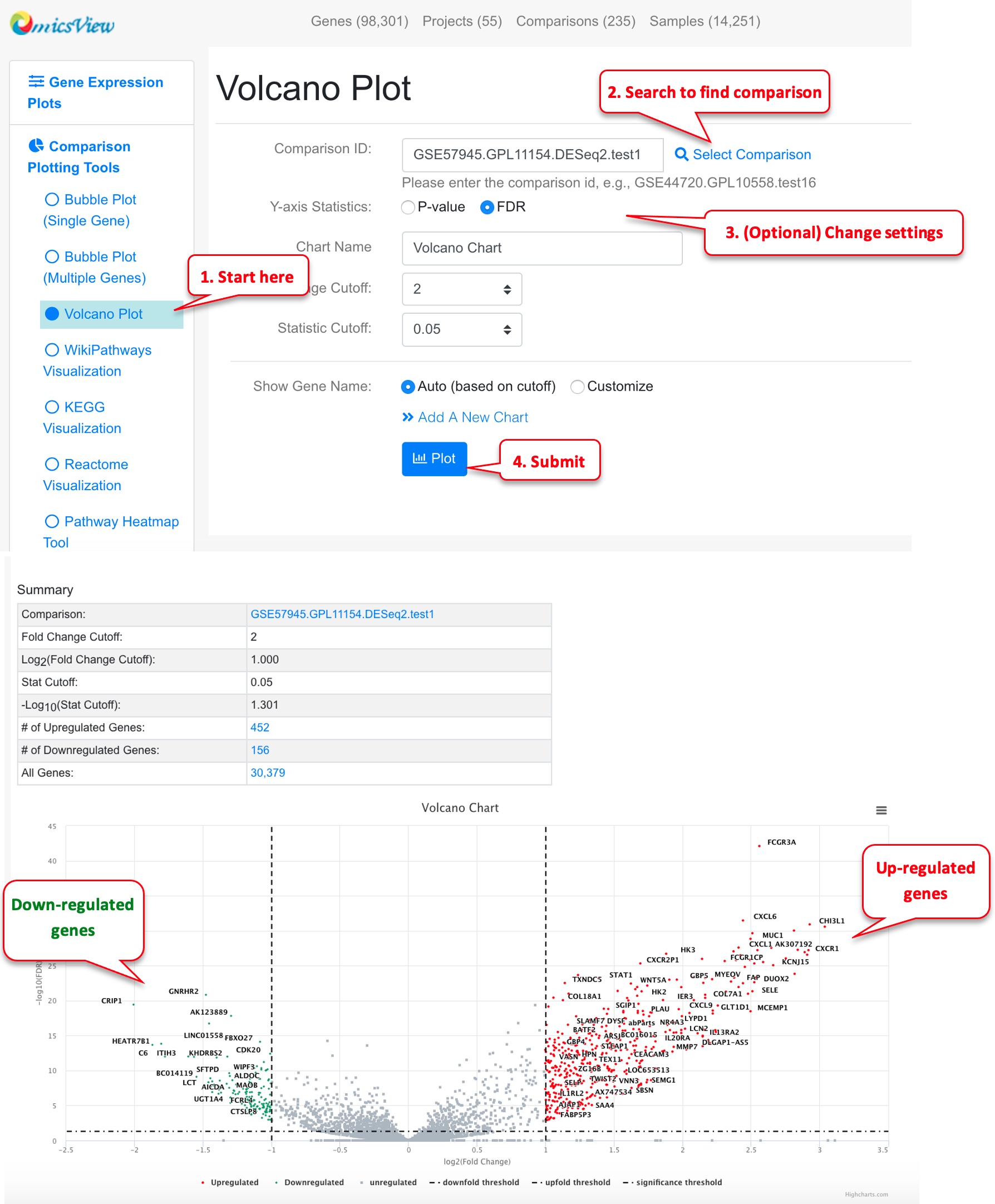
3.9 Volcano Plot of a Comparison
Volcano plot is useful to view a top level summary of how many genes are significantly up- or down-regulated in a comparison.
Users can use mouse to drag over an area to zoom in. Mouse over a point will show the gene details. Click the data point will show you links to other graphs.
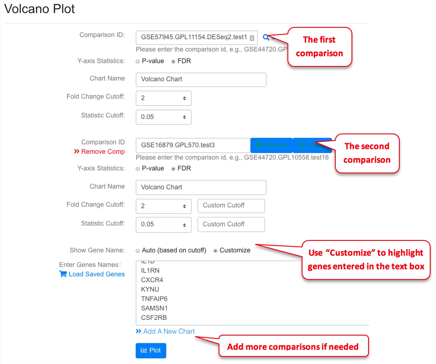
3.10 View Multiple Volcano Plots Together
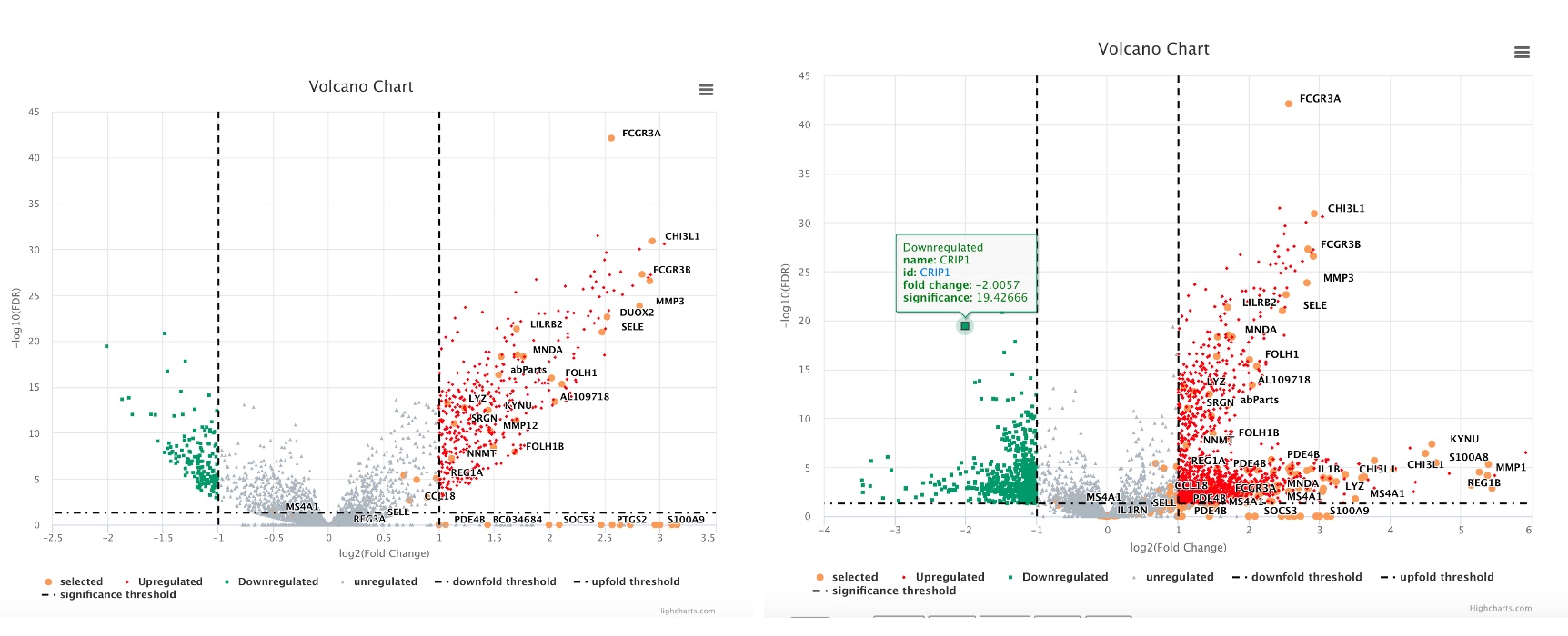
Users can also show multiple comparisons side-by-side. If needed, the user can also highlight the same group of genes across the volcano plots.
The resulting volcano plots are shown as below. Selected genes are shown as orange dots.
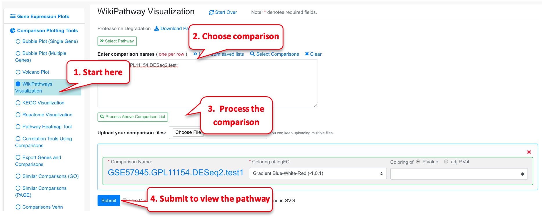
3.11 Overlap Comparison Data to Pathway Graph
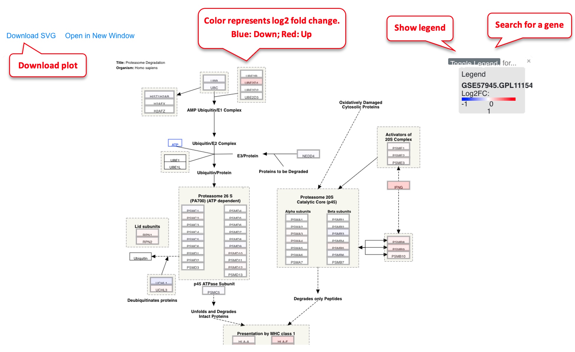
If users are interested in a particular pathway, sometimes it is useful to map the RNA-Seq or microarray data to the pathway for visualization.
In the pathway plot, typically we use red-blue color scale to show the log2 Fold Change. Blue is down-regulated, red is up-regulated.
3.12 Pathway Plot from Several Comparisons
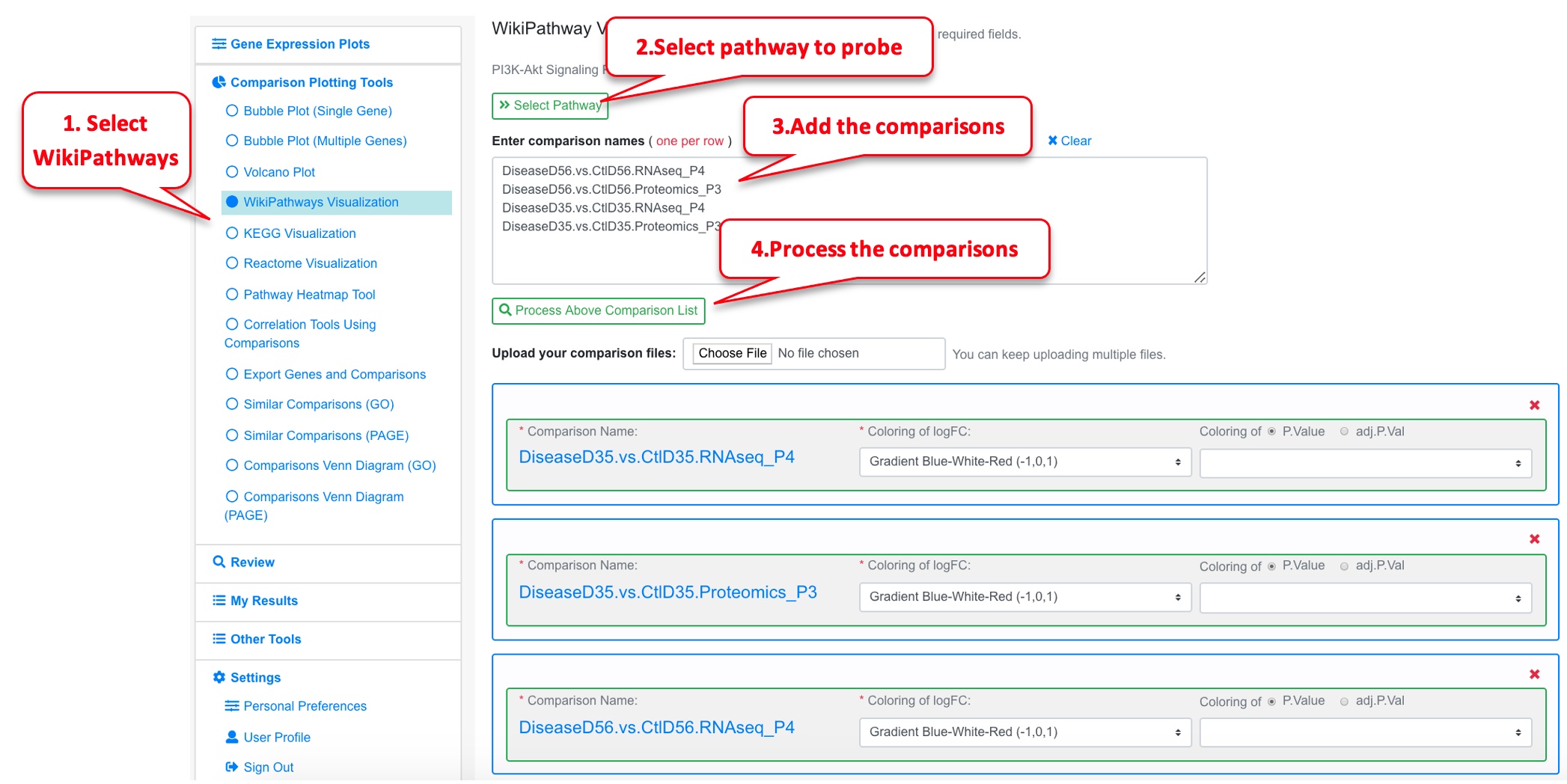
The user can add multiple comparisons from the pathway plot tool by clicking Add Comparison link. This is a good functionality to overlay differential genes from multiple comparisons along a pathway.
In this example we use data from Connor-Robson et al., Neurobiology of Disease, 2019. In this paper, the authors performed proteomics (Mass spec) and RNAseq analysis on diseased and normal iPSCs. They performed both analysis at 2 timepoints of differentiation: D35 and D56. This visualization will identify if the same genes are differentially expressed in the proteomic and the RNAseq datasets, as well as in the two timepoints on a WikiPathway.
The data was uploaded into OmicsView. For the proteomic dataset, the protein ID was converted to the gene ID. Here the 4 comparisons (2 Proteomics and 2 RNAseq) are loaded, and the P13k Akt signaling pathway is probed.
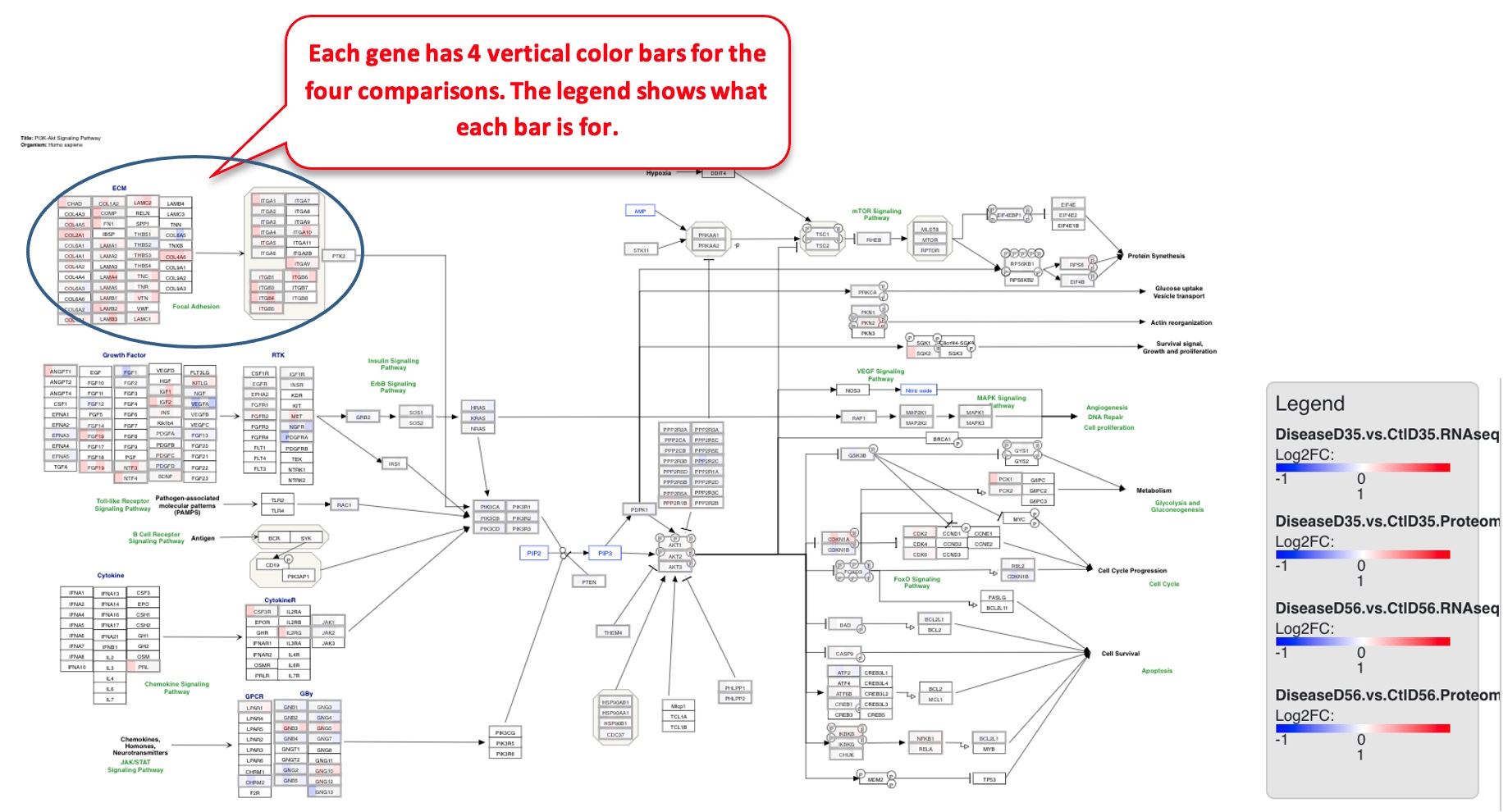
The pathway plot now has 4 color bars corresponding to the different comparisons.
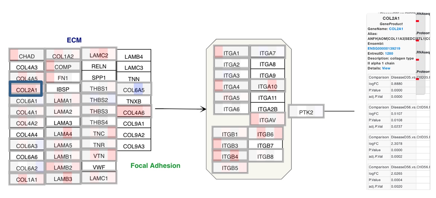
Users can also zoom into the plot for better visibility of the genes. The figure below is zoomed into the circular section from the plot above.
In this example, many of the ECM genes are getting differentially regulated in the same direction across all 4 comparisons. If a particular gene is clicked on, like COL2A1 here, the details of changes in the gene in each comparison can be seen.
