scRNAsequest Slide Deck
Navigation buttons
- Press “Esc” or “o” key to enter the the slide overview
- Alt + mouse click to zoom in/out
- Press “s” key to speaker view to see notes
Introduction
This is a slide deck (part of scRNASequest pipeline).
This report contains basic QC plots generated by the pipeline. If you turn on the filter_step when running scAnalyzer, this report will also display QC plots before and after filtering.
Please go through the figures carefully and decide the cutoffs for data filtering.
QC plots
This section presents a series of QC plots.
These QC plots can be grouped into the following categories:
General QC
Q30 Bases Percentage
Reads Mapping Summary
General QC
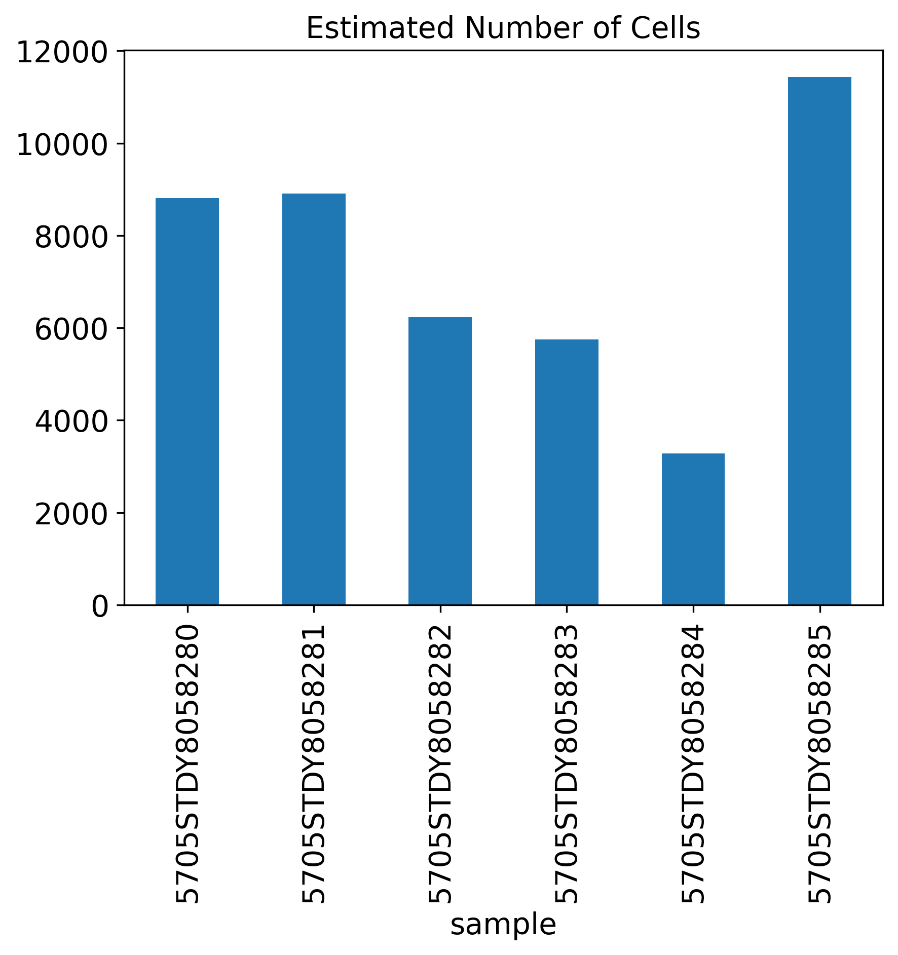
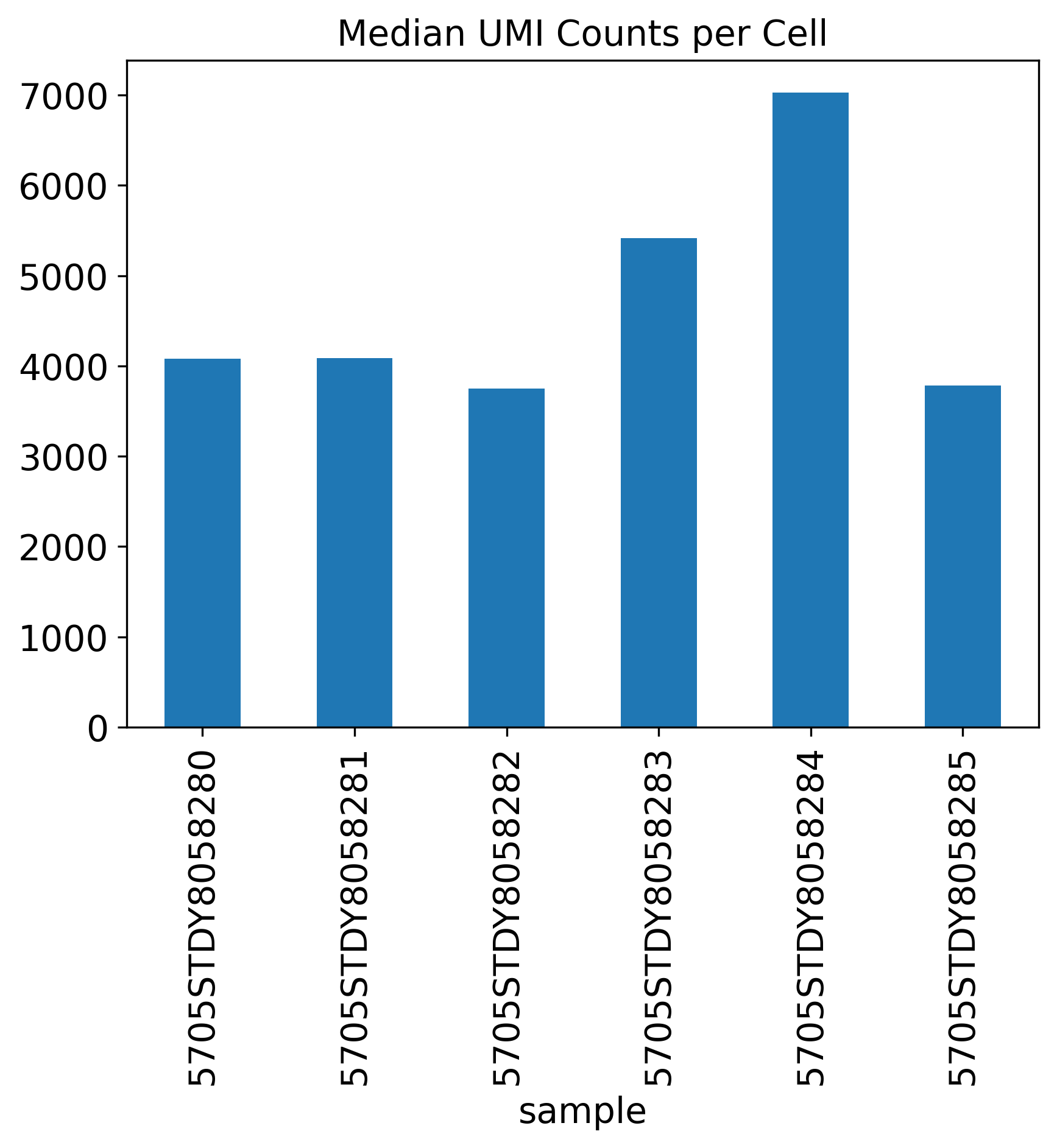
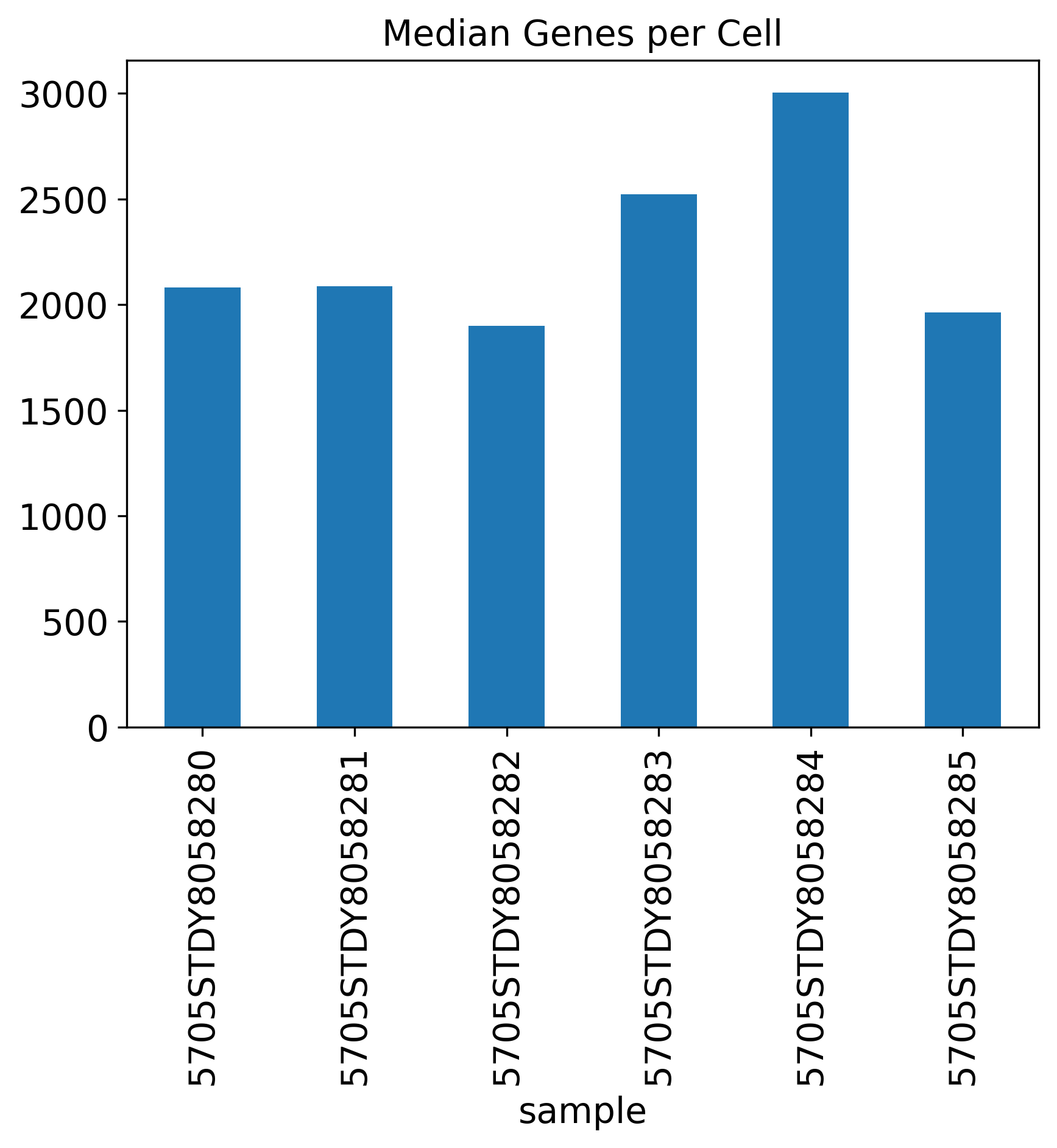
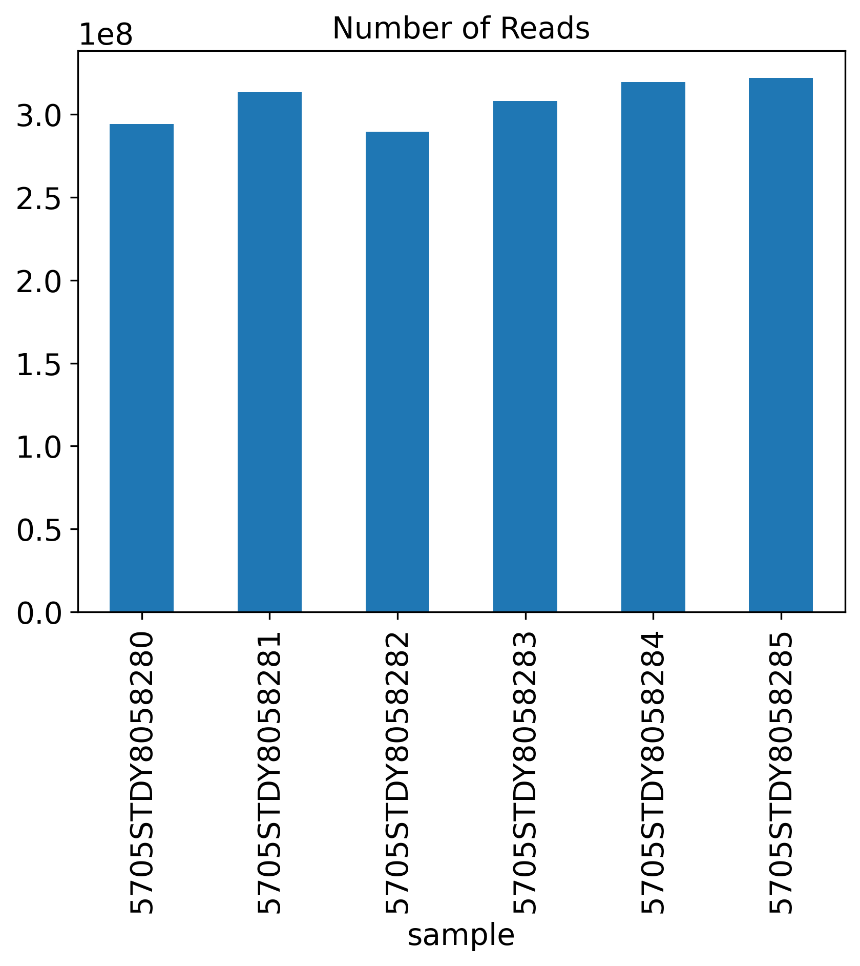
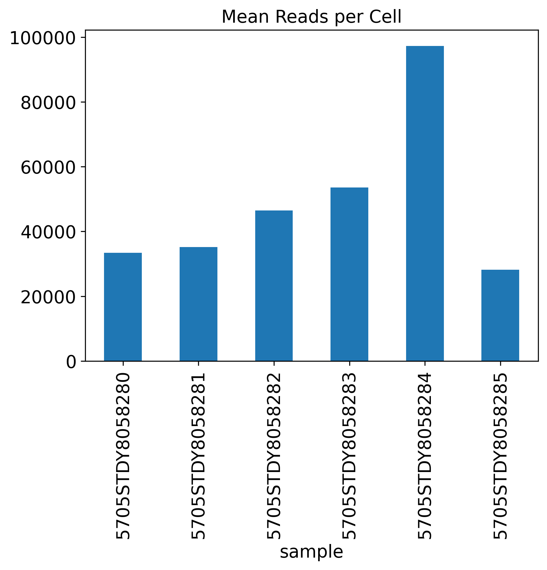
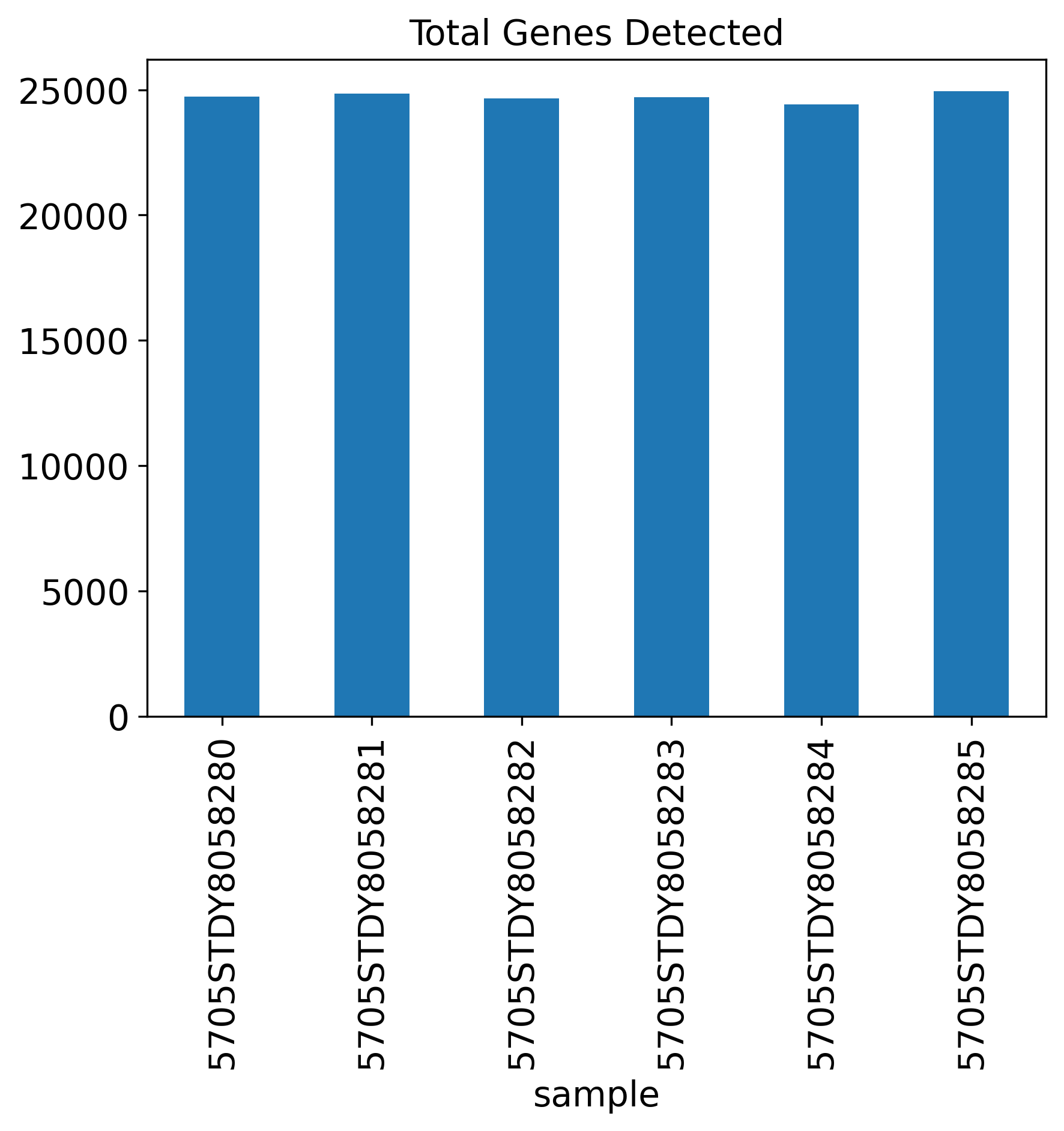
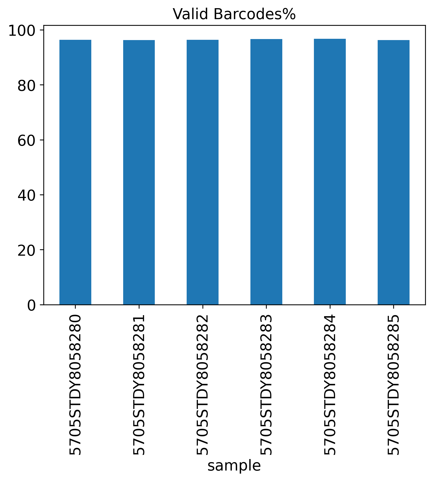
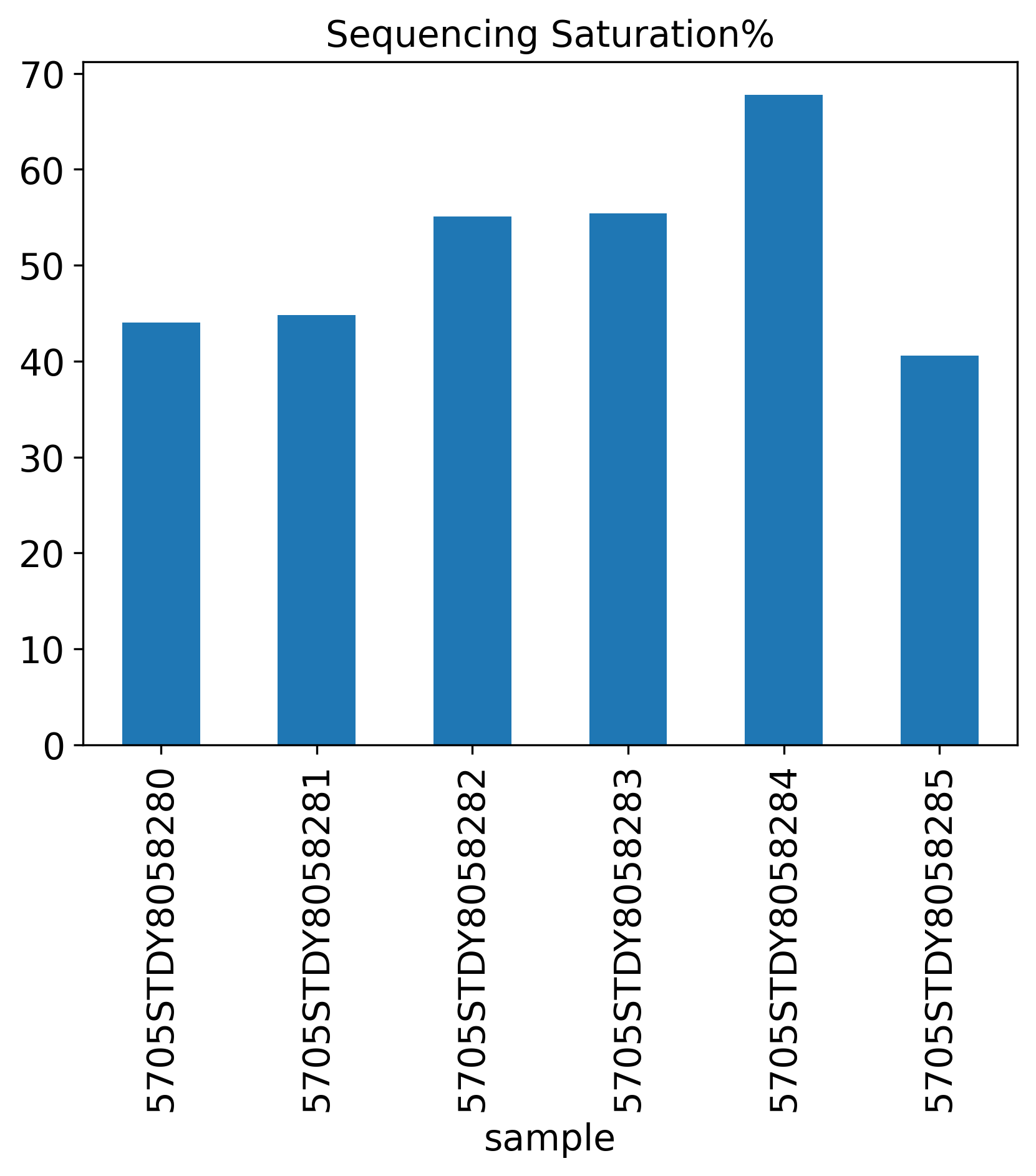
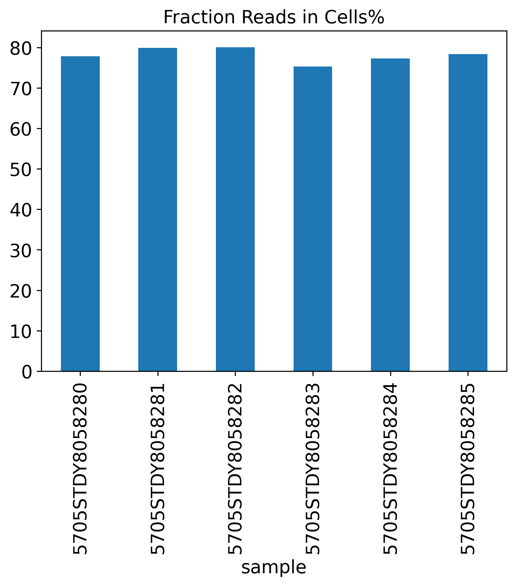
The General QC plot section includes nine bar plots to visualize general metrics of the current single-cell project.
Estimated Number of Cells
Median UMI Counts per Cell
Median Genes per Cell
Number of Reads
Mean Reads per Cell
Total Genes Detected
Valid Barcodes%
Sequencing Saturation%
Fraction Reads in Cells%
Q30 Bases Percentage
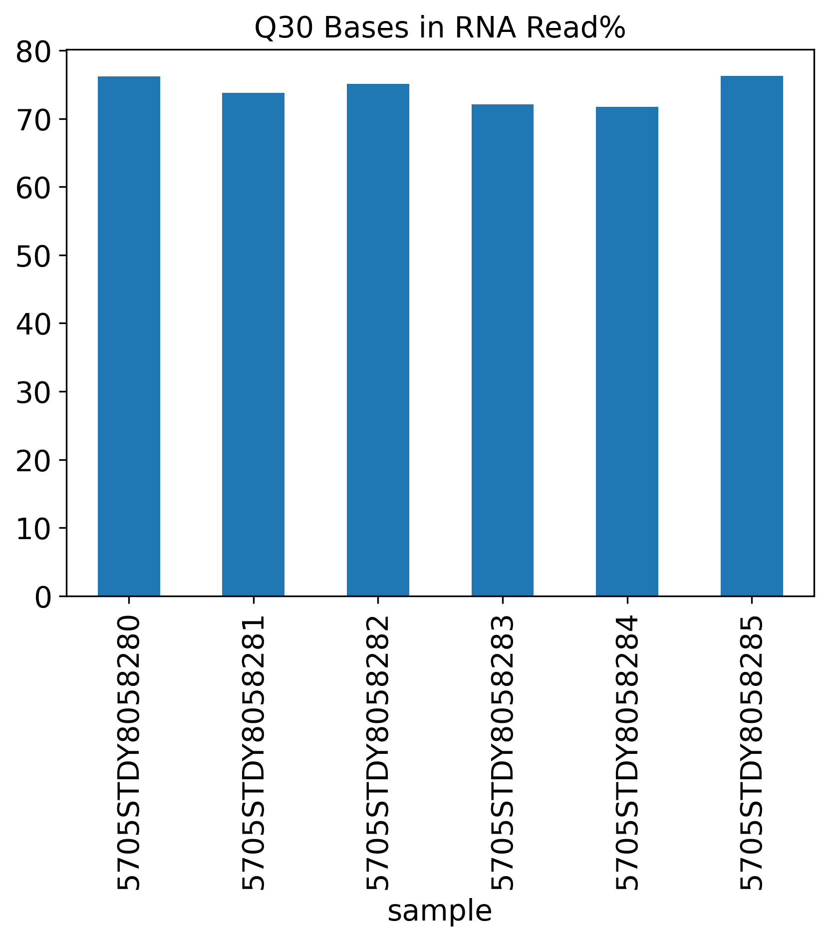
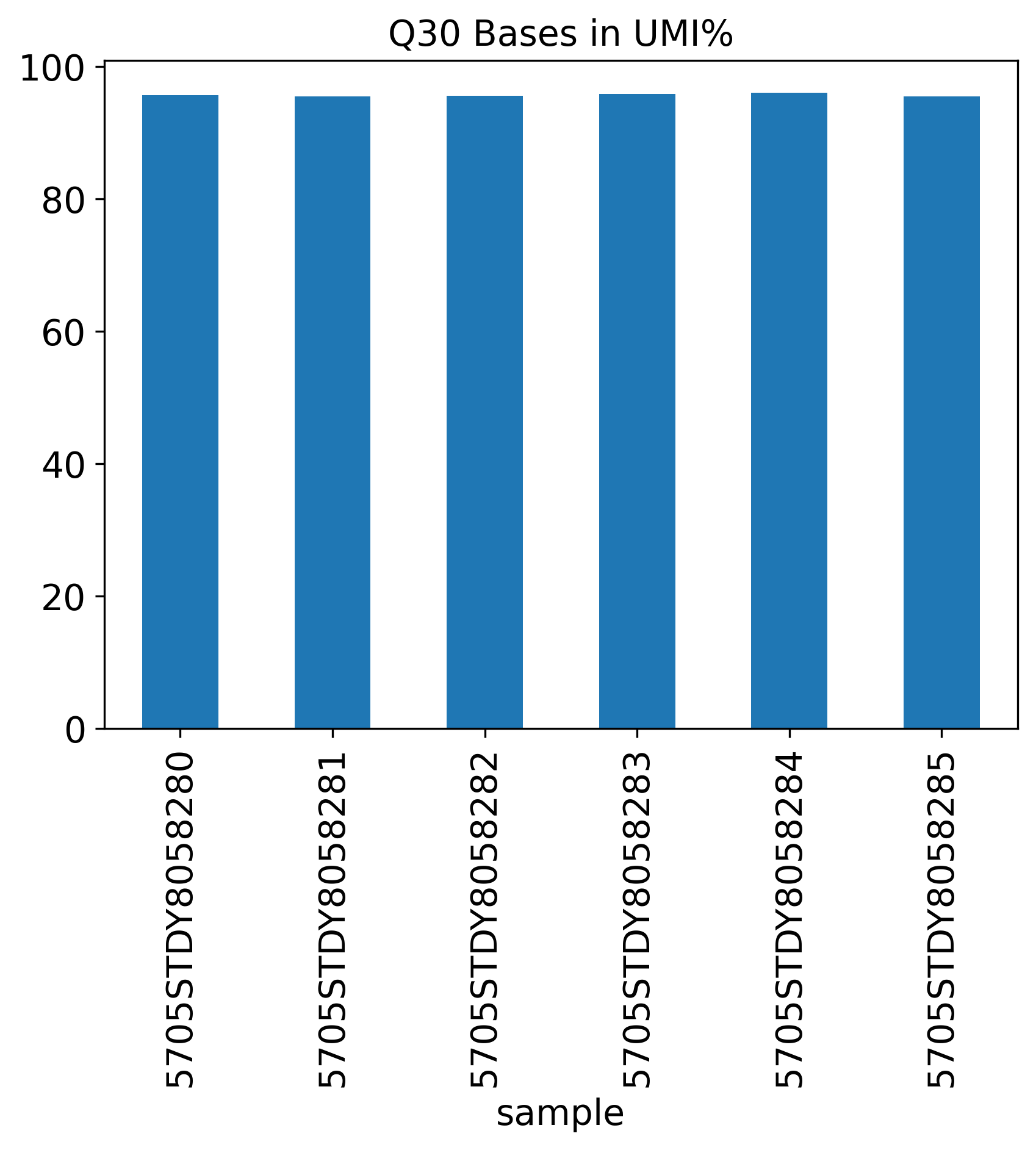
The Q30 Bases Percentage includes three Q30 plots showing Barcode%, RNA Read% and UMI%.
Q30 Bases in Barcode%

Q30 Bases in RNA Read%
Q30 Bases in UMI%
Reads Mapping Summary
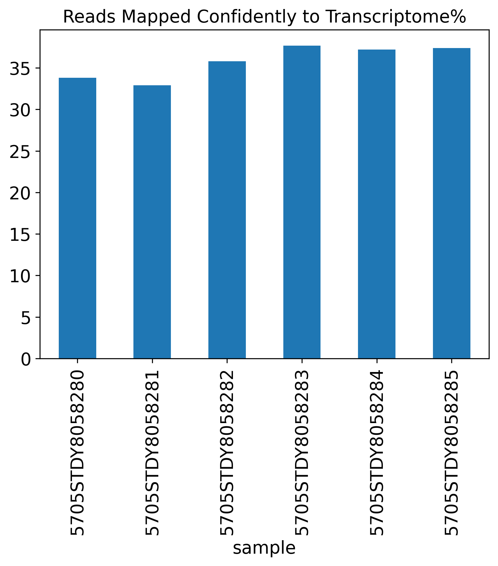
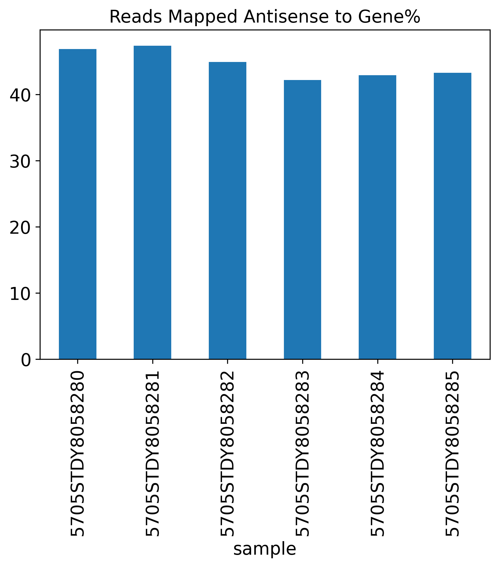
This Reads Mapping Summary section shows the percentage of reads mapped to different genomic features.
Genome%
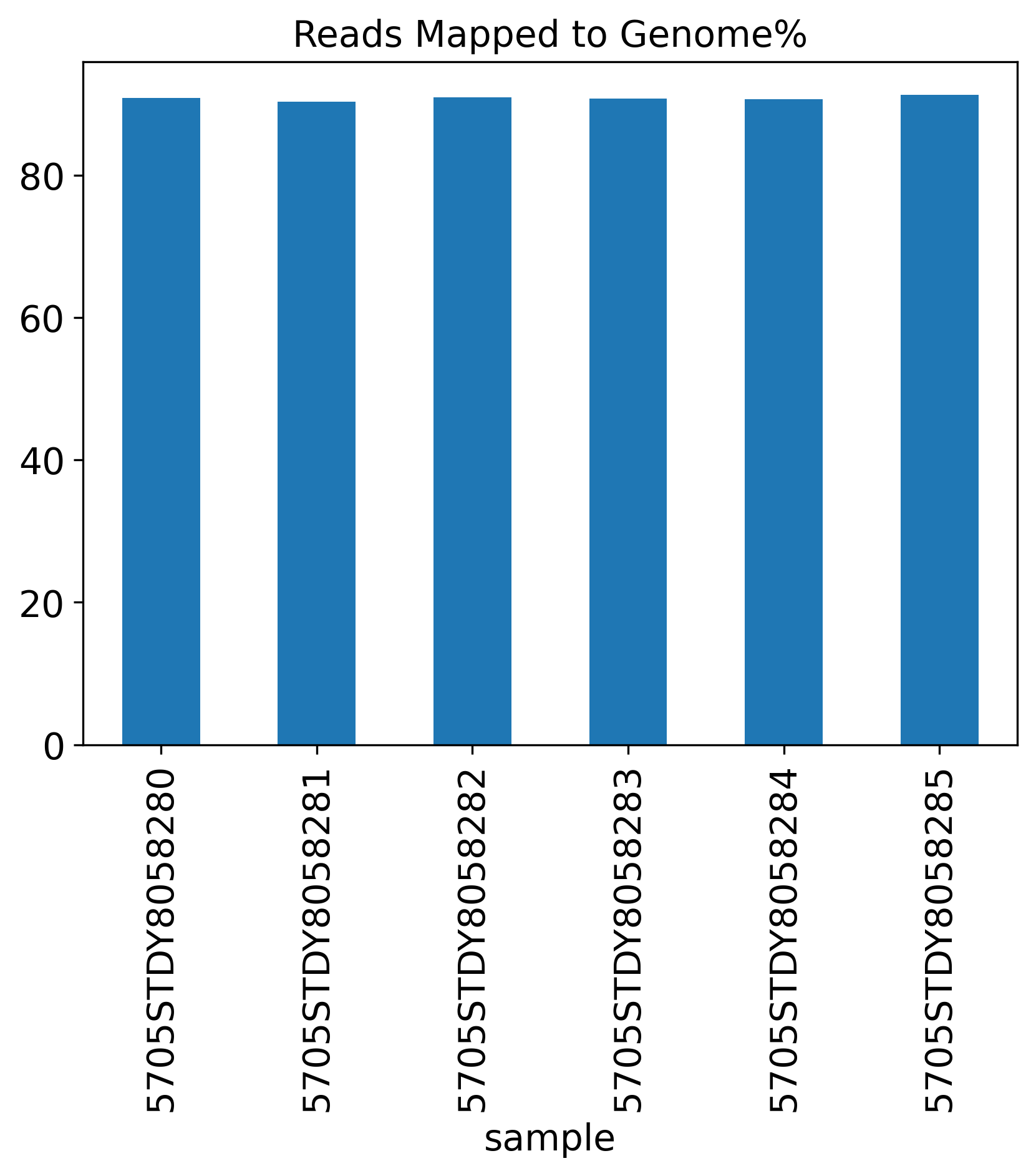
Confidently to Genome%

Confidently to Intergenic Regions%
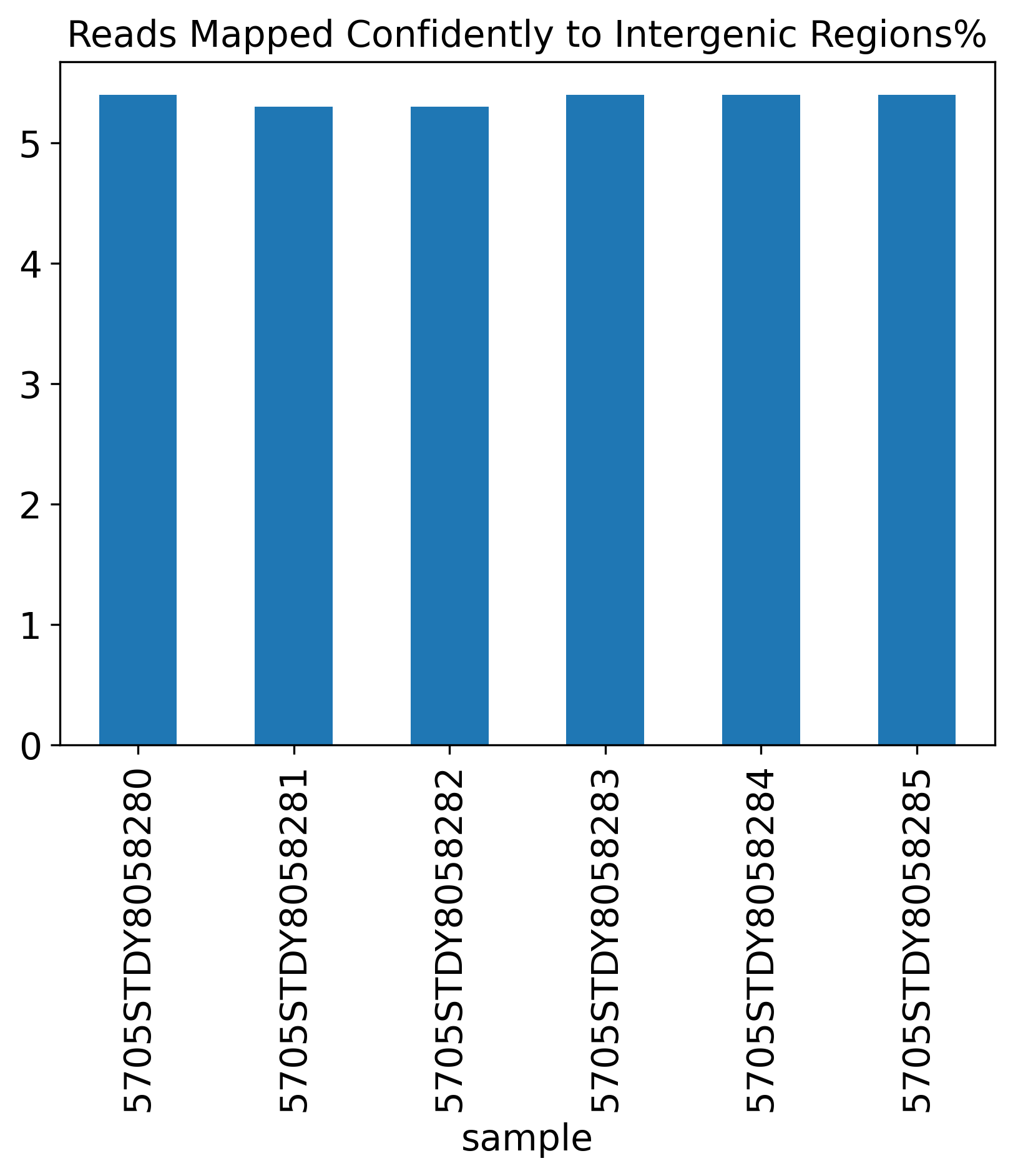
Confidently to Intronic Regions%
Confidently to Exonic Regions%
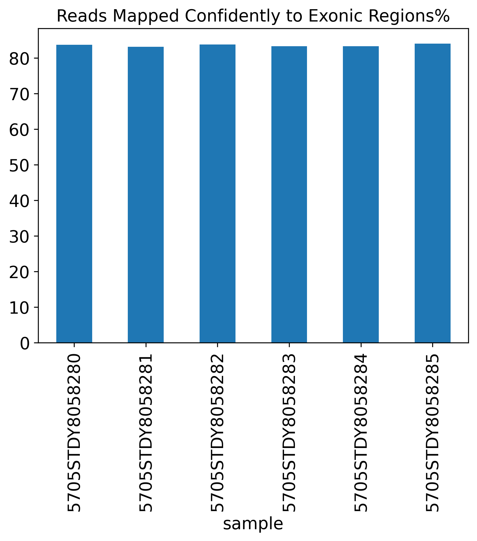
Confidently to Transcriptome%
Antisense to Gene%
Pre-filtering Plots
In this section, we present 8 pre-filtering figures. ## Counts and Genes
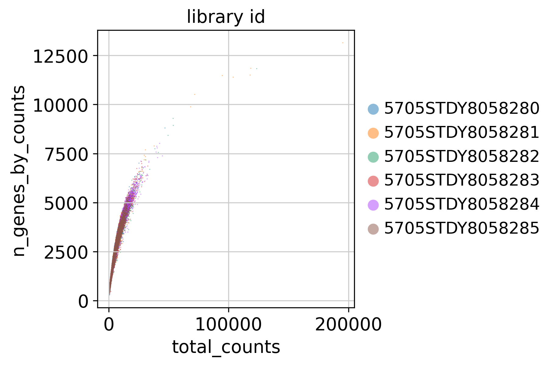
This plot shows Total Counts (X axis) v.s. Genes (Y axis) detected in each sample, before filtering.
Number of Genes
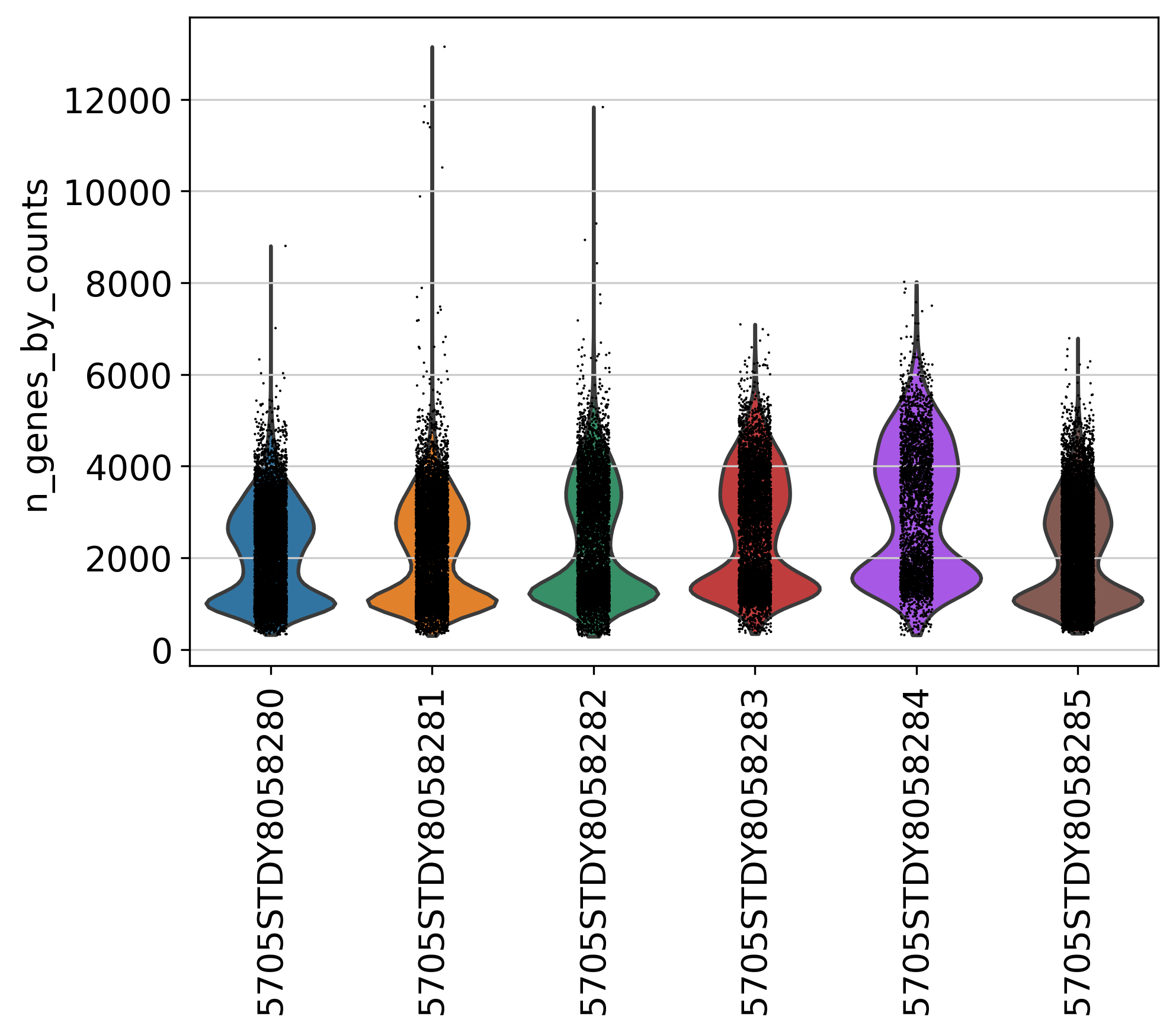
This plot shows Number of Genes (Y axis) detected in each sample, before filtering.
Top Genes
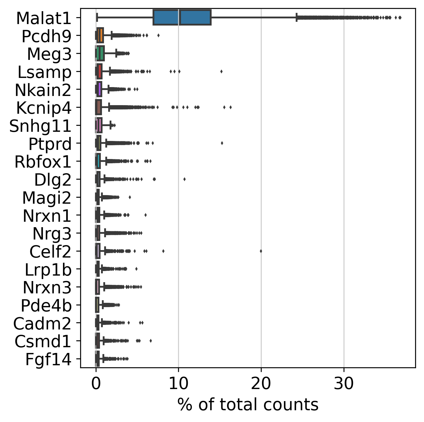
This plot shows Top Genes and % of Total Counts in each sample, before filtering.
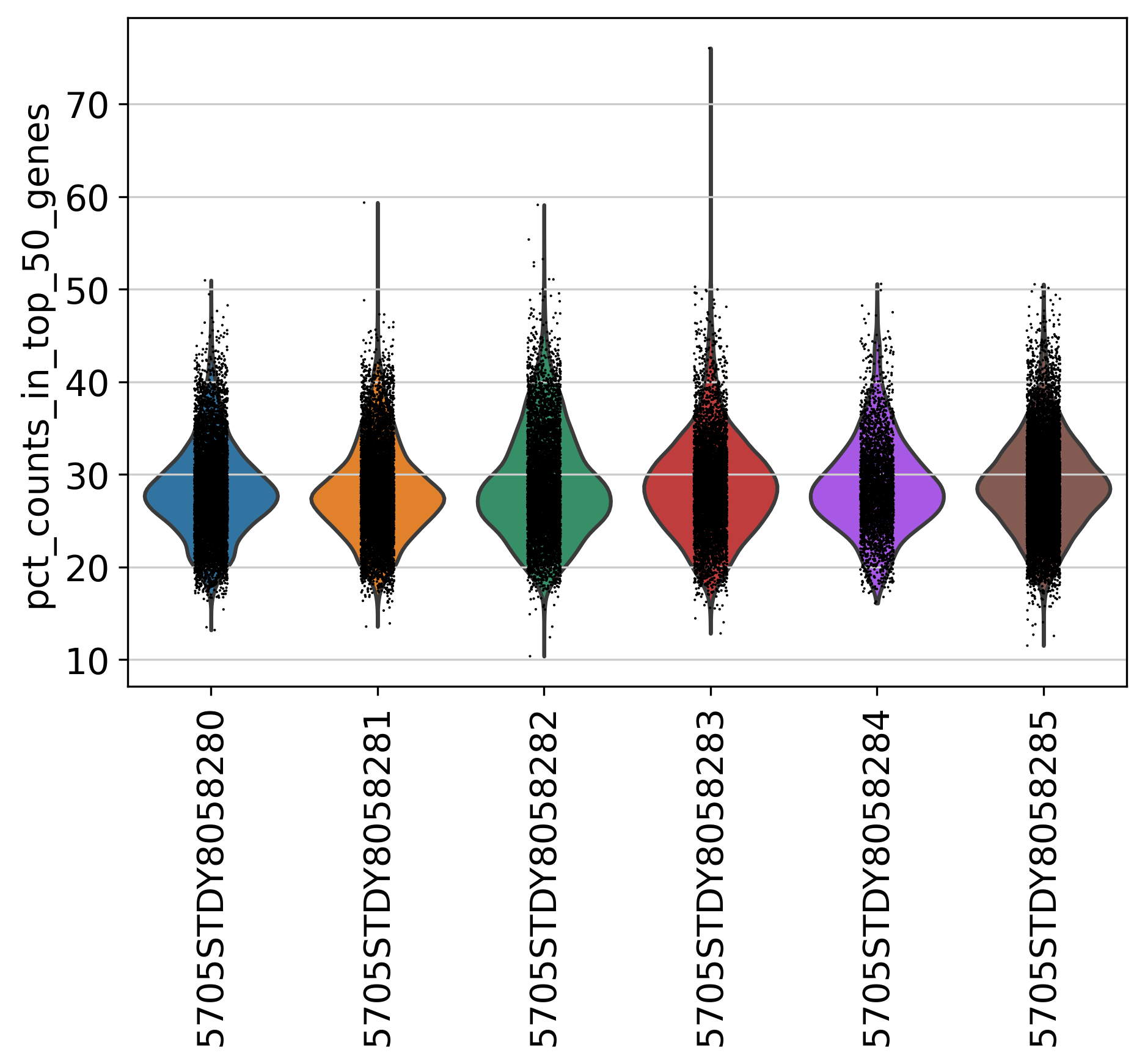
Percentage of Top 50 Genes
This plot shows % of Total Counts of top 50 genes, before filtering.
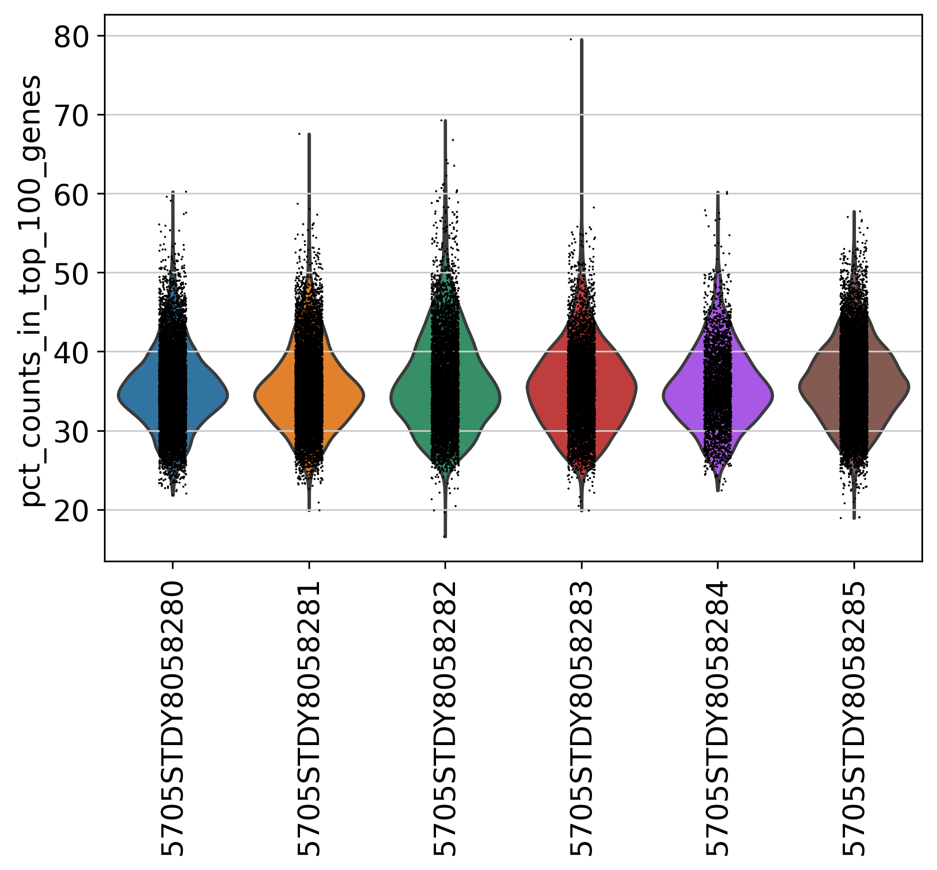
Percentage of Top 100 Genes
This plot shows % of Total Counts of top 100 genes, before filtering.
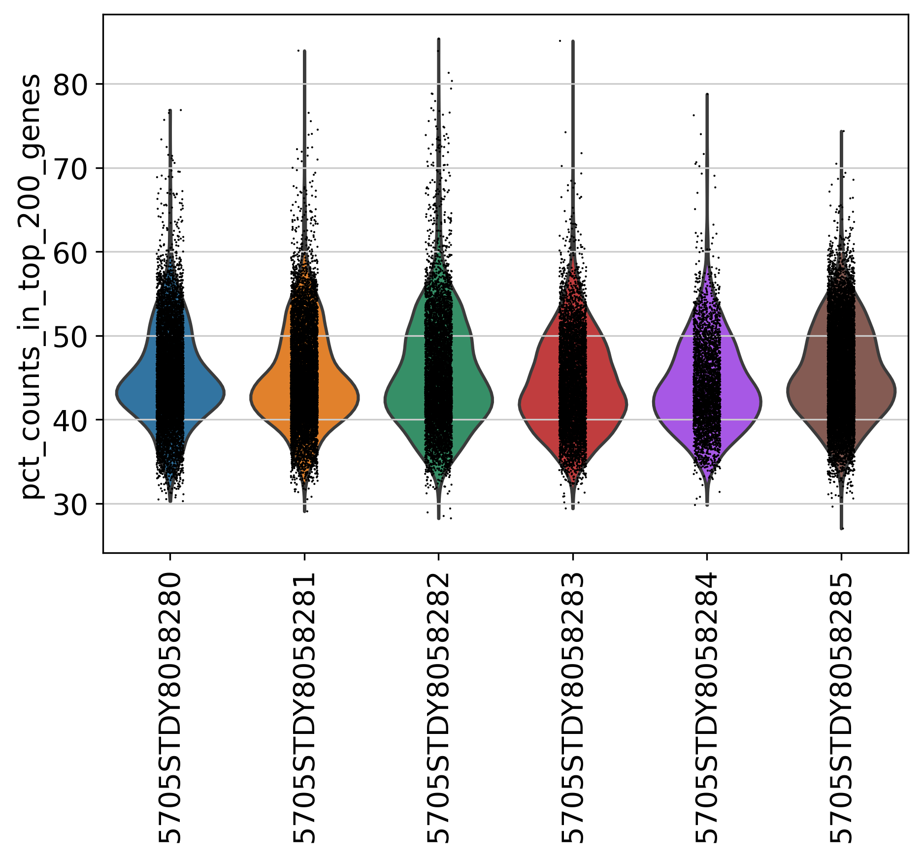
Percentage of Top 200 Genes
This plot shows % of Total Counts of top 200 genes, before filtering.
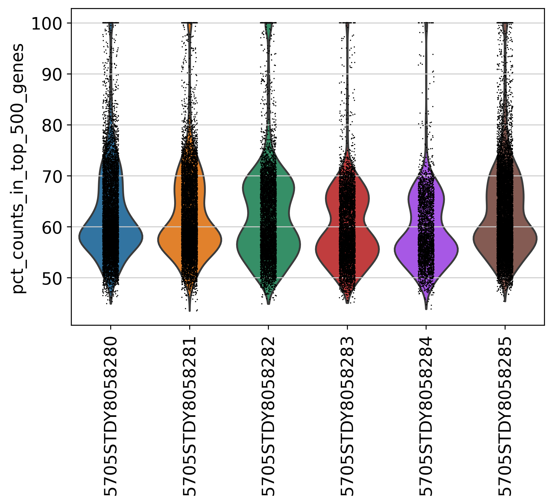
Percentage of Top 500 Genes
This plot shows % of Total Counts of top 500 genes, before filtering.
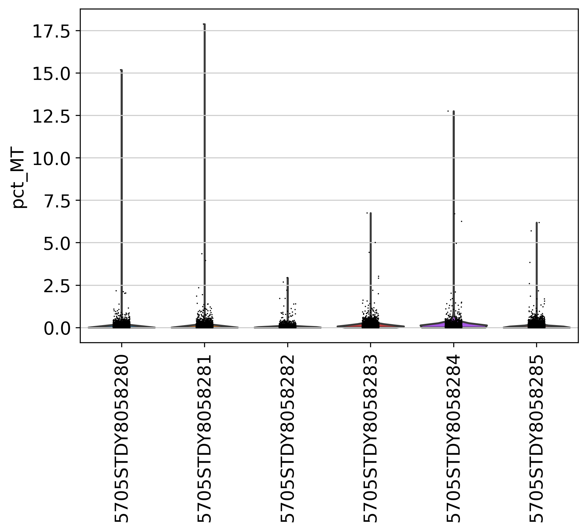
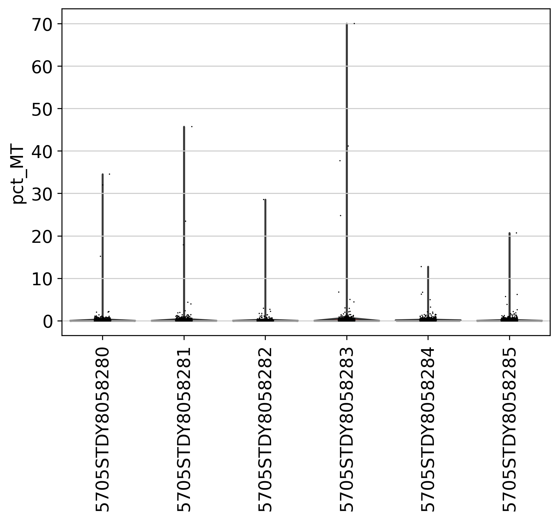
Percentage of Mitochondria
This plot shows % of Mitochondria, before filtering.
Post-filtering Plots
Post-filtering plots can be used to examine the filtering cutoff.
This table summarizes number of cells and genes after each filtering step. The last row shows the final number after all steps.
| Filter | cutoff | cell_number | gene_number |
|---|---|---|---|
| MT | 20 | 44419 | 31040 |
| min cell | 3 | 44419 | 25276 |
| min gene | 50 | 44419 | 25276 |
| max gene | 3000 | 31653 | 25276 |
| max UMI | 10000 | 31648 | 25276 |
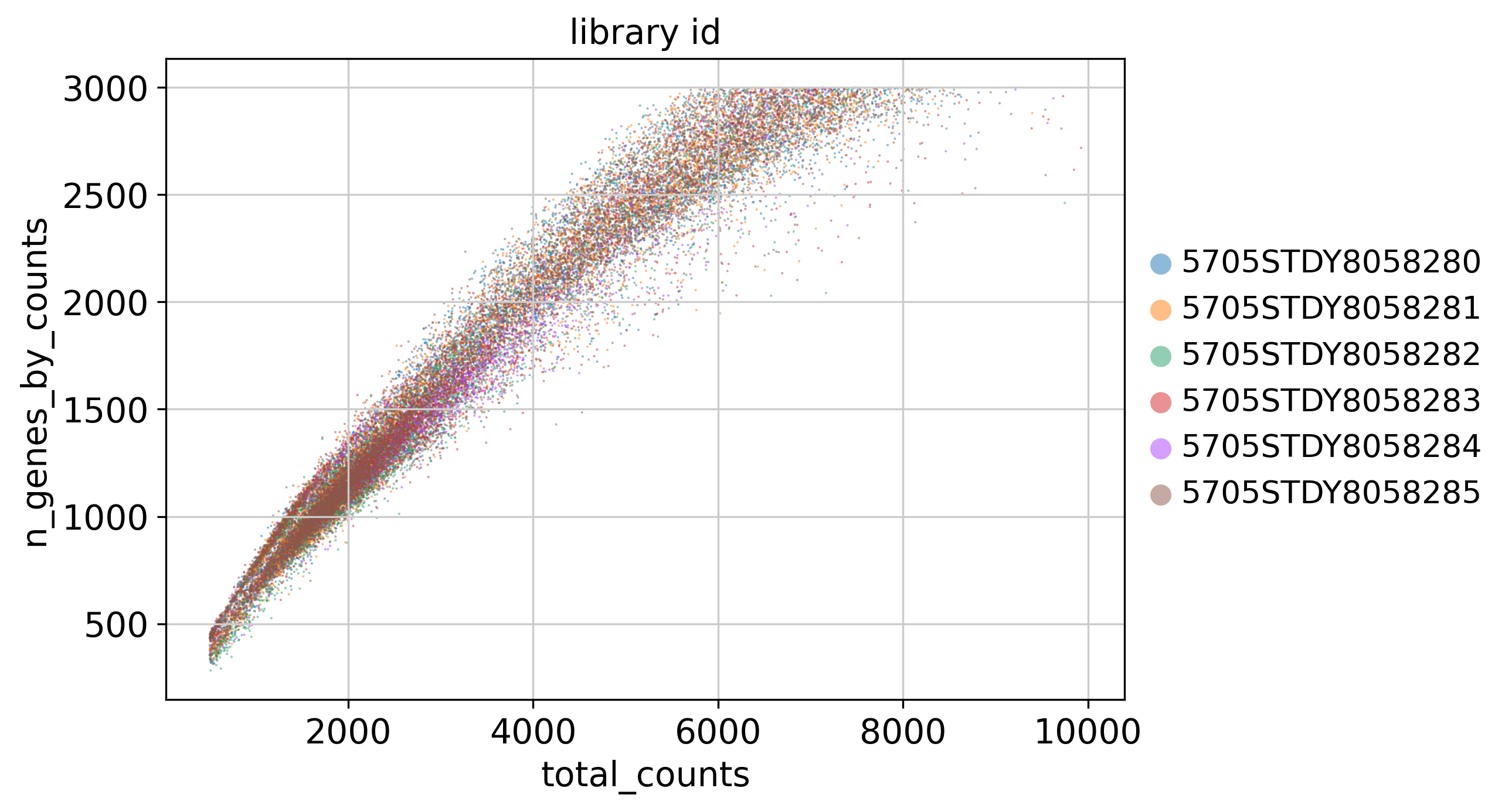
Counts and Genes
This plot shows Total Counts (X axis) v.s. Genes (Y axis) detected in each sample, after filtering.
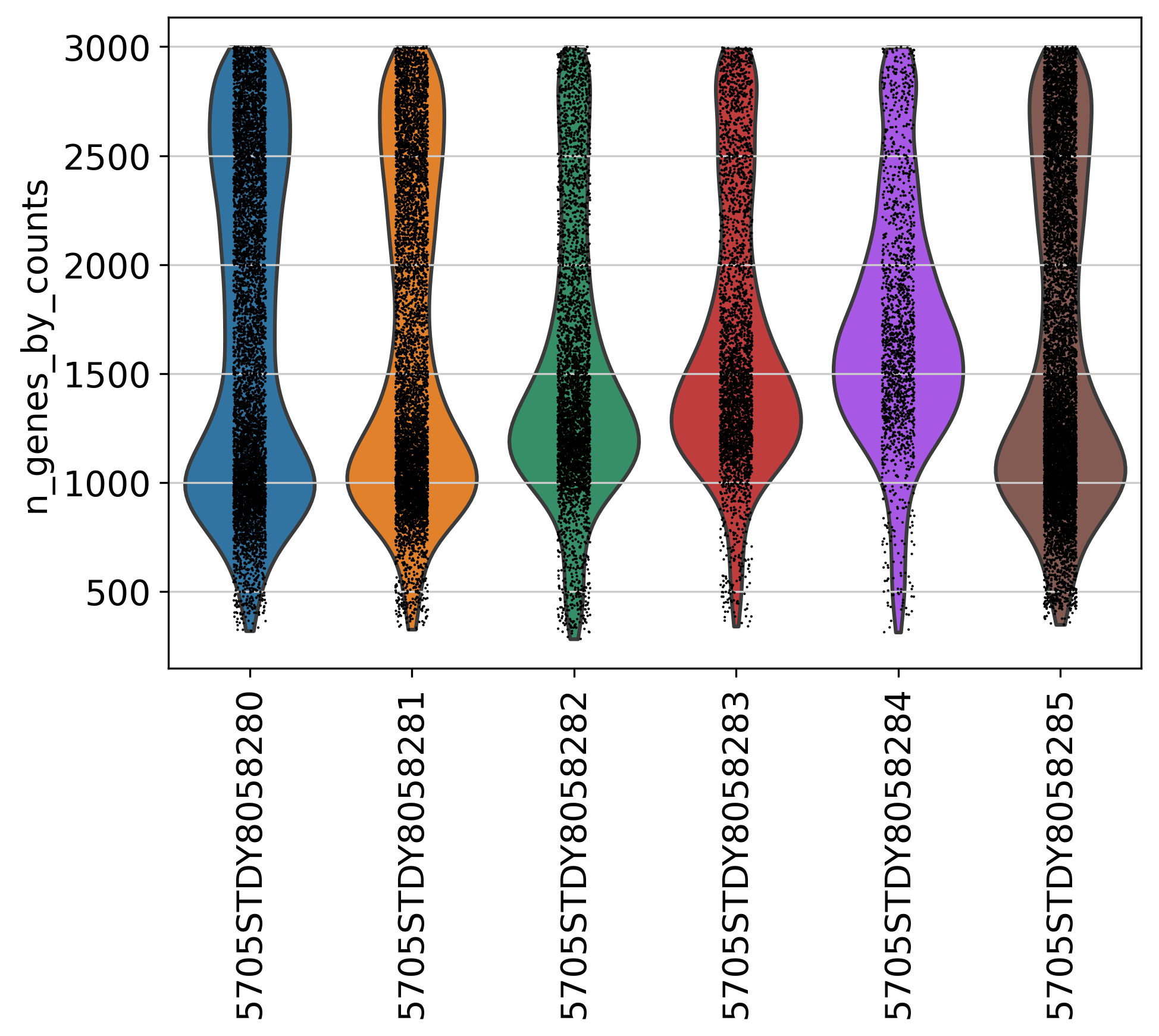
Number of Genes
This plot shows Number of Genes (Y axis) detected in each sample, after filtering.
Top Genes
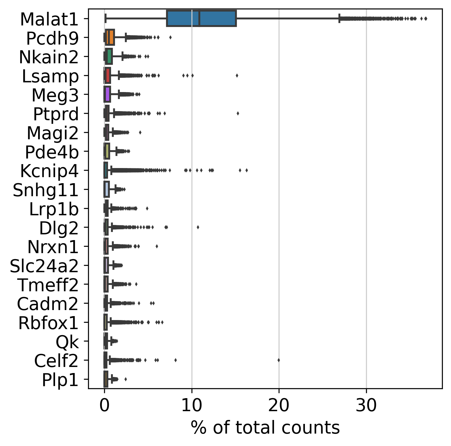
This plot shows Top Genes and % of Total Counts in each sample, after filtering.
Percentage of Top 50 Genes
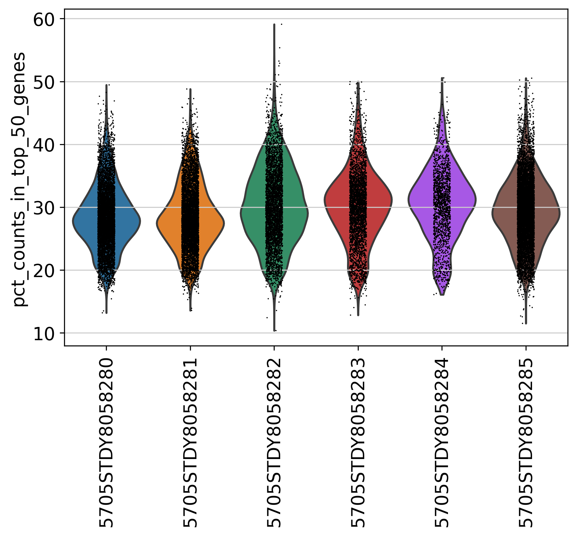
This plot shows % of Total Counts of top 50 genes, after filtering.
Percentage of Top 100 Genes
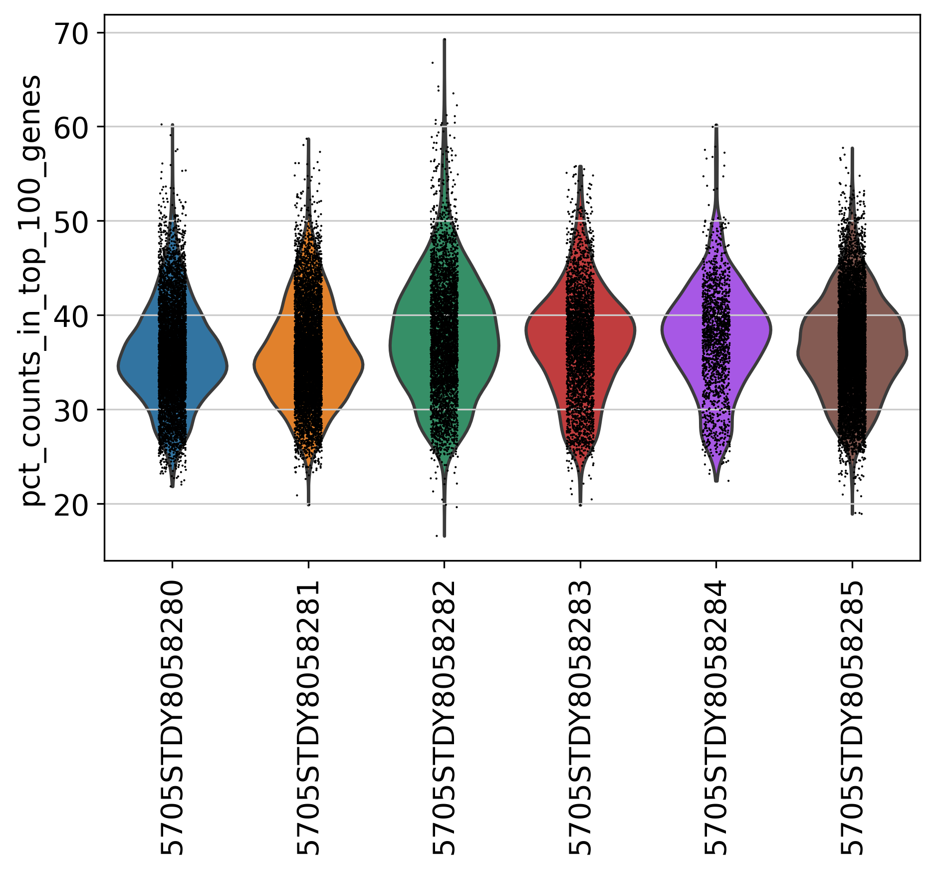
This plot shows % of Total Counts of top 100 genes, after filtering.
Percentage of Top 200 Genes
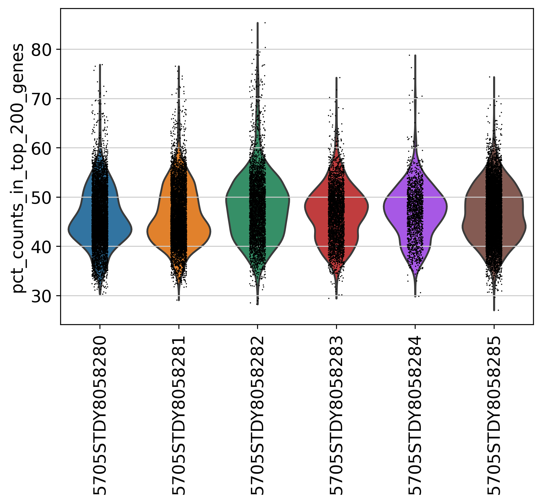
This plot shows % of Total Counts of top 200 genes, after filtering.
Percentage of Top 500 Genes
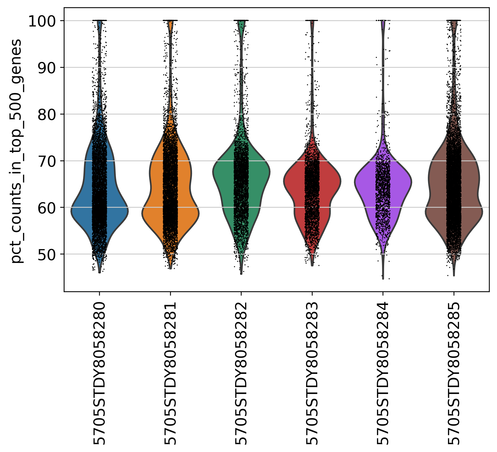
This plot shows % of Total Counts of top 500 genes, after filtering.
Percentage of Mitochondria
This plot shows % of Mitochondria, after filtering.
